Kindling Quarterly / Dot Gain
A new print periodical devoted to the ups and downs of modern fatherhood
A few months back, word of Kindling Quarterly, a print magazine with a focus on fatherhood, popped up and our curiosity was piqued. Fatherhood, for many folks in the urban creative classes in particular, seems to be in transition. We're personally acquainted with a full spectrum of dads from the hyper-involved to traditional 50-plus-hours-a-week office men. Exactly who has the correct recipe for that perfect work/life balance? We're not sure, but we do know that fatherhood is a hot topic.
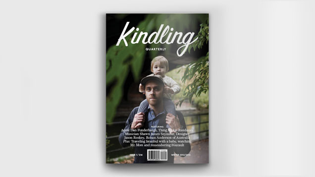
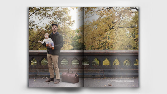
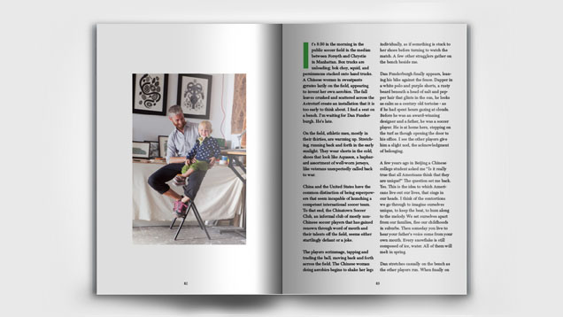
Soon, we had a copy of Kindling in hand and we were pleased with its mix of profiles on creative, involved dads and its well-observed commentary on images of fathers in pop culture. Whatever small criticisms we might have of the mag—in the first issue's introduction, cofounder David Michael Perez mentions it could use some more diversity—we couldn't deny that the publication's original take on fatherhood and our culture's changing attitudes towards dads was worthwhile.
We checked in with Kindling editor Perez to find out more about the inspiration for the magazine.
You wrote the intro for the magazine when your son was just four months old and the co-founder's son was 10 months old. Did you have the concept for the magazine before your son was born? How did you come up with the idea?
It was something I was daydreaming about while my wife was pregnant but not in a totally serious way. As I was preparing for this huge transformation that was about to take place, it struck me that the available narratives about fatherhood were lacking or outdated; most notably there didn’t seem to be a lot of positive and genuine portrayals of fathers. Additionally, while there are a lot of great parenting sites and resources, they are explicitly or implicitly directed at moms and often don’t address the more nuanced changes that parenthood brings about. As I realized there were no notable print magazines about fatherhood I started taking it more seriously. After my son was born—at least I think it was after, there was a lot going on—I approached August and we became business partners. From there the whole thing came together quite quickly and organically. My son is 8 months now and looking back I’m really glad we launched it when we did, not sure I’d have as much mental energy now.
What does the name mean? How does it connect to fatherhood?
Well, it refers to the small sticks or twigs used to start a fire, namely a campfire or bonfire. For me the connection to fatherhood is the way in which all the little small things—especially the small things in the beginning—add up to something much greater.

You flip the typefaces at certain points, using the serif type on title and landing pages and blockier sans-serif type in the main text in the "Notes on Kindling" story. What effect are you going for there?
Going to defer to the Creative Director August Heffner on this one…
“Every magazine design starts with a major typographic crisis, even before the initial stories are all written. What typefaces will we use? What represent us when we don't even know what we are yet? We were equally perplexed by photography, format, and the overall idea of what a "dad magazine" would look like. Ultimately we knew we'd be taking a stab in the dark and feeling our way through the first year of issues (the second issue might feel much different typographically!). We knew we wanted to be straightforward and clear with the type and we knew we wanted to use it big, in huge titles and even somewhat oversized text. We landed on a Scotch Roman typeface for the serif text and titles. Scotch typefaces are a blend of old style serif fonts (the Baskervilles and Garamonds of old) and more contrast-laden modern serifs (Bodoni, Didot). Ultimately we felt a Scotch was extremely reader friendly but also not trying too hard to be rugged. Looks great big and small. For a sans-serif we chose Colophon Foundry's Aperçu (in bold). It’s a contemporary blend of modern sans-serifs from both England and America, the best parts of Franklin Gothic and Gill Sans with a very understated charm. The Gill influence makes it dapper; the Franklin makes it honest as apple pie. Aperçu can appear childlike, but also incredibly instructional. We felt both of these faces had strong personalities but didn't get in the way of reading. They are strong, handsome, and do their job extremely well. They are masculine and very caring, and never asked to be thanked for doing their job.”
Several of your profiles focus on dads who work but do it from home in a way that enables a more active role in the day-to-day family life. Is that emerging as a typical lifestyle for creative dads?
Definitely. I think Kindling is, in part, a response to the way in which men are raising children under very different circumstances then their parents raised them. This can mean a lot of different things but one notable area of change that many of us share is the economic and professional circumstances. For our parent’s generation and certainly our grandparent’s generation, by and large if you kept your head down and followed the rules, you could get a decent job that you would have for the rest of your life. Today that isn’t an option for most of us; we are working a handful of jobs to keep afloat. And of course that work doesn’t end at 5pm. Due to technology our jobs never really ‘stop.’ This applies to people in creative fields but I think it speaks to broader changes in the work force and how we balance family and work. So I think a lot of families are figuring out creative ways to integrate the two. It is definitely one of the biggest challenges my wife and I face and one I hear a lot from other fathers.
Do you foresee a change in the way we view going to work versus staying at home?
For male parents, I think that change is already happening in many respects. In Brooklyn at least, most men I know who have a “conventional” arrangement —dad works full time, mom handles childcare full time—feel like they are in a rather antiquated situation. On the other hand, for a lot of young families, it is being thrust upon us structurally; as the economic opportunities may not be there, it sometimes makes sense for either parent to choose time over money, or of course for dad to stay home as mom may make more money. The larger question is how this will affect gender roles and equality. At least in the US, the imperative for men is to not show weakness and put their career above all else—qualities often at odds with the emotional nuances of caregiving—so of course this is not a smooth transition for many men.
What pop culture dads are inspiring? Are there any? Any from literature or history?
As much as I love talking to actual dads—hearing about their daily lives, how they balance relationships, parenting, work, etc.—I think pop culture is a really useful resource for exploring our shared narratives about ideology and identity. I think the most inspiring pop culture figures are ultimately the ones that are the most honest, even if and often because that is sometimes uncomfortable. From Atticus Finch to Cesar Chavez to Louis C.K.—the latter does an especially great job of exploring the full spectrum of fatherhood, from the absurd to the overly sincere—there a lot of inspiring dad figures for a variety of reasons. What they all share isn’t great or dramatic moments of parenting, but a larger dedication to their children which emphasizes the long term over the short term.
Why do this as a print magazine?
There are several reasons. I think the relative uniqueness of the subject matter warranted it; since there has never been a widely read magazine about fatherhood, print only made sense. Had we been starting a music magazine on the other hand, print probably wouldn’t be the best choice. Beyond that though, we believe in the value of printed matter and its ability to create a connection with the reader. Of course in this day and age, to be successful we will have to be much more than a print magazine.
My only critique is that it seems very NYC-centric, there's one dude in Hudson Valley and one in Australia, and that's it, right? Will future issues be a bit more diverse?
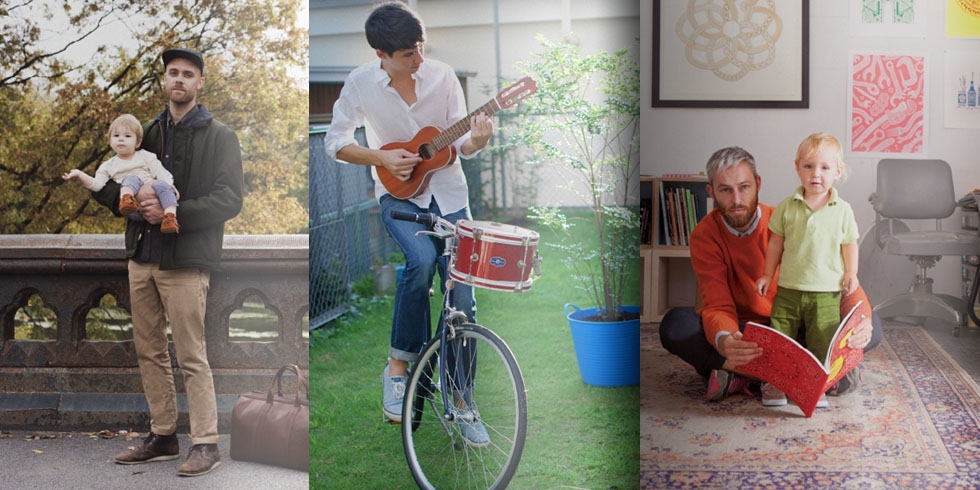
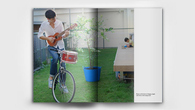
Issue 1 also featured Shawn James Seymour who lives in Japan, but I see your larger point. We are definitely striving to be more diverse geographically and otherwise. As a small print magazine though, this will be a gradual process as we grow. Issue 2 is, a bit surprisingly, looking pretty US-centric with several features on men in L.A. but also NYC, Chicago, the Pacific Northwest. From our subscriber base, Kindling definitely has an international appeal and we definitely want to reflect that in our content. Please stay tuned.
Any major preconceptions about dads you're looking forward to dispelling in future issues?
I don’t know that dispelling preconceptions is how I would describe our approach. We want to tell honest stories about how men build their lives around their children and the transformation that this involves—the challenges and joys. If we are doing this well, hopefully certain attitudes will change in ways we can’t immediately anticipate.