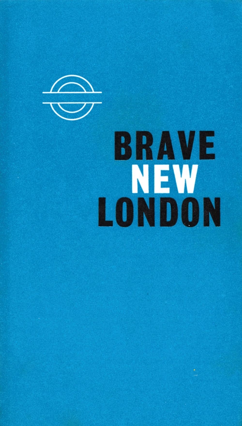
This isn't our first time taking a look at interesting subway posters, or even English railway posters, but a new book of posters and printed matter from the history of London's Tube offers a slightly different perspective than we're used to. The book, A Logo For London, collects Tube imagery from the last 150 years and examines how the circular strike-through logo evolved. Compiled by David Lawrence, the book isn't limited to formally produced posters, but instead includes photographs, pamphlets, and anything else that informed the bar and circle logo. Check out a few images below. [images via DesignTaxi]


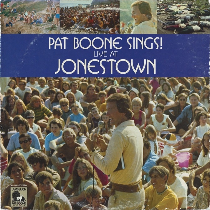
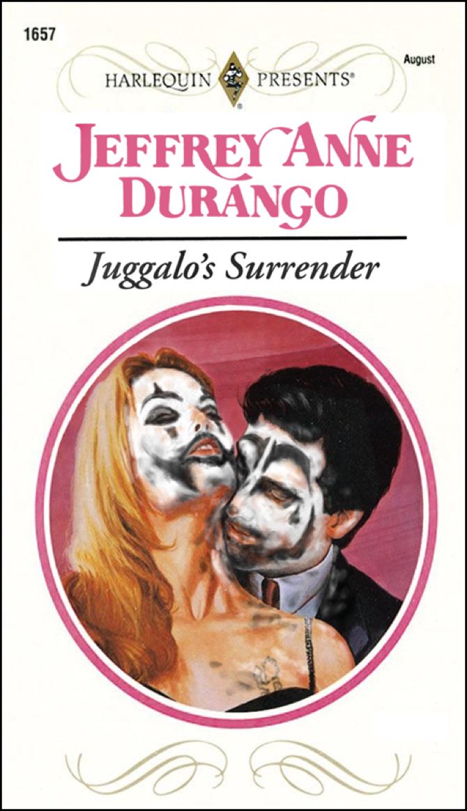
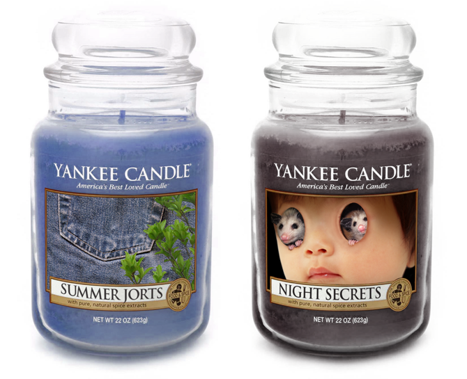
In the world of LiarTownUSA, Pat Boone recorded a live album at Jonestown, Mila Kunis is perpetually “80% upset,” ankle scarves are the latest fashion trend, and raccoons have a Pope (and sometimes they’re called “toilet bears”). Created by Sean Tejaratchi, the graphic designer behind the legendary Crap Hound series of anthologies of scavenged vintage line art, LiarTownUSA is a next-door universe where the banality of late-capitalist existence is amplified to a sinister (and hilarious) extreme, fleshed-out with expertly faked cultural detritus like romance novels (Juggalo’s Surrender by Jeffrey Anne Durango), Netflix listings (Ghost Puncher: Spirits of the Old Plantation), and Yankee Candle scents (“Summer Jorts”). The consistency and uncanniness of Tejaratchi’s vision is matched only by its ability to send creepy, Lovecraftian feelings up and down your nervous system even as you ROFL.

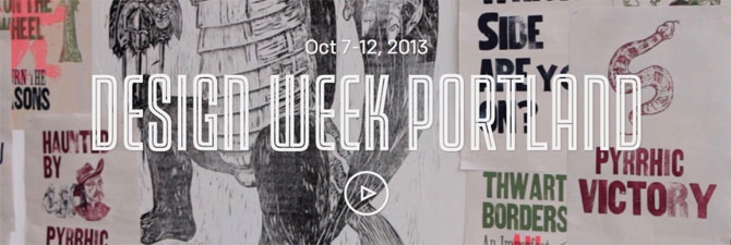
The second annual Design Week Portland, set for October 7-12, does an admirable job of corraling and celebrating the City of Roses's diverse creative community without shoehorning presenters and speakers into preconceived formats. Organizers Eric Hillerns and Tsilli Pines gave wide berth to those heading up individual events, resulting in a mix of presentations, open houses and speakers that give voice to what makes the region so compelling. A letter press fair, Portland design auction, and the opening of the Portland Design Museum all run concurrently with an array of events, including "Blurred Lines," a exhibit of interaction design sponsored by the AIGA, and a speech by Etsy creative director Randy Hunt on design and entrepreneurship.
After talking with some of the organizers, here’s a list of a few of the events we’re excited about. The full list can be found at designweekportland.com.

Home Brewed by Design (October 10 at 6pm, One Grand Gallery)
"Most designers covet these types of projects," said co-organizer Jason Sturgill of his Home Brewed by Design showcase, which pairs 20 artists and 20 brewers to create custom labels for beers that, in some cases, didn't even have a name when they were first conceived. "We wanted to bring together two independent communites, design and brewing, and help connect other communities with Design Week." By the times the event occurs, each team's graphic treatment will grace 200 bottles of home brew, meaning there will be plenty of libations on hand to make connections.

Brandcraft: Building a 21st Century Brand (October 10 at 4pm, Owen & Jones Partners)
The challenges of branding mirror those of web design, as multiple format and continuity become keys to effective communication. Brandcraft, organized by Mark Rawlins and Rusty Grim of Owen Jones & Partners, convenes a panel of creatives to cover how traditional ideas of branding bleed over into everything a company does. "The world has set things up in silos," says Rawlins, "and we should torpedo those silos. Branding is everything you do." Participants include Nike's Global Brand Design Director Jeff Weithman, who talks about how to get smaller and relate to smaller tribes of consumers, and AJ Joseph, Executive Creative Director of Adobe Software, who talks about the emotional versus empirical measurements of how agencies perform.

Domestic, a Showcase of American Design (October 9–13, The Janey)
Curated by interior designer Jasmine Vaughan of design journal Made & State, Domestic pushes American products as a matter of taste, not loyalty, and wants to take a move beyond the "bearded and salvaged wood" to push a more modern aesthetic. Seven designers and stores, such as Beam & Anchor and Fig Studios, will each be given two rooms at the Janey, a boutique apartment complex in the Pearl, and free rein to decorate with American-made goods and clothing. The rooftop will feature craft cocktails and custom furniture by FIELDWORK, and a Saturday afternoon trunk show is being oragnized by Amanda Needham, Portlandia's Emmy-winning costume designer.
Portland Design Week takes places at venues across the city October 10–12; find more info and register for events at designweekportland.com.

This month Vanity Fair released a new serif logo for the magazine's 100th anniversary issue. We reached out to Bas Jacobs from the Underware type foundry for his thoughts.
Jacobs wrote us back:
Although the new logo looks very different from the old one, they are both very classical magazine mastheads. No remarks on the workmanship of the design; that looks very solid, well made. Of course you could question if a magazine like Vanity Fair wouldn't require a different, more progressive, more risky or challenging direction for their covers. My answer would be ‘no’, because such a magazine requires a traditional approach. They can use this new masthead for quite a while in the future.
Wouldn't it be ideal if a magazine like Vanity Fair has such a strong masthead which is traditional, but at the same time one-of-a-kind? Let me explain what I mean. In general you should maybe more question if changing a masthead too often is a good thing by itself. It can be a missed chance of creating a hard-to-avoid publication which becomes part of collective memory. Wouldn't it be better if a magazine keeps their masthead for decades, and let their masthead become their magazine? The masthead equals the publication. However, that requires lots of guts. There are just a few examples of such a lucky situation. Think of the self-willed New Yorker, or maybe even Rolling Stone magazine for example. Their mastheads are not perfect, but obstinate. Newspapers are mostly much more conservative in this aspect, which I believe is a good thing.
Maybe this is more a general observation about publication design instead of a comment on the Vanity Fair redesign, but I believe it’s an essential discussion which needs to be held at every intelligent, self-examining publication.
Visit Underware online.

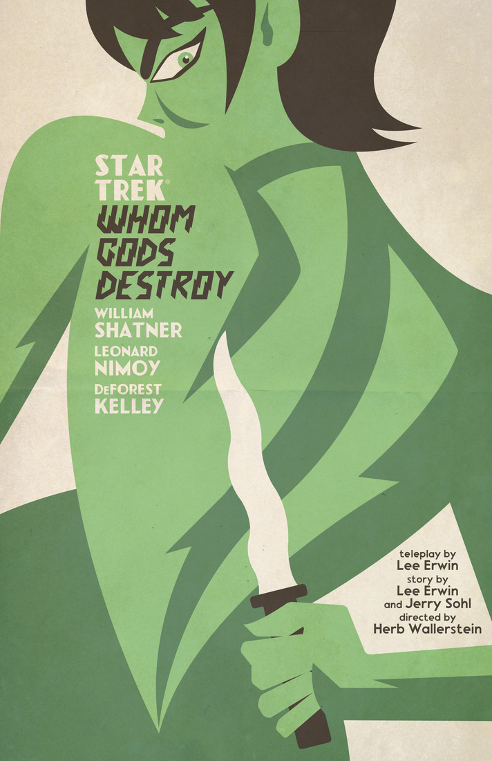
A little known fact about the early days of Star Trek is that the series probably wouldn't have existed without Lucille Ball. After the pilot her Desilu company produced was rejected by NBC, Ball insisted the executives reconsider, and after funding a second pilot, they eventually ordered a full season.
Just about 45 years later, graphic designer Juan Ortiz started a month-long project during which he produced a new poster for a classic Star Trek episode every day, casting each episode in the style of a movie poster or book cover. Like the original series, his posters were eventually picked up by a publisher for a full run of 80.
Star Trek: The Art of Juan Ortiz is out now from Titan Books. Check out a feature with Ortiz over at The Verge, and see a few posters below. 
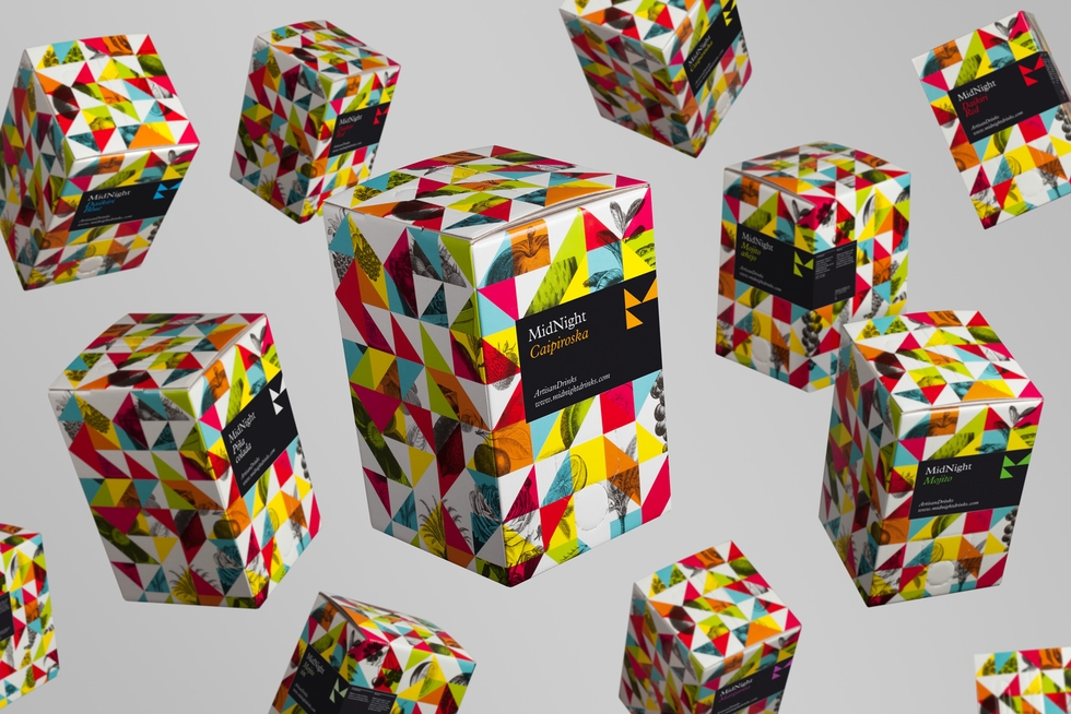
Earlier this year the designers at Mucho had an assignment: Make a small cardboard box fun. While that might seem like an impossible task in most situations, this specific cardboard box had an inherently fun purpose: it was the prototype for a new disposable cocktail shaker concept called MidNight. The firm borrowed the geometry of the two capital letters in the brand's name to design a system of colorful triangles, and added vintage engravings of fruit for texture and contrast.
MidNight Drinks are available in Spain. Keep an eye on this page for an international launch. 

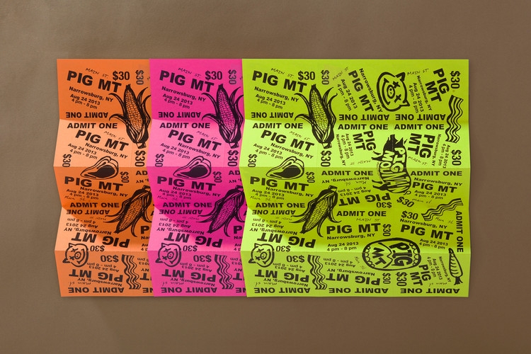
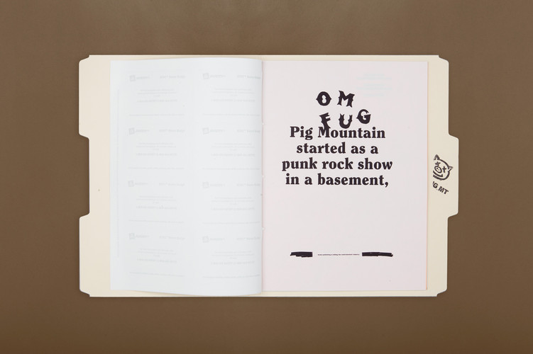
The pig roast (with 14 pigs on spits) is pretty much the equivalent of the DIY punk show for many grown-ups these days. The music might not be as loud, but the mission of the flyer is the same. Convince a bunch of people to travel to a far-off place with a great poster that promises a unique experience. Organizers of Pig Mountain, a culinary festival billed as a Pig Roast & Veggie Fest, worked with the designers at Mother for a series of print posters loosely inspired by a photocopied punk flyer aesthetic. A zine highlights photos of previous roasts and features useful info, maps, and addresses, while the highlighter-colored tickets and three flyers complete the campaign. [via It's Nice That]
Pig Mountain takes place next week in Upstate New York.


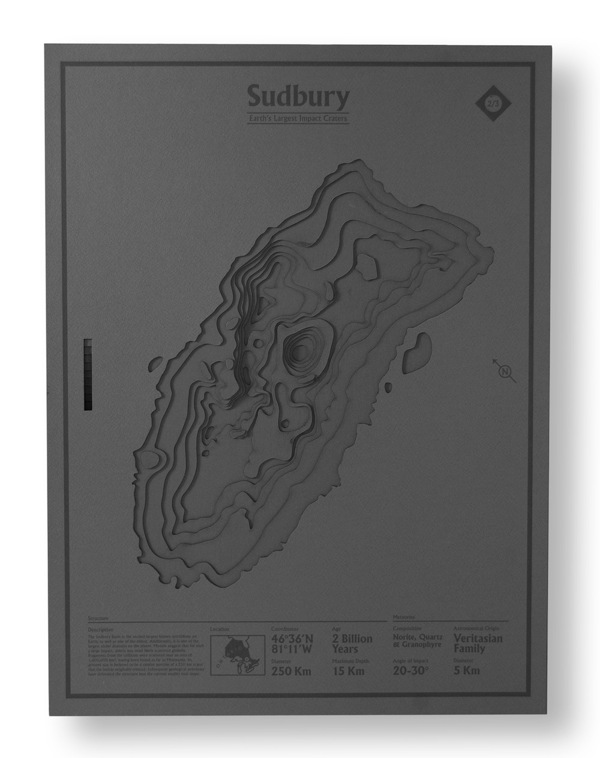
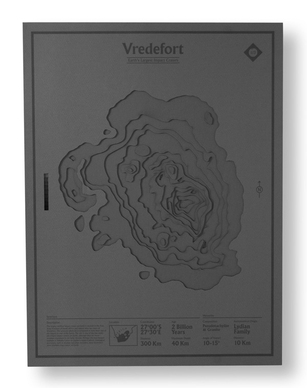
The closest impact crater to designer Nicholas Weltyk's studio at Pratt Institute in Brooklyn is an unconfirmed indent a few hours upstate at a site called Panther Mountain. That crater, however, was too small to make it into Weltyk's die-cut poster series documenting the world's three largest impact craters. To create the images of sites in Mexico, Canada, and South America, Weltyk hand drew about 30 die-cut patterns, which he used to cut and layer museum board for depth. For cartography diehards, each poster has a section of footnotes with topographical and geographical details.
Find more work from Nicholas Weltyk on Behance.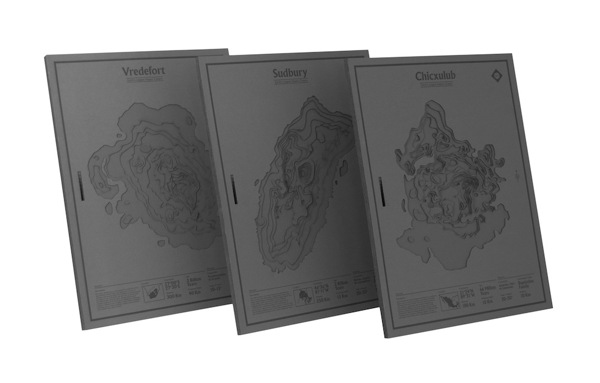


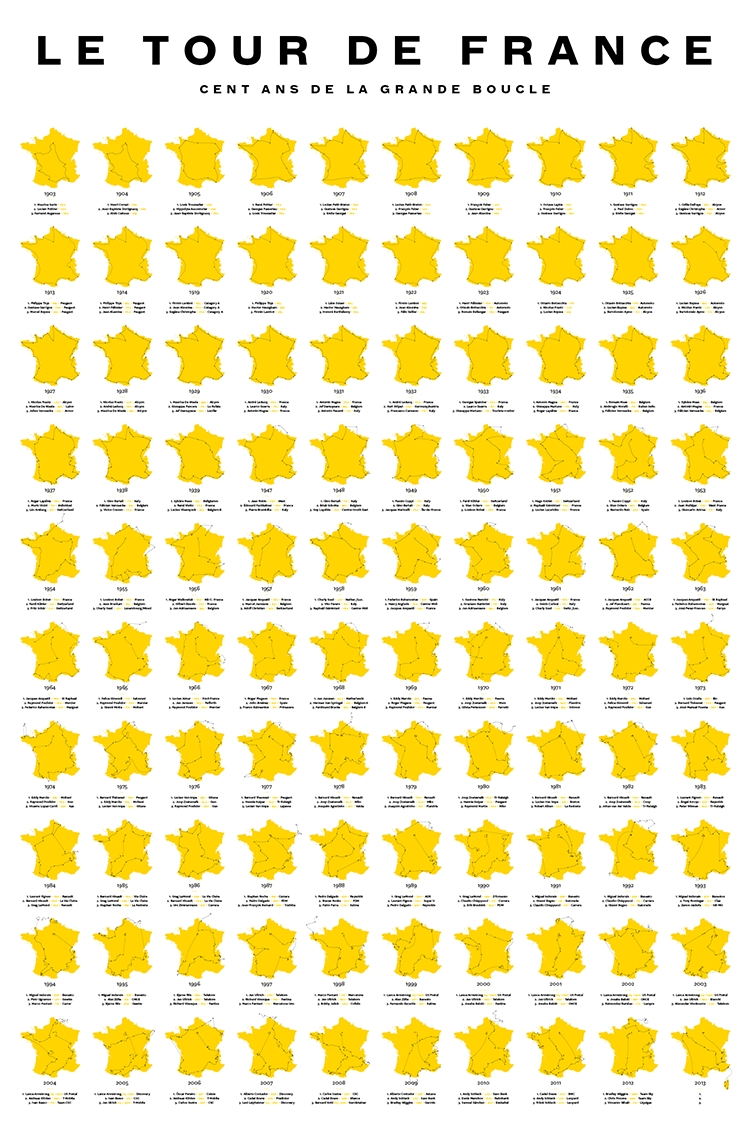
For about 12 years, starting in 1903, the Tour De France route remained unchanged. It formed a nearly perfect outline of France, save for a small indentation in the north west corner. The following 80 or so races featured more dramatic variations, including portions of the route which ranged outside of France altogether. This year's race started in Corsica.
Designer Sam Potts dug through race map archives to design a poster depicting all 100 routes, with a list of the top three riders of each year. While cycling fans might be attracted to the simplicity of just the race's outline in "Races" version, geography buffs will want to opt for the second "Cities" version of the print, which includes the name of every city the tour passes through.
Congratulations Chris Froome, the poster for the 2013 race is avilable for purchase. 


The new poster campaign by Oliver Uberti for 826Michigan, McSweeney's nonprofit tutoring center in Ann Arbor, Michigan, taps into similar rhetoric and imagery to what we've seen from the PSA posters from subway systems in Japan, and staycation posters from wartime England. This time, instead of warning citizens about drinking too much, and not taking vacations, the posters tout the kid-friendly theme of robot revolution and the center's alias as Liberty Street Robot Supply and Repair.

