
Sang Mun is a designer who worked with the NSA in some capacity during his service in the Korean military. Despite his experience with the controversial agency, his ZXX typeface, designed to be illegible to computer text-scanning software, was actually inspired by a slightly less intimidating agency, Google. Specifically, the algorithms used in Google Glass.
The typeface, which has four variations, targets the different methods of optical character recognition Google and other tech companies regularly use. The typeface also has a great name: "ZXX" is a code the Library of Congress uses for books with “No linguistic content."
Read more at Wired, see the typeface in use in our YACHT "Party At The NSA" feature, and download it for free.

This month Vanity Fair released a new serif logo for the magazine's 100th anniversary issue. We reached out to Bas Jacobs from the Underware type foundry for his thoughts.
Jacobs wrote us back:
Although the new logo looks very different from the old one, they are both very classical magazine mastheads. No remarks on the workmanship of the design; that looks very solid, well made. Of course you could question if a magazine like Vanity Fair wouldn't require a different, more progressive, more risky or challenging direction for their covers. My answer would be ‘no’, because such a magazine requires a traditional approach. They can use this new masthead for quite a while in the future.
Wouldn't it be ideal if a magazine like Vanity Fair has such a strong masthead which is traditional, but at the same time one-of-a-kind? Let me explain what I mean. In general you should maybe more question if changing a masthead too often is a good thing by itself. It can be a missed chance of creating a hard-to-avoid publication which becomes part of collective memory. Wouldn't it be better if a magazine keeps their masthead for decades, and let their masthead become their magazine? The masthead equals the publication. However, that requires lots of guts. There are just a few examples of such a lucky situation. Think of the self-willed New Yorker, or maybe even Rolling Stone magazine for example. Their mastheads are not perfect, but obstinate. Newspapers are mostly much more conservative in this aspect, which I believe is a good thing.
Maybe this is more a general observation about publication design instead of a comment on the Vanity Fair redesign, but I believe it’s an essential discussion which needs to be held at every intelligent, self-examining publication.
Visit Underware online.

You know that feeling when you see a great typeface on an old stove or a vintage book, and you can't do much to resist snapping a quick photo? Designer Jonathan Lawrence's Type Hunting Tumblr collects those impulsive images documenting anything from vintage marshmallow cans (?) to gas stations, and just about every foodstuff ever packaged with a great typeface. The majority of the posts feature bygone lettering, but sharp eyes can pick out modern brands that haven't updated in decades. Lawrence lives and works in Atlanta, so there's a good chance most of the artifacts were found in Georgia.

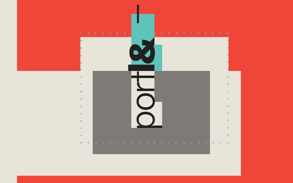
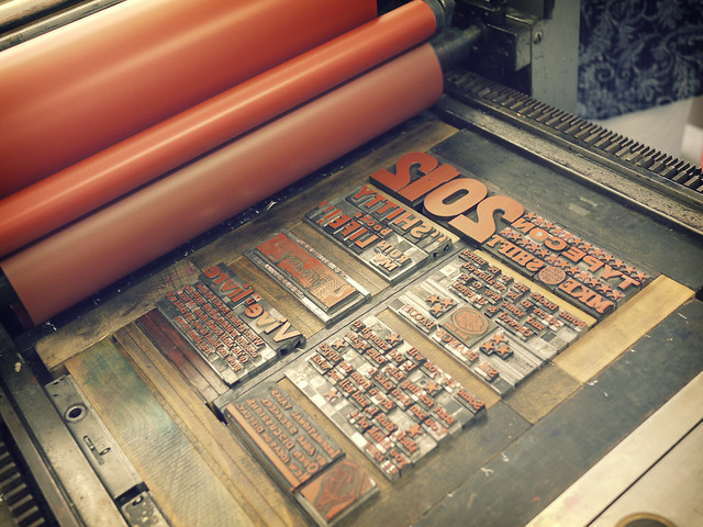
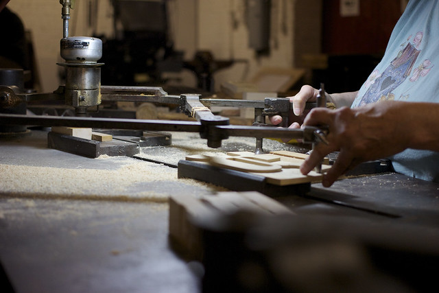
Nearly every year since 1998, the nonprofit group known as the Society of Typographic Aficionados has presented the traveling TypeCon conference. This year's edition in Portland opens on Wednesday with a full lineup of workshops and lectures. TypeCon includes both a full-day course exploring letterpress printing of the Bodoni typeface (now sold out), and sessions to help independent type foundries market their work.
Ahead of the 14th TypeCon, nicknamed "Portl&," we traded emails with organizer Grant Hutchinson about the Emoji workshop, geographic typography, and what makes their type quiz so "infamous."
 There's a workshop on the type of Taiwan, another on type in South Africa. Is there a focus on geographic typography this year?
The focus isn't specific to this year's conference. We always try to include linguistic and cross-cultural topics in the program. For example, at TypeCon2012 in Milwaukee we covered topics such as Cherokee syllabary, South American beer labels, and Mayan writing reform. In 2011, there were presentations on Japanese typography, Turkish type design, and the connections between typography, text, and black identity in America.
Is the lecture on Friday the first time TypeCon will feature the Emoji?
We've had presentations cover the topic of symbol fonts and Emoji before, but this is the first time that the new color Emoji technology has been discussed.
 You're a member of the Society of Typographic Aficionados, which presents TypeCon every year. Can you tell me a little about what kind of work the Society does?
The primary work that we focus on is producing our annual TypeCon conference. We're a small and very grassroots organization, and the conference reflects that. It's important to us that we keep the conference program jam-packed with relevant and wide-reaching variation of topics. We also focus on typographic education through the Type & Design Education Forum held during the conference, as well as our annual Catalyst award targeted at young designers.
Another ongoing project is our Font Aid fundraising efforts. We have organized six Font Aid projects so far, each bringing together hundreds of designers and typographers to create a typeface which is sold to raise needed funds for disaster relief.
 What's one workshop no one should miss?
That's a difficult call. If it was me (and I had the time), I wouldn't miss the two-day, hands-on Brush Roman Majuscules workshop with John Downer & Paul Herrera. Otherwise, this year's special presentation with Alejandro Paul and the keynote by Adrian Shaughnessy should be killer. Of course, I'm biased. This year's entire program is pretty amazing.
What is the "infamous type quiz" all about?
Each year, Allan Haley of Monotype hosts a quick-fire trivia contest featuring some of the toughest typographic questions out there. It's amazing to witness how much geeky type knowledge (and minutia) some of the participants possess. Points are tallied; drinks are poured; prizes are awarded.
TypeCon kicks off Wednesday, August 21 in Portland, OR. All photos are embedded via the TypeCon Flickr Pool.

Princeton Architectural Press' upcoming Shadow Type book is actually the first comprehensive collection of three-dimensional typefaces. The book, which collects images of three-dimensional lettering dating back to the 19th century up until the middle of the 20th century, compiles examples from use in advertisements, business signs, and posters, while providing a history of three-dimensional typefaces from their experimental invention by metal type foundries to their eventual mainstream use. [Images via Princeton Architectural Press]
Shadow Type is available for preorder now.

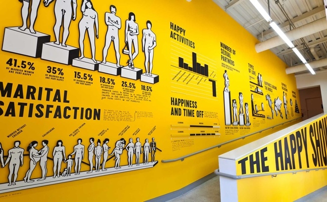
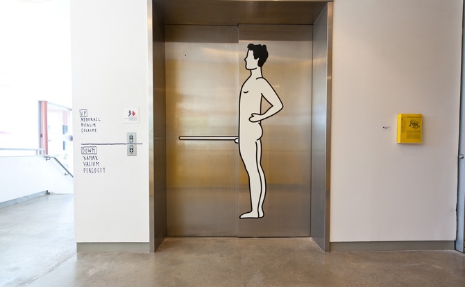
Images of "The Happy Show" at ICA via sagmeisterwalsh.com
Stefan Sagmeister's film may still be in production, but his related exhibit has been getting rave reviews. "The Happy Show" has been making the rounds and July 13 it arrives in Chicago. Visitors will feel as if they're walking into Stefan Sagmeister's mind as the designer attempts to up his happiness via techniques such as mediation, cognitive therapy, and pharmaceuticals. Typographical installations will fill the fourth floor galleries and in-between spaces at the CCC. Sagmeister combines his typographic maxims with social science data from psychologists and anthropologists. A 12-minute segment of the Happy Film will also be viewable.


If you picked up the latest issue of Apartamento, you might have seen the epic 14-page "Looking for Anything" comic, the work of illustrator Andy Rementer. While his style looks great as a piece of longform, Rementer has also done remarkable lettering work, including features for New York Magazine, The New York Times, The New Yorker, and a spot for a sustainable paper called Opus 30, seen at the top of the post.
See more work on pillowcases, posters, and wrapping paper on the artist's site.


Pick up a copy of this poster from the artist.

True to its name, Ten Dollar Fonts offers new fonts every week with licenses that only cost $10. The a la carte pricing is a huge cost-saving alternative for designers who can't afford pricey font packages, and because the site also works as a distributor for tiny type foundries, smaller projects see a much wider release.
Licenses for personal use are $10, while a commercial license is a still-reasonable $20.
Pincambrella
Modula Mono

At the Chicago Design Museum opening party on June 10, as attendees celebrated and congregated around banks of displays, designer Marian Bantjes stood aside, circling a table and slowly ripping up flowers. Delicately tearing petals and leaves to make a floral mosaic that spelled out the word “sorrow,” she was the picture of the concentrating artist.

A renowned Vancouver-based designer who has worked for clients such as Penguin Books and The Guardian, and a member of the Alliance Graphique Internationale (AGI), Bantjes turns fonts and phrases into something kinetic, where tightly wound letterforms spring loose. Her book “I Wonder,” and forthcoming monograph, showcase a career focused on rich ornamentation and constant exploration, from almost heraldic lettering to a piece for Stefan Sagmeister’s “Things I have learned in my life so far” series made with sugar, inspired in part by her fondness for breakfast cereal.

“I keep trying to do new things and follow what interests me, and it can be very hard to drag clients along with me,” she says. “Most people are shockingly unimaginative, and want me to do the same thing I’ve done before. The people who have trusted me to do whatever I want have always been really happy, as far as I know, and I’ve absolutely done my best work for them.”
How did you come to typography?
I didn’t. I just got a job. I was 18, and I needed work, and I saw a little job posted in a bookstore for a publishing company. And I applied for it and got it. It started out mostly filing magazines; quite quickly they trained me in paste-up and layout, and I became a typesetter, and learned a lot about typography. Typesetting is not a creative job, it’s basically following a designer’s directions exactly, but you learn the do’s and don’ts of typography, and you become an expert on how things are done, and some designers know more than others, and you add to that. Of course, they’re not going to handle all the details, like how you balance pages, rivers and things like that. You work really closely with type. You learn all the lingo and the whole thing; so over the period of ten years, I became an expert.
When did you start experimenting?
Not until much later. I became a type snob. The typesetting that I was doing before was just for books. It was very conservative. Once I started my design company, I started doing different kinds of things, business cards and brochures, which require more decisions about what you do with type. That was a new learning curve. But I wasn’t really experimenting. When I went out on my own, I felt like I had a lot of knowledge of type, but it’s not really a passion. I can’t really describe it.

A craft instead of an art?
That’s a close analogy. It was a craft I knew very well. But I had always been very conscious of doing things right. Even as a designer, I didn’t break the rules very much and, if I did so, I did it very carefully. When I went out on my own, I didn’t know what I wanted to do. I didn’t really know. Something happened, and I can’t explain it, but somehow my knowledge in typography, and an interest I have in ornamentation, they just sort of came together in a spontaneous way. And I started working with type in much more adventurous ways, and ways that I never would have dared to before, eventually making my own lettering. I’m not one of these people who goes around taking pictures of signs or identifying type. I’m not as much of a type geek as people might expect.

Is it that type is so proscribed, that it has so many rules, that there are infinite ways to play with it?
Yeah, I think I like the fact that you can push letterforms into so many different shapes. Like graffiti—I’m fascinated with graffiti—I think graffiti is so sophisticated typographically. I love the idea of something that’s recognizable and readable to those who know how to read it, but not everybody else. I like the continuum between the readable and unreadable, the variation there is within that. I just really love that ability to experiment with that and make forms that are interesting but that say something, but are not abstract.
Do you always feel the challenge to do something very ornamental, to top something, or does simple ever work?
That’s an interesting question. I do have a love for modernism, I love it so much, and I do have some ideas for some things that I’ve wanted to do that are very simple. But I have a double mental block about it. On one hand, I feel certain responsibilities to the people who like my work, to continue to do that, and on the other hand, simple seems so easy. I seem to exist on making things difficult for myself. It seems like cheating or something. Which is not to say I don’t respect other people’s work. When I look at those John Massey posters (on display at the Chicago Design Museum), I don’t think it’s easy, I think it’s so beautiful. When it comes to my own work and myself, I need to sweat it out.
Do you ever see yourself doing other types of design, like icon design?
Icon design doesn’t interest me. It has to be clear. It would be very frustrating for me to do that. I’ve done a little bit of illustration and stuff. Early on, I, when I figured out what I was doing, and I put the typography thing together, I was an illustrator, just not the kind that can draw you a cat. And now, I think about segueing into the kind of illustrator that can draw a cat.
A lot of your work has a childlike sense of play, like the macaroni art or the sugar art for Stefan Sagmeister. What informs this sense of wonder? What interests you outside of art and design?
All sorts of things. I’m interested in science. I’m an atheist, so I’m very interested in atheists and the atheist movement, and non-religious forms of gatherings sharing information and creation. I’m interested in animals, and started scuba diving a few years ago. I don’t know if I have a problem-solving mind. Maybe I do. I’m quite good at figuring things out. I can fix my own plumbing.
Why has there been such a resurgence of this handcrafted typography?
It always goes forward and back, clean and simple, always comes back into something else. A lot of people credit me with starting some kind of design revolution. I know I contributed to it, but that pendulum was just starting to swing. People are taking interest, there’s a move away from the computer into handwork.

I know you’re a big fan of The National. Can you tell me about those posters that you did for the band?
They hired me to do the Wiltern show poster, then had me do one for a gig at the Orpheum in Vancouver. The glass one for the Orpheum needed a little bit of negotiation. I convinced them to sell them for more than they intended to sell them for, so we could spend more on construction. The first one was supposed to be a little poster, and I hate little posters, so I made it bigger. Design diva, why the hell not.
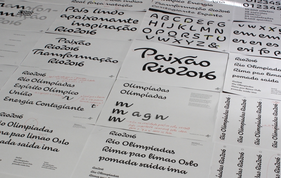
It's been a tough few years for Olympic typefaces. London's 2012 event used this sharp-edged, jagged, and much criticized font and the next Olympics, 2014's games in Sochi, will probably feature this futuristic heavyweight lettering. The good news is that the Rio Olympics may come out ahead of the three, with a conceptual typeface designed by the Rio-based studio Dalton Maag. To make the typeface site-specific, Dalton Maag incorporated lines and features of landmarks in Rio like the "Christ The Redeemer" statue, as well as the surrounding natural features. [via Typedeck]


