
Jeff Jank
You won’t find this key figure in the Stones Throw inner circle on Google Image, but you know his sleeve designs for the one-of-a-kind Los Angeles label. Jeff Jank gives Nothing Major a rare glimpse behind the scenes in underground hip-hop. But, with Jank, many of the mysteries remain intact.
Before Stones Throw Records moved into its current brick-and-mortar Highland Park, Los Angeles location on Figueroa St. in the late ‘90s, it was four guys in a house figuring things out, albeit four guys who had amassed quite the record collection. Many of those LPs belonged to DJ and founder Chris Manak, better known by his stage name Peanut Butter Wolf. Others belonged to Eothen Alapatt, the funk connoisseur who would go on to create the Now-Again Records imprint, specializing in fossilized funk re-issues. And the majority of the LPs belonged to Madlib, the chameleonic producer and beat maker. It is difficult to say how many records the house held in total, but by 2009, when Jeff Jank helped Madlib move studios, he estimated the total weight of the collection at 8,000 lbs.

Quasimoto cover and character illustration by Jeff Jank
The fourth member of the tribe, creative director and designer Jank, had quite a few albums for a non-DJ, but eventually gave up the pursuit of rare vinyl. No need to spend hours hunting or laying down top dollar for wax when your roommates did that for a living, he tells us over drinks at a downtown Los Angeles bar. Our night out was a rare opportunity to converse with Jank, much less see him with a set of human eyeballs. Jank has been part of the inner sanctum of Stones Throw before it was even operational: Jank and PBW played in a band together (Jank says he uses the word "band" loosely).
Jank keeps a low profile, preferring the shroud of mystery that also consistently defines some of Stones Throw's most important artists. You have the producer behind the mask (Doom), the producer with a hundred identities (Madlib), and then you have Jank: a man so steeped in the visual world—crafting personas for others, but lacking a visual identity himself. All three are variations on the same theme.

Artwork for Madlib's monthly Medicine Show series by Jeff Jank
Jank is hardly one to court a visual image for himself. When Nothing Major inquired about sending out a photographer along for the interview, he told us, "I'll have to pass on the photo thing. I take about one picture every three years...I'm about due, but f**k it, I'll have to pass anyway." There is, in fact, one image of Jank floating around on an old Myspace page.
Combing through Jank's personal website gives you a broader stroke of who he is, as you'll find a collection of personal photographs, excerpts from books, and reggae album covers designed by Wilfred Limonious. If you have the patience and the eye, you'll uncover photos of Madlib's studio, or even first takes of album designs that didn't make the cut. The information is there, Jank just makes you dig.
Jank's work for Stones Throw, on the other hand, is well documented in posters, album covers, liner notes, illustrations, and supremely clever one-offs. For the past 14 years, Jank's designs have graced some of the most iconic, groundbreaking projects in the world of underground hip-hop, including Madvillain, The Unseen, the Madlib Medicine Show series, and J Dilla's legendary Donuts. Side note: Jank also designed Mayer Hawthorne's major label album How Do You Do?, in case you were wondering.
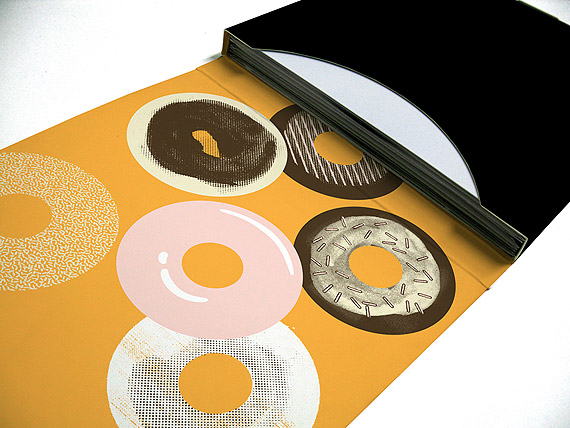
Donuts 45 box set
Jank ranks among a few contemporary designers whose looks have defined an entire label's aesthetic. One designer shaping the aesthetics of a label harkens back to the days of Reid Miles of Blue Note Records, whose stylistic choices defined an entire era of music with boldfaced type and hard, angular lines. Jank has defined his with donuts in revolving shades of pink, a fictionalized stoner with the alter-ego of Quasimoto, and an understated sense of humor.
Over a couple of Scottish ales and the sounds of a reliable classic rock jukebox, Jank opened up about his work, DIY punk-ethics of the Bay Area, and the doubts that arise in his own design. A nice chunk of the conversation was off the record: some J Dilla anecdotes; stabs at what it means to be mythologized; and even the disclosure of Jank’s real name (we asked about it when he flashed his ID to the bartender). What follows is a segment of our conversation.

T-shirt for The Wire magazine by Jeff Jank
Stones Throw is based in Highland Park, but you’re originally from the Bay Area, right?
Jeff Jank: I lived all over the East Bay from Berkeley to all the cities in between and down to San Jose. I consider Berkeley my home for the longest time. I started making music when I was in the South Bay, and that’s when I met Chris [Peanut Butter Wolf] and MC Charizma. I recorded their first record (laughs) because I was the only guy who had a 4-track tape player. I don’t even remember why I had one. I loved the recording process and dubbing though. I was never a real musician, and so this was a way to get around it. Some things like editing I still take from that experience. Over 10 years now I have taken Madlib's beat tapes, which is just one long file, and turned it into individual tracks.
Back in the day, Chris and his brother had recorded some music together, just some spontaneous goofy stuff. Me, Chris, and his brother Johnny, who by this time was 11... we told Johnny we were going to have a real band, like Guns n’ Roses, but we wanted just to hear a little kid singing about smoking crack. (laughs) The band was called Peanut Butter Wolf, which is where he got his name. I would edit all the songs into an album format and we'd have a session. It was some fun shit.
You were playing an instrument?
We'd all just do whatever we wanted. Drums, guitar, maybe we had a couple beats (laughs). That was more interesting than being in a cool band (laughs). I always found it interesting to make something out of editing, which is what I do with artwork. I deal with photographs. I'm not always making things from scratch, putting pieces together.
I grew up in the fanzine era. It was all about vibrant independent artwork and self-publishing, part of the punk rock music scene. I loved Lookout Records, which was my model for what a record label is. Finally after years of working at Stones Throw, now this has replaced that model. But all the successes and pitfalls I first saw were at Lookout. I was into drawing, writing, and editing, and I saw others doing fanzines, and the entire time I was working at the Fremont Library. It's sort of a square and quiet suburb. So I had this normal respectable job and I'd go back to Berkeley and either hang out with a bunch of cartoonists and be productive or hang out with the punk rock guys and drink and break shit (laughs). And this was also, to put it into perspective, this was after I'd been living in San Jose and interested in hip-hop, and seeing Chris and Charizma do their thing, that alternative West Coast hip-hop thing that was developing in the early '90s. In the late '80s you had NWA which blew up, and it was gangsta, and rap became pop, but in places like the Bay, there weren’t a lot of people that related to that—either the L.A. gangsta rap shit, or the East Coast stuff. Even though we loved all of it, people’s own natural scenes were starting to emerge, like the Skratch Piklz in the West Bay.

Rejected Mayer Hawthorne sleeve design from Jank's blog
Where did the name Jank come from?
Jank I used because I did a fanzine thing when I lived in Berkeley. When I did my first project for Stones Throw, I used the name Jank as a nod to [the zine] project. And then I did it again, and I moved to L.A. People who had known a couple of these projects assumed it was my real name because it wasn’t weird enough to be fake. It came about when I said ‘janky’ around someone, and they asked what does that mean? It means shitty, fucked-up, weird. This friend of mine said "Let's do a fanzine called Jank." (laughs)
You keep a low profile too.
I'm just not comfortable with putting my name out there too much.

Artwork for Madlib's monthly Medicine Show series by Jeff Jank
There's not one single picture circulating on the Internet. And I scoured the Google Images pages.
Can't find me. (laughs)
That has to be intentional, no?
Actually there is one. I know exactly where it is, it's deep on [a Low End Theory DJ’s] old Myspace page.
In terms of design, are there things during your time in the Bay that you can specifically recall that changed your design sensibility?
My time in Berkeley with the punk scene there, and seeing people doing their own things because they were purely inspired to do it, was definitely an influence. And that's something I brought to my artwork and attitude to Stones Throw. Don’t try to be a part of the mainstream, lead your own way. Be original. Simple stuff like that. There's a few years in there where I hadn’t seen or talked to Chris which is when he started Stones Throw. I didn’t see him again until ‘98. He had put out a couple records. It was weird going into Amoeba and seeing Charizma records. He was a kid I knew who was shot when he was 21. It was just strange.
Later on I caught up with Chris again, and I said it’s great what you're doing, but you have really bad album covers (laughs). And thus my involvement.

You do most of the liner notes too?
No, not really. I did the fictional stuff for Madlib’s Yesterdays New Quintet. That was real fun. I totally understood what Madlib was doing, creating this false world. It’s the same as drawing a comic book but he was making his own jazz group. It’s a creative thing, not strictly music. Also he was not a real jazz musician. He was trying to recreate it. I tried to naturally complement it. I was doing record covers for unreleased stuff, mimicking the records I knew he was listening to, or adding my own experiments to them.

Did the music guide you in telling the story?
No, the stuff that informed my story were the band members that were made up. It cracked me up that he was making up so many members, and that certain guys would be on this record, and why would you choose to carry this guy over on the other record? First it was five guys, and then it exploded with other groups. The Shades of Blue record suddenly had all these other band members.
So you were given free reign to develop your ideas?
I guess so. It's not like we ever planned or talked about it. Otis was making some music. He never planned he was going to stop making rap for two years and do weird shit. It was four people living in the house at this time.
There's definitely a humor to your writing, even if it’s an undercurrent.
That is something that motivates me, definitely. I'm trying to make myself laugh. Not sure if anyone else is... I don’t like writing where people describe things using a lot of pushy adjectives. I just like the facts.
So you like Hemingway (laughs)?
Yeah. (laughs) But I don’t relate it to that. But if you try to push yourself too hard it seems phony. If your music is worth its own weight... just say what it is, where it's from. No one is going to latch on to the phrase ‘atmospheric cloudy music.’ No one will repeat it. It sounds like bullshit.

In my mind, all that YNQ stuff screams Jeff Jank.
That's interesting because it's also some stuff that is very heavy with references. I was recreating a record collection that already existed. I knew the records he was being inspired by, so I started to do a lot of heavy record references.
Take Uno Esta, which is stupid because there' s no brass on the album. There's a lot of those I really don’t like because I was never trained in design or layout. I figured all this shit out on the job. And then I had the chance to do the Blue Note record, which was a real jazz record on a real jazz label. And I realized that all my life I'd seen a million Blue Note knock-offs. It was the first iconic label that still looks cool today. I’m like, man, I'm doing something for this label. I can do a Blue Note knockoff and not have it be a knockoff... even though I'd go back and change it. I'd get the typeface right (laughs).

Didn't you live next to [artist] Klaus Voormann in Berkeley?
No that’s here near the house I still live in. It's not next to him. I only learned because his house went for sale, and I looked it up. I thought that was cool because I'm a Beatles fan. I like Klaus in particular because he pops up in odd moments in Beatles history and does both the art and music. And then he drew himself into an album cover, Revolver. It was the first he ever did and it’s a groundbreaking album cover.
Do you think there are a lot of people who don't catch references in your work? Do you plant things?
Oh yeah, there are things where I've consciously told my own story, or my own meaning that I bring to something. There’s one record cover in particular. It was straightforward, but I had a particular view of this artist's life, and the stuff he was singing was hypocritical in a way. He was leading a different life from the one he professed to like, and I went out of my way to, not necessarily poke fun at that, but to use imagery that heightened what I thought was the conflict. I also arranged song titles in a way that said something (laughs). It’s something no one would ever see.
What made Revolver so groundbreaking?
If you look at the record covers before and after, that's like the first psychedelic album cover. Maybe not exactly, but that was at a time when art and music began rapidly changing, and the record covers before that were straightforward photos and words. Suddenly you got this wild black and white collage.

Stones Throw cig pack cassette packaging by Jeff Jank
Are there other albums that mark major shifts in the world of music?
I have milestones but not only in the album cover world, because there's so many things involved.
I really love the period of albums where they're the dominant force of music, which starts a little before Revolver, where they were more important than singles, which goes all the way to maybe the time of MTV when videos and CDs come out and displace them. Through those 20 years, you can look at so many album covers and identify the year. That’s what is cool about that period. That's why I’m surprised album covers are still considered important now.
In the digital age, it seems more valued than ever before. In some way, Stones Throw reminds me of McSweeney’s, in the sense that you’re making relics that people want to hold on to. They’re not disposable. There’s attention as well as intention behind the design.
Yeah, it's like some sort of nostalgia, and I hate to say that word, but there's a ton of it in my album cover art. I like that reference to McSweeney's because Stones Throw has a lot of comparison to things that aren’t necessarily record labels. I’ve always thought of Criterion Collection. People are very much into that brand; it has a certain ethic. It’s almost like they’re not a part of the movie business because they're doing their own thing. Same way with Stones Throw. I’ve never really felt a part of the music business. I feel like Stones Throw is its own individual thing, you know?
My friend’s brother is one of the premier reggae DJs in L.A., and it's been fun for me to sift through the 45s, just from a fascination standpoint of font and text and disappearing typefaces. Do you have your own collection? I noticed you post reggae album covers on your website.
I don’t have much of a record collection. I didn’t buy many for the longest time because of living with Madlib and Egon and Wolf, when we all came together, and as a record guy, you can’t keep up with them. I just stopped buying records because, why be the fourth in line? (laughs) I’m totally up on that world of reggae pressings though and why they’re great... not just the design but the physicality of them, how badly they're printed; they’d even re-use the sleeves.
Your scope is really broad; you can do highbrow stuff, stencils, cartoonish drawings..
I try (laughs).
Having that range, have you picked up cues from other designers?
I try to be aware of the context of what they're doing. They were working with different tools then, and also strictly doing vinyl. You’re influenced equally by the stuff you try to recreate, as the stuff that you take a mental note of not to do again. And there’s plenty of that.
I just wonder, am I doing anything that is really going to represent my time? I have no way of planning it out. Looking back now, the Quasimoto stuff looks like it's from '99, 2000. I had no computer skills so it looks like that. I'm not sure if Madvillain represents the time. Our records are not that commercial, so we're not tapping into the look of the moment.
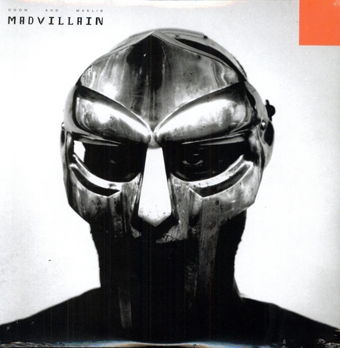
Madvillain artwork by Jeff Jank and Eric Coleman
But Madvillain seems timeless.
Yeah, but that was conscious also. There's so many classic face covers. People like those because they hear a song from an artist, and the artist sings something personal, and the listener wants to think of the artist that way—'he's so deep and loving' (laughs). Faces work well for a cover like that. I was trying to flip this idea on its head. Because here you have this guy who is covering his face. You’re thinking, what the hell is his story? I also think in terms of marketing and think of records as products. I actually like thinking that way. This was great because Doom had never been on the cover, and he's trying to hide from the world behind his mask. I thought it was a 50/50 chance he'd be into it or against it.