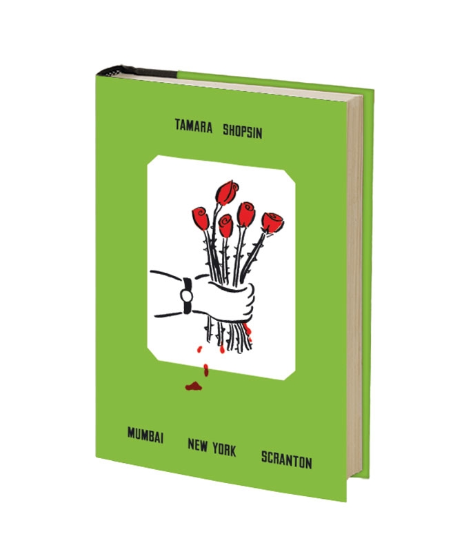
Originally drafted as part of a natural cure for insomnia, Tamara Shopin's new memoir, Mumbai New York Scranton, is part travelogue, part personal essay, and part creative journal. Naturally, Shopsin's day jobs enter the book in a big way. She spent formative time at her family's eponymous (and exclusive) Shopsin's store and restaurant, and received lessons in creative persistence and repetition while working in a printer repair shop. Shopsin keeps the photos in the book in the family as well: she sequenced the images which were shot by her husband Jason Fulford.
Grab a copy of Mumbai New York Scranton in the Nothing Major shop.

Well-known in design circles and on blogs for its folded polypropylene backpack and unusual iPad cover, Solid Gray looks to fill the gap in the mobile boom box market with its speaker-outfitted backpack, dubbed the Basspack. Currently just a working prototype, the collaboration with Case of Bass adds boombastic sound to the geometric backpack design. No word yet on availability or audio specs, but the very idea of it makes designophile music fans giddy, but their neighbors? Perhaps not so much.
Get more info at Solid Gray online.

Although you may not know much about American design duo Gluekit, you’ve likely seen their award-winning work in New York Magazine, GQ, Nylon, and The New York Times. Since 2002 husband/wife team Christopher Sleboda and Kathleen Sleboda have collaborated to make simple two- and three-dimensional designs, airbrush-y retro illustrations, experimental photo collages, typography, and product lines. Then there’s Part of It, Gluekit’s online boutique that works with artists to create cool T-shirts and totes for various charitable causes. Yeah, they’re busy—and clearly in demand.
Add a current exhibition/pop-up in L.A. to the list. "Long Play," which runs through April 13 at the Scion AV Installation gallery, “confronts the evolving role played by various objects. Modernism and the ethos of the youth crew-era pair off with clichès and classical Greek expressions.” Hmm, we’re not sure what that means, but Gluekit’s new limited-edition products and work will be for sale—skateboards, home décor, and bedding.


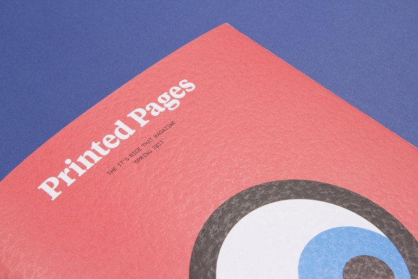
The folks behind It's Nice That have just re-launched their print arm under the apt title of Printed Pages. The first issue, which is out officially today, boasts eight features including a conversation with Hanly Banks about her Bill Callahan documentary Apocalypse, a rare glimpse inside the home of Apartamento founder Omar Sosa, and a discussion with Chris Ware about visual storytelling. The new magazine comes with a very accessible newstand price of only £4.
Head to the Printed Pages site to find a distributor near you, or pick one up from Company of Parrots.
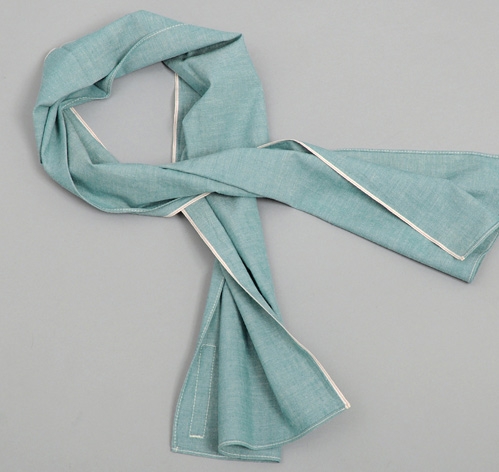
As the Hill-Side tells it, the "asagi-iro" fabric it offers its selvedge chambray scarf, neckties, and pocket squares in this season is a traditional Japanese turquoise with an interesting history. In the mid-1800s, a group of samurai known as the Shinsengumi ("newly special force") wore "asagi-iro"-colored "haori" jackets to stand out from warriors in traditional black, grey, and brown samurai uniforms. At its peak, the police force for the shogunate had 300 members. We're not sure how the turquoise helped in battle but we'd guess it made for a good conversation starter at the izakaya after-hours.
The Hill-Side asagi-iro selvedge chambray small scarf is available for $81.

Dutch upstart label GoodPeople is capturing a few imaginations with its SS13 collection, which, as one can see in the photos below, is clearly inspired by a part-rake, part-gentleman dandy living fancy free on the Italian Riviera. The collection mixes fine Italian knits in summer weights, cotton blazers, four-button pique polos, and tailored stretch chinos and punches them up with blues and purples. Sounds exactly like what we should be sporting when we order that first Negroni of the summer.
Shop GoodPeople online. For pension reservations, you'll have to look elsewhere.


Andrew Huang directed the "Brennisteinn" video for Iceland's Sigur Rós which is currently touring the states ahead of new album Kveikur, due this summer. The video conjures both the mythical Hades, an ancient volcano and builds some kind of narrative around the yellow gas/liquid/rope that breaks up the stark and intense black and white images. We're still mulling it over.
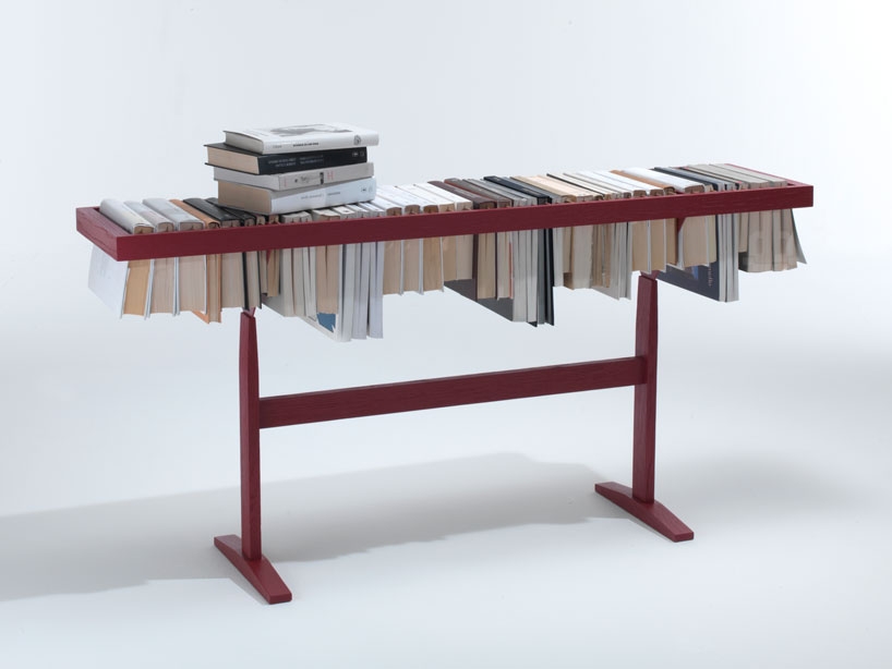
Raw Edges' offering for the upcoming Salone del Mobile puts a functional spin on the bookshelf. Booken switches the posture of book storage to expose spines horizontally, which creates an additional useable surface. Bibliophiles might worry about potential damage to the books, but small apartment dwellers will appreciate the the slim profile and extra storage in a smaller room or wide hallway. [via designboom]


Even in the age of streaming video, the vast majority of the information we consume online is in the form of type. While sophisticated typography may be a given in an era of web fonts, a new exhibition from famed font and imaging firm Monotype showcases the painstaking artistry behind the classic typefaces we see on screens everyday.
"Pencil to Pixel," which runs May 3-9 at New York’s Tribeca Skyline Studio, connects historic, handcrafted fonts and hot metal typesetting to the contemporary type displayed on handheld devices. More than a century of artifacts drawn from the Monotype’s archives in Salfords, UK, will be part of this rare display, including drawings by Eric Gill, creator of Gill Sans, production pieces from Helvetica, original drawings of Times New Roman commissioned for The Times of London, as well as concept art, photos, and metal and film masters. It helps “tell a story about how the design of typefaces is informed, constrained, and even enhanced by technology” according to Monotype type director Dan Rhatigan.
“It’s an opportunity to see the hand of the author,” says James Fooks-Bale, Monotype’s director of marketing, who helped curate the exhibit. “A lot of designers are familiar with the tick-down menu in Adobe and aren’t familiar with the fact that it came from someone’s hand. Consider that in Salfords alone, the original Monotype plant built in 1897, there were once 1,000 people at work designing typefaces. The precision engineering apprenticeships there were considered second only to Rolls Royce.”
Visit penciltopixel.org for information on the exhibit and booking tours. Details on related speeches and events, including “From Logo to Experience,” exploring design and brand identity hosted by Lippincott, a brand strategy and design firm and event co-sponsor, will be released later.


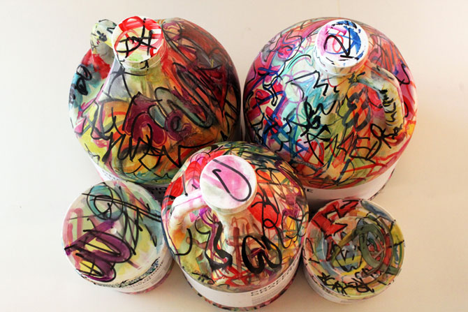
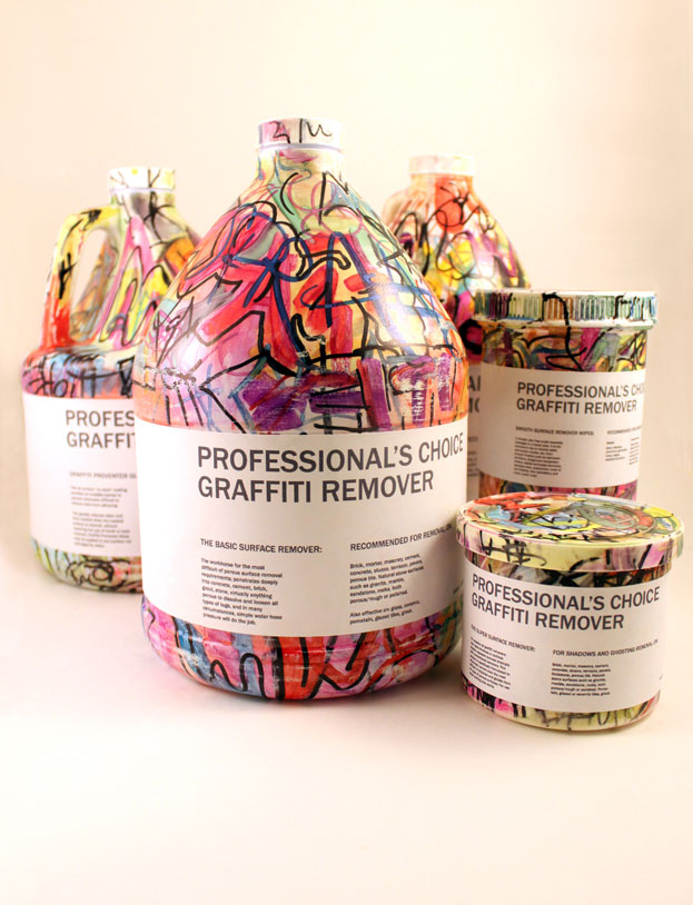
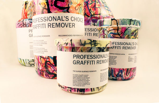
It's not that strange to brand a solution to a problem with an image of that very problem—think of bugs on pest-control spray. Yet we don't often see laundry detergents covered in soiled clothes, or household cleaners with glamour shots of filthy floors. But in the case of this graffiti remover, designed by Casandra Straus, the hectic and colorful aesthetic of a wall covered in graffiti is much more compelling on the shelf than the thick substance inside the bottle. The large solid labels covering the colorful bottle are also reminiscent of the product's purpose.