
At the Chicago Design Museum opening party on June 10, as attendees celebrated and congregated around banks of displays, designer Marian Bantjes stood aside, circling a table and slowly ripping up flowers. Delicately tearing petals and leaves to make a floral mosaic that spelled out the word “sorrow,” she was the picture of the concentrating artist.

A renowned Vancouver-based designer who has worked for clients such as Penguin Books and The Guardian, and a member of the Alliance Graphique Internationale (AGI), Bantjes turns fonts and phrases into something kinetic, where tightly wound letterforms spring loose. Her book “I Wonder,” and forthcoming monograph, showcase a career focused on rich ornamentation and constant exploration, from almost heraldic lettering to a piece for Stefan Sagmeister’s “Things I have learned in my life so far” series made with sugar, inspired in part by her fondness for breakfast cereal.

“I keep trying to do new things and follow what interests me, and it can be very hard to drag clients along with me,” she says. “Most people are shockingly unimaginative, and want me to do the same thing I’ve done before. The people who have trusted me to do whatever I want have always been really happy, as far as I know, and I’ve absolutely done my best work for them.”
How did you come to typography?
I didn’t. I just got a job. I was 18, and I needed work, and I saw a little job posted in a bookstore for a publishing company. And I applied for it and got it. It started out mostly filing magazines; quite quickly they trained me in paste-up and layout, and I became a typesetter, and learned a lot about typography. Typesetting is not a creative job, it’s basically following a designer’s directions exactly, but you learn the do’s and don’ts of typography, and you become an expert on how things are done, and some designers know more than others, and you add to that. Of course, they’re not going to handle all the details, like how you balance pages, rivers and things like that. You work really closely with type. You learn all the lingo and the whole thing; so over the period of ten years, I became an expert.
When did you start experimenting?
Not until much later. I became a type snob. The typesetting that I was doing before was just for books. It was very conservative. Once I started my design company, I started doing different kinds of things, business cards and brochures, which require more decisions about what you do with type. That was a new learning curve. But I wasn’t really experimenting. When I went out on my own, I felt like I had a lot of knowledge of type, but it’s not really a passion. I can’t really describe it.

A craft instead of an art?
That’s a close analogy. It was a craft I knew very well. But I had always been very conscious of doing things right. Even as a designer, I didn’t break the rules very much and, if I did so, I did it very carefully. When I went out on my own, I didn’t know what I wanted to do. I didn’t really know. Something happened, and I can’t explain it, but somehow my knowledge in typography, and an interest I have in ornamentation, they just sort of came together in a spontaneous way. And I started working with type in much more adventurous ways, and ways that I never would have dared to before, eventually making my own lettering. I’m not one of these people who goes around taking pictures of signs or identifying type. I’m not as much of a type geek as people might expect.

Is it that type is so proscribed, that it has so many rules, that there are infinite ways to play with it?
Yeah, I think I like the fact that you can push letterforms into so many different shapes. Like graffiti—I’m fascinated with graffiti—I think graffiti is so sophisticated typographically. I love the idea of something that’s recognizable and readable to those who know how to read it, but not everybody else. I like the continuum between the readable and unreadable, the variation there is within that. I just really love that ability to experiment with that and make forms that are interesting but that say something, but are not abstract.
Do you always feel the challenge to do something very ornamental, to top something, or does simple ever work?
That’s an interesting question. I do have a love for modernism, I love it so much, and I do have some ideas for some things that I’ve wanted to do that are very simple. But I have a double mental block about it. On one hand, I feel certain responsibilities to the people who like my work, to continue to do that, and on the other hand, simple seems so easy. I seem to exist on making things difficult for myself. It seems like cheating or something. Which is not to say I don’t respect other people’s work. When I look at those John Massey posters (on display at the Chicago Design Museum), I don’t think it’s easy, I think it’s so beautiful. When it comes to my own work and myself, I need to sweat it out.
Do you ever see yourself doing other types of design, like icon design?
Icon design doesn’t interest me. It has to be clear. It would be very frustrating for me to do that. I’ve done a little bit of illustration and stuff. Early on, I, when I figured out what I was doing, and I put the typography thing together, I was an illustrator, just not the kind that can draw you a cat. And now, I think about segueing into the kind of illustrator that can draw a cat.
A lot of your work has a childlike sense of play, like the macaroni art or the sugar art for Stefan Sagmeister. What informs this sense of wonder? What interests you outside of art and design?
All sorts of things. I’m interested in science. I’m an atheist, so I’m very interested in atheists and the atheist movement, and non-religious forms of gatherings sharing information and creation. I’m interested in animals, and started scuba diving a few years ago. I don’t know if I have a problem-solving mind. Maybe I do. I’m quite good at figuring things out. I can fix my own plumbing.
Why has there been such a resurgence of this handcrafted typography?
It always goes forward and back, clean and simple, always comes back into something else. A lot of people credit me with starting some kind of design revolution. I know I contributed to it, but that pendulum was just starting to swing. People are taking interest, there’s a move away from the computer into handwork.

I know you’re a big fan of The National. Can you tell me about those posters that you did for the band?
They hired me to do the Wiltern show poster, then had me do one for a gig at the Orpheum in Vancouver. The glass one for the Orpheum needed a little bit of negotiation. I convinced them to sell them for more than they intended to sell them for, so we could spend more on construction. The first one was supposed to be a little poster, and I hate little posters, so I made it bigger. Design diva, why the hell not.

Moving downtown from last year’s inaugural exhibition inside a Humboldt Park warehouse, the Chicago Design Museum, a month-long pop-up exhibition opening June 1, won't lose any of its curatorial edge this year.
For 2013, ChiDM’s sharp yet eclectic lineup unites different disciplines of art and design under the theme of "play," and seeks to "speak to an underlying discussion in the design community about whether design is art, designers are artists, and if either a pursuit to create work that was personal (content self-generated) or commercial (content from/for a client) could be deemed a nobler pursuit than the other," according to design director Jim Thomas.
(Images below are meant to showcase the work of some of the featured artists; they may not be included or displayed at the museum)

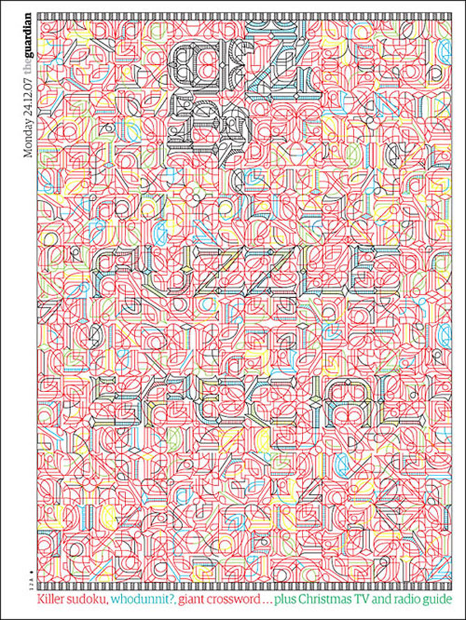
"Hemlock," Marian Bantjes
Featured designers for this year's exhibit include: Vancouver-based Marian Bantjes, a graphic artist whose kinetic typesetting led Stefan Sagmeister to call her “one of the most innovative typographers working today”; local ad-world icon John Massey, who worked at Container Corporation of America and the Center for Advanced Research in Design (CARD) and made these amazing Chicago posters; New Wave Swiss typographer and graphic designer Wolfgang Weingart; and Michael C. Place, founder of Build and a former member of Designer’s Republic, the seminal Sheffield studio responsible for many famous record designs for labels like Warp.

John Massey, Flag
“The board members of ChiDM talked a lot about designers who experimented with creating new ways to present visual information,” says Thomas, “whether it be through simplifying elements to include only those that communicate the intended message, like John Massey, or pushing the limits of new technology (or old technology used in new ways), like Wolfgang Weingart. We also have two designers in the exhibition, Marian Bantjes and Michael C. Place, who quit established practices to create work that was more personal to them, both in content and context. These second two are still very much in the prime of their design practice and we are excited to watch where their experimentation will lead them, and the design community, in the years to come.“
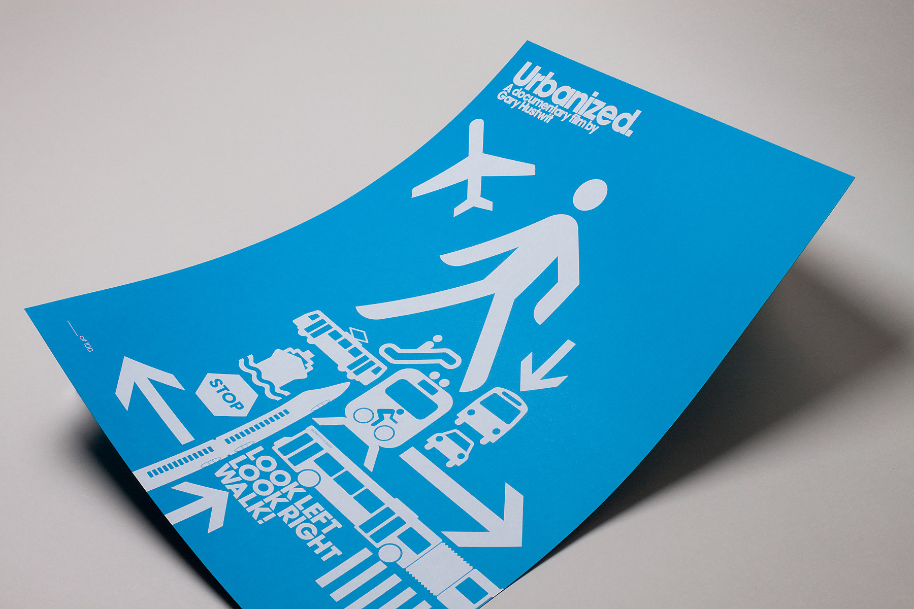
Urbanized poster by Build
The museum, which opens at Block 37 in Chicago's loop, will also showcase its own curated exhibition of new work, Re/view, based around the theme of optical illusions.
“Pieces in Re/view play with the idea of illusions as something that takes more than one look and multiple vantage points,” says Reina Takahashi, special exhibits curator. “Artists pushed this in a number of different ways—pieces that make you step back, look closely, stand on a specific point in the room, or even turn the viewer into the subject of an illusion. Interpretations of the theme varied from those that took a historical look back at the traditional optical illusion, to those that incorporated their own personal narrative.”
The Chicago Design Museum will be open June 1–30, and host a variety of special events. On June 6, 6-8pm, Pop-up Art Loop will host a First Thursday's Gallery Walk. Marian Bantjes will give a design talk on June 8 from 2-4pm. The museum’s kick-off reception will be held in the ChiDM space June 10 at 7pm. Adobe will host a Create Now event, showcasing new developments with the Adobe Creative Cloud on June 18. Visit ChiDM online for more information.