:
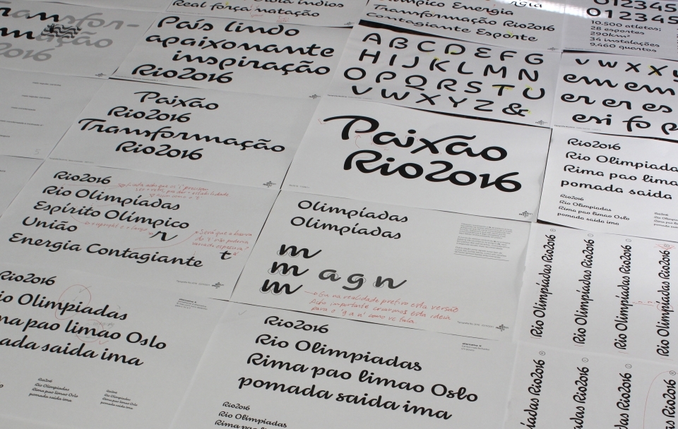
It's been a tough few years for Olympic typefaces. London's 2012 event used this sharp-edged, jagged, and much criticized font and the next Olympics, 2014's games in Sochi, will probably feature this futuristic heavyweight lettering. The good news is that the Rio Olympics may come out ahead of the three, with a conceptual typeface designed by the Rio-based studio Dalton Maag. To make the typeface site-specific, Dalton Maag incorporated lines and features of landmarks in Rio like the "Christ The Redeemer" statue, as well as the surrounding natural features. [via Typedeck]


