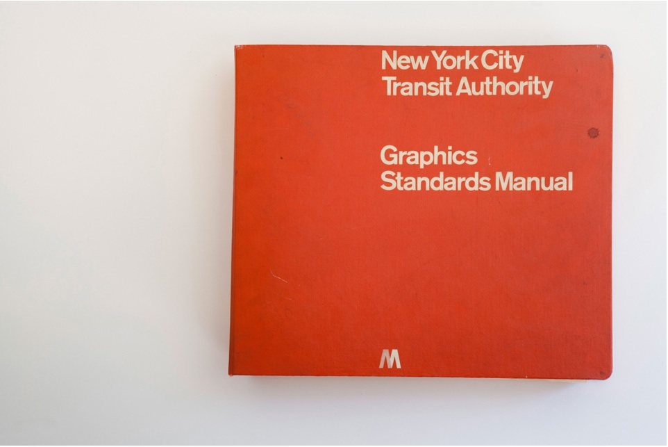
Oddly enough, it was a Chicago-based firm which issued the official Graphics Standards Manual for the New York City Subway system in 1970. The visual identity presented by Massimo Vignelli of Unimark International is in many minds the most iconic visual identity for a transit system in the world. Thanks to the efforts of Niko Skourtis, Jesse Reed, and Hamish Smyth the manual is now available to explore in digital form.
The manual itself is small in stature, but exhaustive. It contains the elements you'd expect: the ubiquitous circular letters and numbers and nine chosen colors, but it also contains a few entries explaining Vignelli's beliefs about civic design. The best example is probably his "information tree," meant to simulate a rider's experience using the signage system. At the very top, Vignelli includes the surprisingly strict design guideline, "The subway rider should only be given information at the point of decision. Never before. Never after."
Learn more about Vignelli's vision at StandardsManual.com