You might associate Shades of Grey by Micah Cohen with the neutral basics that got you through the week in past seasons (grey SGMC oxford, grey SGMC cardigan, etc.), but this summer's collection heads in a very different direction. Cohen says his collection is streetwear-influenced—"a combination of bold prints and loud, bright colors." The collection's vibrancy comes from animal prints and strong athletic influence seen in gym shorts, tanks and varsity jackets. There are still enough polished classics in there to balance things out, but the overall message seems to be that its okay for us to run a bit wild when the weather calls for it.
The collection is available at Saks Fifth Avenue, Bloomingdale’s and shadesofgreyclothing.com.


Last week we picked Richard Mosse's photo series "The Enclave" as one of the highlights for this year's Venice Biennale. The project, which is on view in the Irish Pavilion at the Biennale, depicts Mosse's time shooting the military conflict in the Democratic Republic of Congo in artificial but arresting pink shades. Frieze has an interview with the photographer about the special film he used, Kodak Aerochrome, which was originally developed to detect camouflage during World War II, and the origins of his trip to photograph "the unphotographable."
Tatsuo Horiuchi didn't always use Microsoft Excel to make his artwork. He first gave Microsoft's Word and Paint programs a try, but oddly enough, he found Excel's spreadsheets to be the most flexible. The 73-year-old artist first used the software a decade ago after observing co-workers using the program to draw graphs, and stuck with it partially because of the high cost of programs meant for graphics.
Curious about your own Excel aesthetics? Download one of his works and give it a shot here. 

Brooklyn design studio CHIPS designed the lyric book for the new Eleanor Friedberger album Personal Record (reviewed in Pitchfork today). And it being Friedberger and a collaboration with the wordy and wise John Wesley Harding, the lyrics are of no small importance. Thusly CHIPS made the lyric book a wall calendar in which each month features the lyrics for a different song in varying typeface and color. That should make singing along in the shower just a little bit easier.
You can buy the calendar with the vinyl of Personal Record, or by itself, via eleanorfriedberger.com


Photos by Clayton Hauck
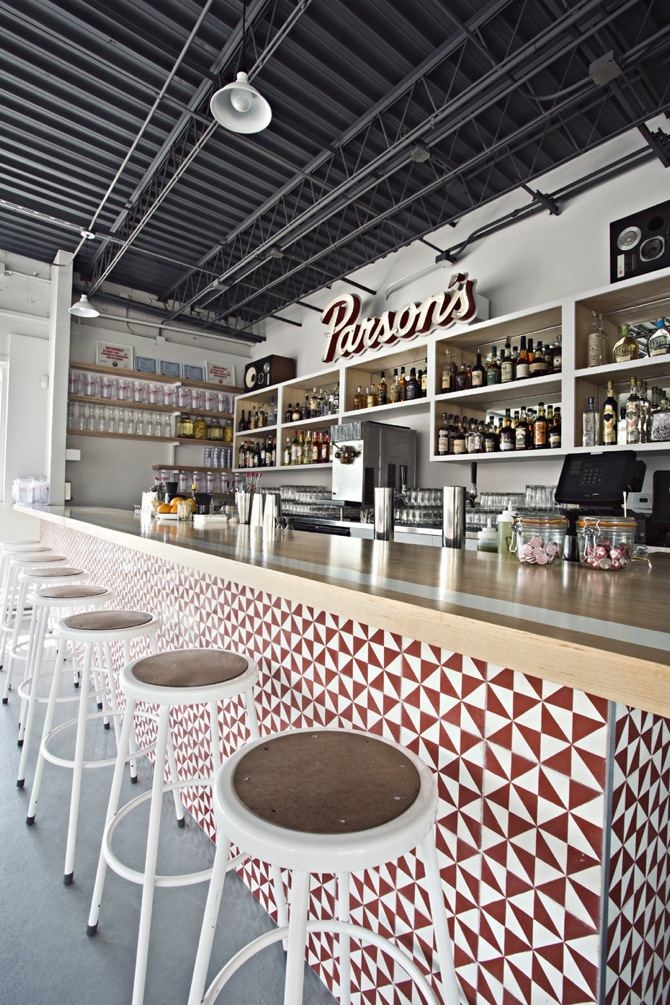
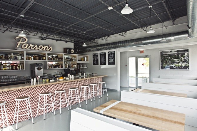
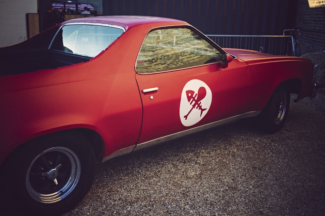
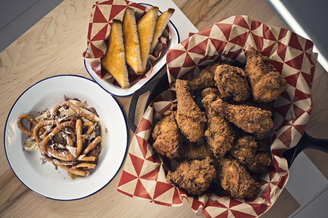
Parson's Chicken & Fish is the latest cool joint from the folks at Land & Sea Dept. It began turning out splendiforous fried food and Negroni slushies (designed by bartender Charles Schott) just a few weeks ago and is already shaping up to be a summer favorite. The Land & Sea team has taken design fundamentals seriously in the space. The visual identity and graphic design are by Cody Hudson's Struggle Inc.—and the Parson's logo was hand-drawn by Hawaiian artist Matthew Tapia. Parson's features a small dine-in area and a spacious back patio—complete with a permanantly installed red 1977 El Camino which local designer Ryan Duggan has tricked out with design elements. Inside, the look is a mix between industrial with exposed ducts, factory-style lighting, and retro lunch counter with handcrafted booths, neon-style sign, and a red and white chevron pattern in tile. The handmade cement tiles were sourced from Los Angeles-based Granada. The patterned laminate bathroom door stalls were a collaborative effort between Land & Sea Dept., Mode, and Parson’s partner Jon Martin, and artists and designers Stephen Eichhorn and Jessica Paulson. Outside, the graphic-emblazoned picnic tables are the draw with a light cedar finish and a converted shipping container serves as outdoor bar. Sprout Home teamed up with Land & Sea to outfit the space with landscape elements and its own herb garden.
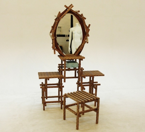
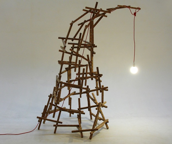
David Graas's "Everything but the Manual" furniture system consists of 177 identical oak blocks, shipped in a cube. The idea is that the user builds whatever piece of furniture they need by joining the blocks with a single bolt and wing-nut connection. Because the bolt doesn't damage the wood pieces, the structures can be disassembled and reassembled as furniture needs or tastes change. [via Intralld]

Bryan Ray Turcotte, founder of Kill Your Idols which published the authoritative volume on punk flyers, Fucked Up + Photocopied, has collaborated with Los Angeles MOCA for a new web series called "The Art of Punk." The episodes feature interviews with Raymond Pettibon, who created the bars logo and album cover art for his brother Greg Ginn's band Black Flag, as well as punk luminaries Flea, Henry Rollins, Jello Biafra, Keith Morris, and more.
The three-part series begins with Black Flag on June 11, but in the meantime check out the trailer below to see Flea on the toilet talking about art and action coming together, as well as details about the L.A. premiere at MOCA this Thursday, June 6.

While the Red Bull Music Academy has just wrapped up its month-long string of shows in New York, its publication of record, The Daily Note, is finishing its season strong with a feature decoding a whopping 22 iconic music logos—most, if not all, originating in NYC. The list leans heavy into hip hop, with stories behind the the Run DMC double bars logo, Wu Tang's bat wings, and the gold brick of relative newcomers Fool's Gold. The feature also reopens the debate about who sketched the original DFA lightning bolt, which James Murphy claims as his.
Read the full list over at the Red Bull Music Academy. Or screen their DFA documentary.
Images courtesy Suzanne Tarasieve Paris
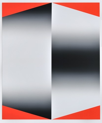
Swiss artist Pierre Schwerzmann creates bold canvases that seem to contain a kinetic energy. Blocks of color sit next to black and white spaces that appear to throb and move. Some even seem set to hypnotize us—but the experience is too heady to label a trompe l'oeil.


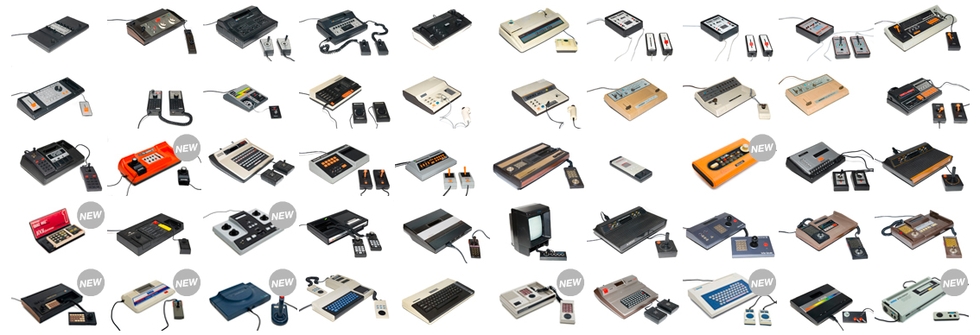
Consollection is the result of a lifetime of gaming and an impulse to collect. The collection of about 200 consoles belongs to a gamer named Phil (no last name provided) who created an online archive for every console he's ever owned, complete with a profile page of each system, with his close friend Patrick Molnar. Although the collection is meticulously organized, it's far from sterile. The profiles place each system in the context of a bigger video game history, and there are some subtle physical remnants of a life of gaming, like the well-worn original Game Boy. The massive collection ranges from the obscure, (#121, "Loopy" is a Japan-only console from 1995 with a built-in thermal printer to print screenshots), to the common (#120 is Nintendo's critically mocked formal experiment Virtual Boy). Just as any true obsessive collector would have, each original box is included.
#42 Philips G7000 (1978)
#55 Vectrex (1982)


