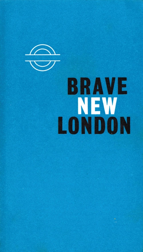
This isn't our first time taking a look at interesting subway posters, or even English railway posters, but a new book of posters and printed matter from the history of London's Tube offers a slightly different perspective than we're used to. The book, A Logo For London, collects Tube imagery from the last 150 years and examines how the circular strike-through logo evolved. Compiled by David Lawrence, the book isn't limited to formally produced posters, but instead includes photographs, pamphlets, and anything else that informed the bar and circle logo. Check out a few images below. [images via DesignTaxi]


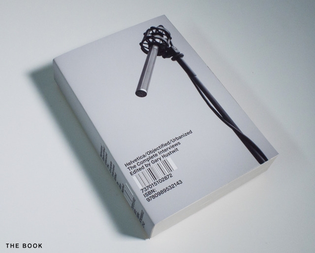
For his design trilogy, Helvetica, Objectified, and Urbanized, Gary Hustwit and his crew shot nearly 100 hours of interview footage. After editing, only about 3% of that footage made it into the final cut of the films. In order to make use of the other 97 hours of conversation, which were cut for time and narrative and not quality, Hustwit has collected transcriptions of the interviews in a new book called, Helvetica, Objectified, Urbanized: The Complete Interviews.
He's seeking funding on Kickstarter for publishing, and in addition to the Build-designed book, rewards include an hour-long highlight reel of the best unused interviews, an iPad version of the book, and bundles with custom Field Notes journals and DVDs of the three films.
Back Helvetica, Objectified, Urbanized: The Complete Interviews on Kickstarter.


Perdiz is a new bilingual design magazine from Spain that's billed as "a magazine about people and the things that make them happy" and mixes a collection of profiles, narrative features, and advice lists that in one way or another explore the idea of personal happiness. In between issues, the editors maintain a blog with supplemental contributor interviews, short lists, and meditations on art that didn't make it into print.
Issue #2 of Perdiz is out now.
Look for an excerpt from Perdiz in Nothing Major Features later this week.


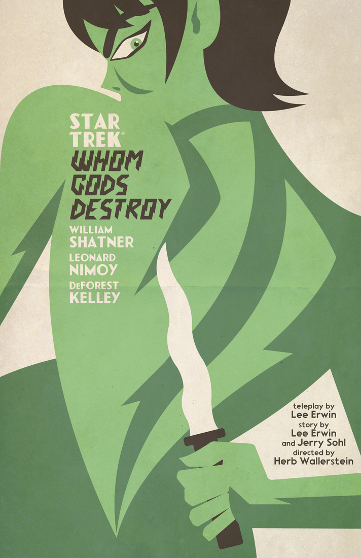
A little known fact about the early days of Star Trek is that the series probably wouldn't have existed without Lucille Ball. After the pilot her Desilu company produced was rejected by NBC, Ball insisted the executives reconsider, and after funding a second pilot, they eventually ordered a full season.
Just about 45 years later, graphic designer Juan Ortiz started a month-long project during which he produced a new poster for a classic Star Trek episode every day, casting each episode in the style of a movie poster or book cover. Like the original series, his posters were eventually picked up by a publisher for a full run of 80.
Star Trek: The Art of Juan Ortiz is out now from Titan Books. Check out a feature with Ortiz over at The Verge, and see a few posters below. 

Earlier this month, the English artist's book publisher Visual Editions got a strange message from its printer. One of its more ambitious upcoming titles, a book containing 16 individual maps with extensive hand folding work required, faced production delays of nearly a month. What's worse, since receiving the news, Visual Editions discovered that a slightly larger British operation, the boy band One Direction, had plans for a book with the same title. To prevent a much different book getting lost in a sea of SEO doom, it tweaked the title to Where You Are.
Outside of the unpredictable title change, these delays are nothing shocking for a publisher of visual writing. In recent months they've published Tree of Codes from Jonathan Safran Foer with intricate die-cut pages, reissued The Life and Opinions of Tristram Shandy, Gentleman with an entirely new visual layout designed by A Practice for Everyday Life, and coded an accompanying iPad app for another visual retelling of Composition 1, a 1960 work from Marc Saporta, whose physical book takes the form of a case of printed cards.
If you're still foggy on the meaning of visual writing, Visual Editions' own definition is a good starting place: "…visuals aren’t gimmicky, purely decorative or extraneous, but are key to the story they are telling. And without them, that story would be something altogether different."
Upcoming titles from Visual Editions include a visual retelling of Don Quixote and work from Tao Lin, Sheila Heti, and Adam Thirlwell.

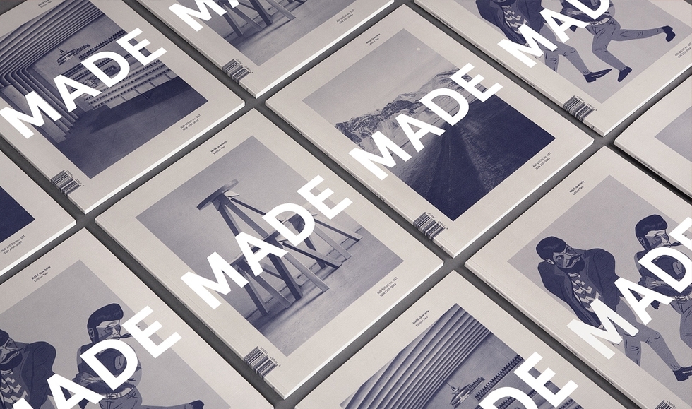
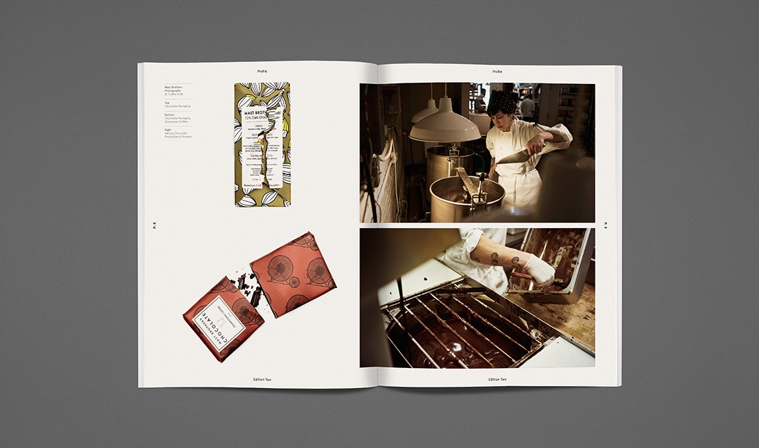
What do Brooklyn chocolate makers, Dutch car designers, and a food grade cosmetics company in San Francisco have in common? They all deal in the medium of made goods. MADE Quarterly, a new magazine from the Australian press Published by Process profiles makers and small scale manufacturers from the United States, Europe, and Australia in glossy quarterly editions. The new issue, just the second yet, features interviews with the folks behind Best Made Co., Earth Tu Face cosmetics, the watchmakers at Uniform Wares, and Mast Brothers chocolate in Brooklyn.
Order a copy of the latest issue directly from Published by Process.


Princeton Architectural Press' upcoming Shadow Type book is actually the first comprehensive collection of three-dimensional typefaces. The book, which collects images of three-dimensional lettering dating back to the 19th century up until the middle of the 20th century, compiles examples from use in advertisements, business signs, and posters, while providing a history of three-dimensional typefaces from their experimental invention by metal type foundries to their eventual mainstream use. [Images via Princeton Architectural Press]
Shadow Type is available for preorder now.


The second issue of Works that Work, a publication that dissects the impact of design advances, has an impressive list of practical design topics. In the space of a single book the editors manage to cover handmade soccer balls all over the world, the rise of the Boeing 747, globalization in the context of the shipping container, and a study of sometimes poorly concealed cell phone towers.
Issue 2 is available digitally and in print directly from Works that Work.


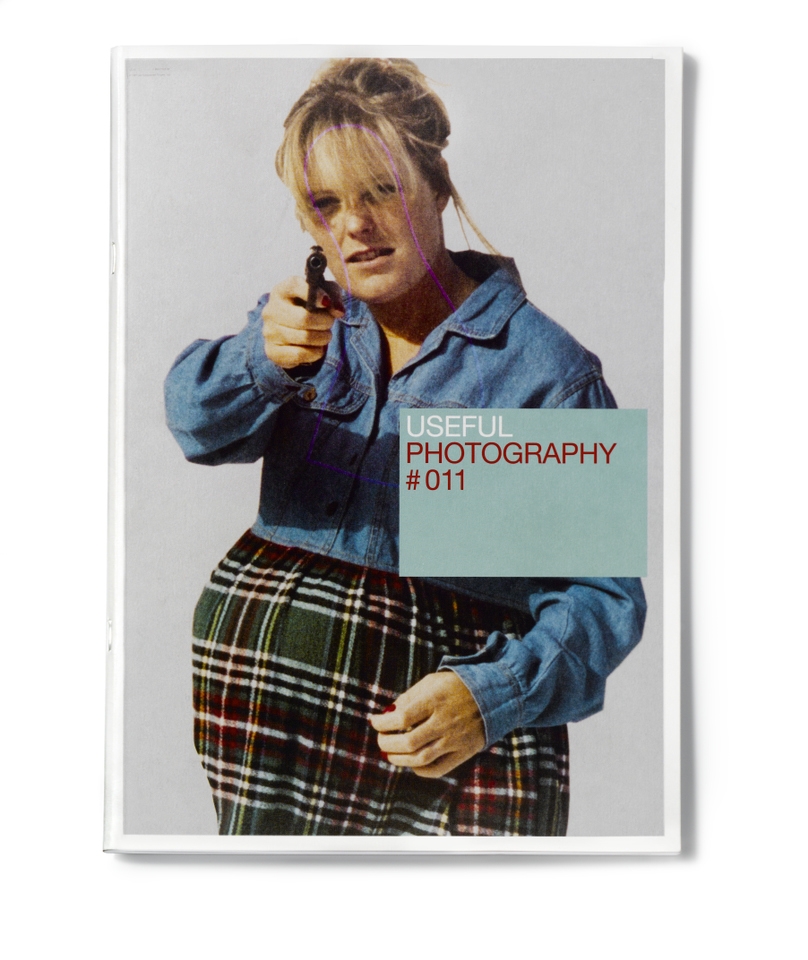
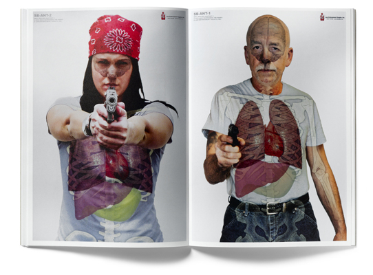
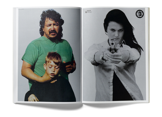
Useful Photography has a shared mission for both its books and gallery shows: to recontextualize "underwhelming images created for practical purposes" as compelling imagery. In the past, the series has examined found imagery created for the pornography, weddings, and war industries.
For the eleventh issue, the editors collected images used for human targets during shooting exercises at gun ranges. The unsettling portraits, including child abductors and a variety of armed aggressors, represent what gun manufacturers think Americans find the most frightening.
Issue 11 of Useful Photography is forthcoming from Kessels Kramer Publishing.

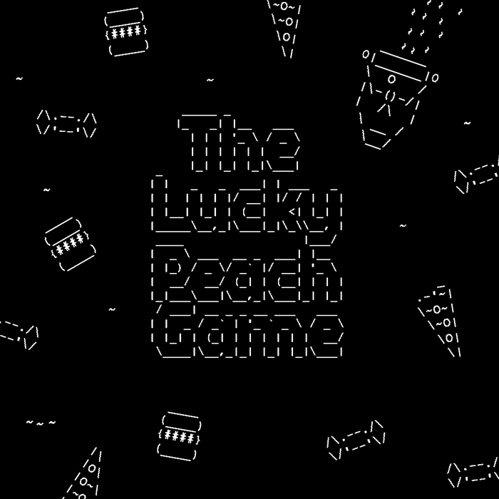
Lucky Peach, McSweeney's food magazine, which features the New York Times's Peter Meehan and Momofuku's David Chang on its masthead, has just released a new web game to promote their latest issue. The dead simple game, in which you must pilot an ASCII art rowboat toward different food choices, keeps score by increasing or decreasing the rower's weight. The issue, which is out now, features travel tips from Aziz Ansari and the story of a trip to the most beautiful Taco Bell from Jason Polan.
Play the game, and order the The Travel Issue of Lucky Peach from McSweeney's. 
