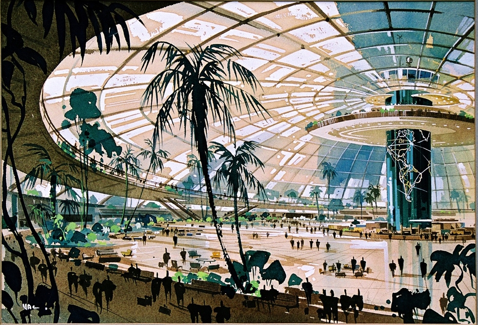
Believe it or not, that amazing glass dome at the top of this post was one of the original plans for LAX. The image is part of a new exhibition at the Architecture and Design Museum in Los Angeles that offers a hypothetical version of L.A. by collecting a series of scrapped civic projects. The collection includes plans and renderings for everything from transportation systems to parks and building projects, which never made it past the planning phase.
According to the curators, the plans, each presented with the narrative of their creation and reason for eventual demise, would have created a much denser city with clearly defined urban centers instead of the sprawling neighborhoods of present day L.A. The museum also created an iPhone app to guide users to sites of the ill-fated projects.
"Never Built: Los Angles" is open until October 13.  Frank Lloyd Wright's Huntington Hartford Sports Club
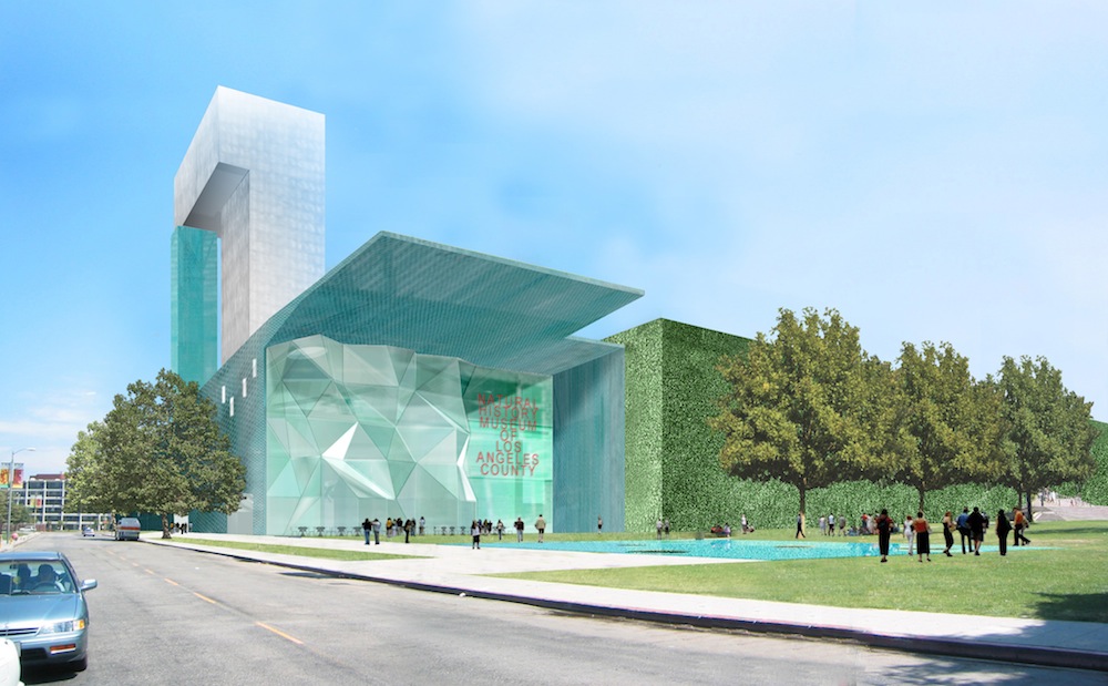 Steven Holl's Natural History Museum Addition

The Goodell Monorail
Santa Monica Offshore Freeway
William H. Evans' Tower Of Civilization, 1939
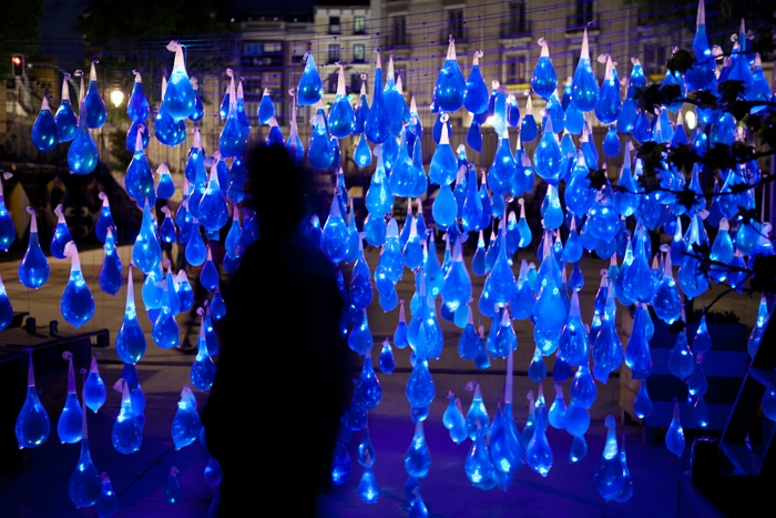
When the Spanish light artists at Luz Interruptus installed and illuminated 800 condoms filled with blue water, they chose a politically charged location. A square in Madrid that previously housed a public swimming pool had been closed two years earlier by local politicians. Even worse, new plans to develop the square into a tourist market would take the space from locals completely. To reference the need for community recreation, and the history of the square, the artists designed and installed an interactive sculpture called "Prophylactic rain that doesn’t wet anything" with the help of a few local kids.


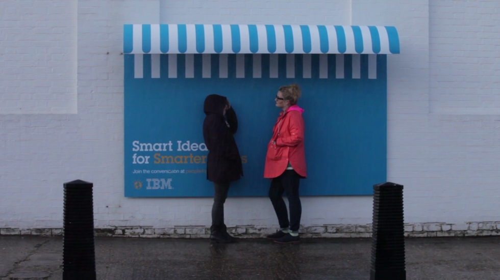
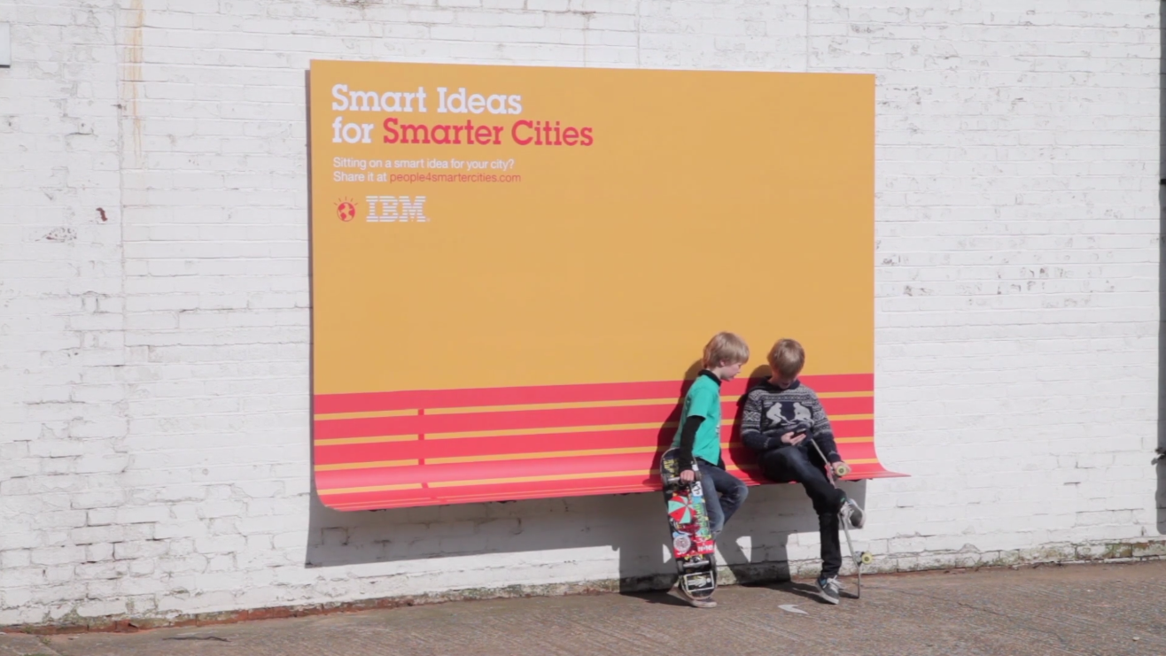
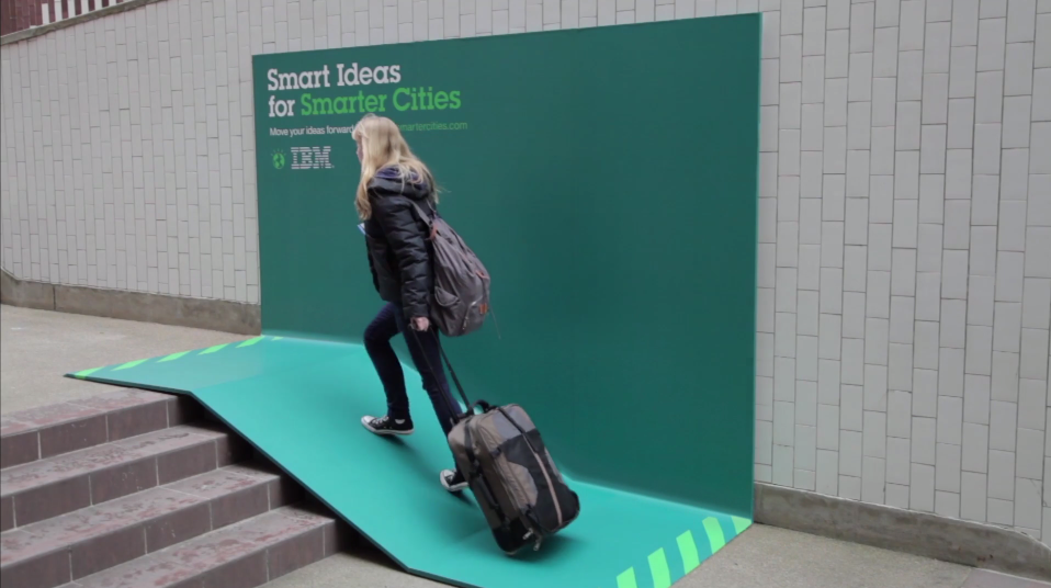
To launch its new ideas platform, called "Smart Ideas for Smarter Cities," IBM worked with Ogilvy and Mather France to design ads that make urban life slightly easier. By adding simple curves, or using standard materials in clever ways, the partnership produced ads that double as benches, ramps, and awnings for cover from the elements.
IBM has a strong reputation with advertising and sponsorship. In 1977 it funded the Eames Studio classic, "Powers of Ten".
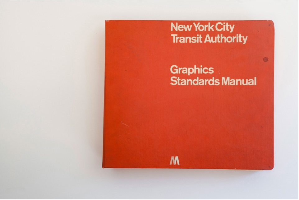
Oddly enough, it was a Chicago-based firm which issued the official Graphics Standards Manual for the New York City Subway system in 1970. The visual identity presented by Massimo Vignelli of Unimark International is in many minds the most iconic visual identity for a transit system in the world. Thanks to the efforts of Niko Skourtis, Jesse Reed, and Hamish Smyth the manual is now available to explore in digital form.
The manual itself is small in stature, but exhaustive. It contains the elements you'd expect: the ubiquitous circular letters and numbers and nine chosen colors, but it also contains a few entries explaining Vignelli's beliefs about civic design. The best example is probably his "information tree," meant to simulate a rider's experience using the signage system. At the very top, Vignelli includes the surprisingly strict design guideline, "The subway rider should only be given information at the point of decision. Never before. Never after."
Learn more about Vignelli's vision at StandardsManual.com