Miami-via-NYC group Lansing-Dreiden released a trio of well-regarded and influential long-players in the aughties, all refining an original blend of '80s synthpop and galactic space rock. But L-D isn't a typical band—in fact, it calls itself a "multimedia company" and has created visual art, graphic design, installations, and a free literary journal, Death Notice, all under the L-D name. Famously, Lansing-Dreiden featured a band in its video that was not Lansing-Dreiden. This year, the Mexican Summer label reissues three Lansing-Dreiden albums on vinyl, so we thought we'd check in with the directors of the multimedia company and see if we could find out more.

"iii"
What was Lansing-Dreiden all about? It was a "collective" and also made up of visual artists, right?
We refer to Lansing-Dreiden as a company instead of a collective. Collective implies a group of artists working together on a single project whereas a company has a mission and aesthetic that must be maintained regardless of who the members are. Some members were visual artists and some were musicians, some both, but the company was set up in a way where everyone could take part in all of the decisions since they were ultimately meant to reflect the company itself and not any individual.

"SmallM4"
And then it became more about art than music? What kind of art?
It has never been an either/or situation. The entire body of work we make all comes from the same place. Our favorite medium has been misinformation.
What's the connection with Violens?
Apparently one of Lansing-Dreiden's members is part of a guitar pop group named Violens. We have never listened to it.

Why are the L-D albums being reissued? I always thought they should have gotten a bit more attention.
We appreciate that. They are being reissued because the label asked us if we wanted to have the records printed on vinyl, and we did. Over the years, the number of people we've met that found the work interesting in some way have far outnumbered the ones that have initially dismissed it. These re-releases are for them.

Can you tell us about the album packaging design?
It is pretty minimal, just black and white. A double-matte coat with silver foil stamp logo and song names on the back. Three releases are being reissued on 12". Each record cover is a more minimal spin on its original packaging.

L-D has been fairly media shy, but Violens has done interviews. Is that about creating a mystique or just more about time management?
Lansing-Dreiden has never really been media shy, we answer most questions. The press have accused us of using our anonymity as a gimmick—perhaps that's laziness on their part? The point of Lansing-Dreiden was to produce works in various mediums that were thematically and aesthetically in harmony, following a set of rules. We chose anonymity because we wanted the audience to relate to the work on its own terms, without needing to have a media personality to refer to.
For more Lansing-Dreiden, visit lansing-dreiden.com
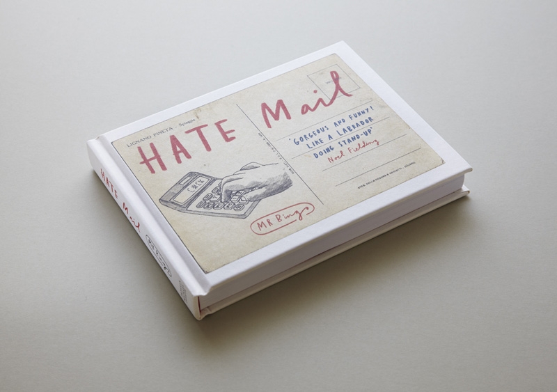
Last year, someone in the UK opened their mailbox and found a postcard that read only, "Fuck You and Fuck Your Cat," with an image of an expertly illustrated, and very sad, cat. While that aggression might be a shocking experience without context, the card was actually part of the illustrator Mr. Bingo's "Hate Mail" project.
The idea for the project came about after Mr. Bingo sent a drunken tweet that offered the first person to reply an insulting post card. In the first minute, about 50 requests came in. To keep up with demand he set up a store on his website where you could buy an insulting card or send one to a friend. About 400 pieces of hate mail later, he collected some highlights in a book called Hate Mail, and will exhibit 250 of the cards at a new show in London. If you're brave enough, and you buy a copy of his book at the show, he'll write you a personal insult on the spot. [via Ignant]
Mr. Bingo's "Hate Mail" show will open at KK Outlet in London on June 6. His book, Hate Mail, is available now. 


Moving downtown from last year’s inaugural exhibition inside a Humboldt Park warehouse, the Chicago Design Museum, a month-long pop-up exhibition opening June 1, won't lose any of its curatorial edge this year.
For 2013, ChiDM’s sharp yet eclectic lineup unites different disciplines of art and design under the theme of "play," and seeks to "speak to an underlying discussion in the design community about whether design is art, designers are artists, and if either a pursuit to create work that was personal (content self-generated) or commercial (content from/for a client) could be deemed a nobler pursuit than the other," according to design director Jim Thomas.
(Images below are meant to showcase the work of some of the featured artists; they may not be included or displayed at the museum)

"Hemlock," Marian Bantjes
Featured designers for this year's exhibit include: Vancouver-based Marian Bantjes, a graphic artist whose kinetic typesetting led Stefan Sagmeister to call her “one of the most innovative typographers working today”; local ad-world icon John Massey, who worked at Container Corporation of America and the Center for Advanced Research in Design (CARD) and made these amazing Chicago posters; New Wave Swiss typographer and graphic designer Wolfgang Weingart; and Michael C. Place, founder of Build and a former member of Designer’s Republic, the seminal Sheffield studio responsible for many famous record designs for labels like Warp.

John Massey, Flag
“The board members of ChiDM talked a lot about designers who experimented with creating new ways to present visual information,” says Thomas, “whether it be through simplifying elements to include only those that communicate the intended message, like John Massey, or pushing the limits of new technology (or old technology used in new ways), like Wolfgang Weingart. We also have two designers in the exhibition, Marian Bantjes and Michael C. Place, who quit established practices to create work that was more personal to them, both in content and context. These second two are still very much in the prime of their design practice and we are excited to watch where their experimentation will lead them, and the design community, in the years to come.“
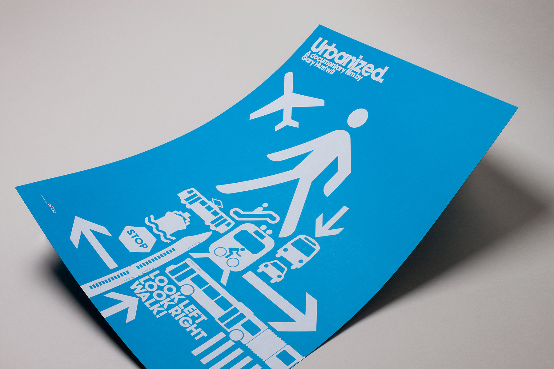
Urbanized poster by Build
The museum, which opens at Block 37 in Chicago's loop, will also showcase its own curated exhibition of new work, Re/view, based around the theme of optical illusions.
“Pieces in Re/view play with the idea of illusions as something that takes more than one look and multiple vantage points,” says Reina Takahashi, special exhibits curator. “Artists pushed this in a number of different ways—pieces that make you step back, look closely, stand on a specific point in the room, or even turn the viewer into the subject of an illusion. Interpretations of the theme varied from those that took a historical look back at the traditional optical illusion, to those that incorporated their own personal narrative.”
The Chicago Design Museum will be open June 1–30, and host a variety of special events. On June 6, 6-8pm, Pop-up Art Loop will host a First Thursday's Gallery Walk. Marian Bantjes will give a design talk on June 8 from 2-4pm. The museum’s kick-off reception will be held in the ChiDM space June 10 at 7pm. Adobe will host a Create Now event, showcasing new developments with the Adobe Creative Cloud on June 18. Visit ChiDM online for more information.
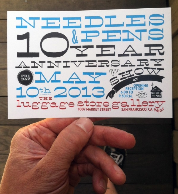
Needles and Pens, opened in June of 2003 by founders Andrew Martin Scott and Breezy Culbertson, has accomplished a lot in the last ten years. As it curated 85 exhibits featuring artists all over the world, published half a dozen books, hosted musical performances, and sold some nifty stuff, the San Francisco based art space/shop established itself as a community hub for artists. To celebrate this success, Needles and Pens hosts an anniversary show at The Luggage Store Gallery in San Francisco. The opening reception for the show is May 10, 6-9:30pm, includes work from 66 unique artists, as well as musical performances by Tara Jane O'Neil, Strawberry Smog, and WR/DS.
The show will be running until June 8, so make sure to stop by and celebrate a decade of Needle and Pens.

One might assume the struggling former coal mining town of Rugeley, Staffordshire might adore its new role as home to an Amazon fulfillment center. Roughly the size of nine soccer fields, the new facility has brought a lot of jobs to the area. But photographer Ben Roberts and journalist Sarah O'Connor, on assignment for the Financial Times, seem to find mixed reactions from the locals in the incredible photo series "Amazon Unpacked." Although Prime Minister David Cameron has rolled out the welcome mat, the online retailer has gotten a skeptical welcome in the UK from those concerned about the vanishing high-street shops. Still the Internet giant has invested billions in a UK expansion and promised thousands of jobs.
Visit Ben Roberts online, where his photos and O'Connor's captions tell a nuanced story of Amazon in Rugeley.


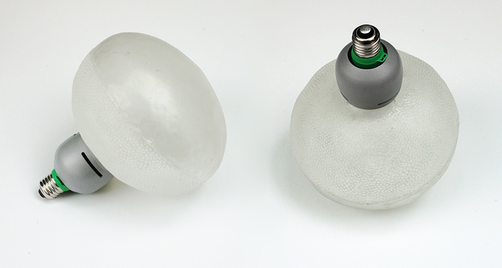
The soft rubber bulb of Booo's new light fixtures doesn't just filter the LED light source. Designer Nacho Carbonell realized that shipping large (and fragile) glass light bulbs was an unnecessary risk and expense, so he set out to make a collapsible and attractive fixture that could ship more securely in a smaller package. The lamp's simple form is another conscious decision: the designer hopes it will be used as a standalone light fixture, but it's also simple enough to work inside a bigger lampshade.
Advertising’s ubiquitous nature makes it hard for a single message or image to break through the white noise in 2013. But there’s something eye-catching about handmade signs that manages to cut through the clutter.
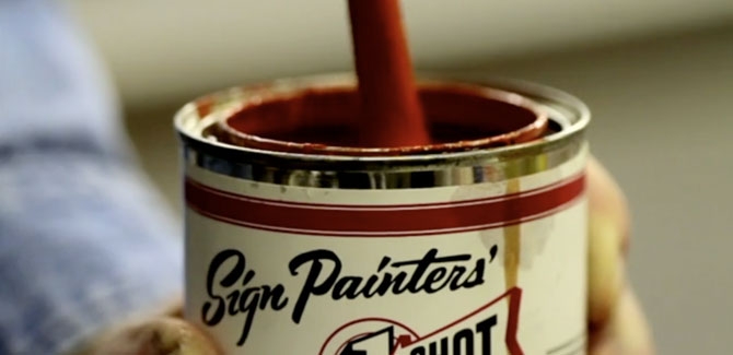
Attracted to the craft behind traditional public advertisements and handmade signage, authors and filmmakers Faythe Levine and Sam Macon set out in 2010 to make Sign Painters, a documentary and book about the subject. A few years and 40-plus interviews from across the country later, they’re screening the movie and raising awareness of the art form, which was hurt by the introduction of cheaply made vinyl signs in the late ‘70s and early ‘80s, but is now experiencing a resurgence due to a rising awareness about authentic craft and better design.
“Once you become aware of the basic elements of sign painting, it makes you walk down the street and ingest the information you’re seeing in a different way,” says Levine. “It makes you become conscious of your visual landscape in a very different way.”
SIGN PAINTERS (OFFICIAL TRAILER) from samuel j macon on Vimeo.
Nothing Major spoke to Levine and Macon about covering the craft.
Nothing Major: While traveling around the country and talking to people in different cities, did you discover that certain regions had their own styles of sign painting?
Faythe Levine: It was more attached to a person than a region. So-and-so worked at a shop with this guy or under this guy, this is Gary’s 'R' or so-and-so’s 'I'. You’d meet people who knew where that particular 'S' originated.
Sam Macon: The main regional thing, and it’s not a perfect example, would be window splashes, the bright, often temporary window painting that’s done for a sale. It was very big in Southern California in a way that we didn’t see elsewhere, where the climate allowed you to be outdoors every day painting.
Levine: The easiest way to explain it to our generation is graffiti. There’s a lot of crossover for a certain style in a certain place.
Nothing Major: How did sign painting and graphic art inspire one another?
Levine: The influence [on graphic design] is more direct than most people realize. Sign painting was prevalent until we were kids. Vinyl signs really took over in the late ‘70s and early ‘80s, within our lifetime. That’s why it’s such an important conversation to have. The amount of time a sign painter spends talking to people on the street versus sign painting is 50/50 sometimes. People keep asking, "What are you doing? Are you doing that?" What does it look like they’re doing, they have a paint brush in their hand? People are amazed to see people painting things on the street.
Macon: Sign painters were always tied into current trends and designs. Only recently have more people become aware. It’s more a product of a more aesthetically aware culture, especially among younger professionals. Everything needs to look cool.
Nothing Major: How would you qualify the health of the craft right now?
Levine: People are excited about it. I feel like it’s a growing part of people’s general awareness of their surroundings.
Macon: You have the first generation really tuned into graphic design and aesthetics. There are so many more branding executives or design specialists. One person we interviewed was saying, “I need to sell myself and sign painting to these people. I just need to go to them and say 'Listen, people are coming from the building from this side and that side, and we need to play off the sign on the next building, and it needs to stand out from the sign next door.'” If you don’t know that’s an option, the default is going to your corporate office, and getting a sign, the same image they send everywhere, regardless of local aesthetics and geography.
Levine: You don’t need to go to a fast-and-easy sign shop where they crank out this ugly vinyl banner. You can actually go to this skilled person. There’s a lot to the trade, you don’t put certain colors together, for instance. To make a 45- to 60-minute film about the history and how things happen, that was probably our biggest challenge. We started off not knowing if we had enough content, and all of a sudden we could make a miniseries. Call Ken Burns.
Nothing Major: Were there any pieces or murals you saw that you thought were masterpieces of the craft?
Macon: Probably the coolest things were old ghost signs from unnamed people. I can’t believe that nobody knows, or has any information about, how this stuff was made. People will pay extra for a refurbished old loft apartment with a fraction of a ghost sign. And some of the most dynamic stuff I’ve seen goes uncredited. I think scale is always impressive. Anyone who does something big, it takes an incredible amount of work. The guys at Colossal, who often do something really big, do some amazing projects, painting 70-foot-plus sides of buildings in the middle of winter hanging over the streets of Manhattan. There’s really too much to name one. Gary Martin in Austin doing flash art design style in his work. A lot of his work has this really cool wild style. There’s someone in Chicago like Bob Behounek, or John Downer in Iowa, their knowledge of alphabet styles, and the ability to wield a brush on a small scale. When they’re done painting, it looks like it was printed out. They can just go through fonts, whole alphabets are learned and programmed in their brains.
Levine: They have the muscle memory. John Downer can paint out the perfect Helvetica alphabet. One of the guys we interviewed said sometimes the best hand-lettered signs are the ones you don’t notice. You just don’t realize it’s there, it’s doing its job so well. He took us to this black-paint-on-white-board "no parking" sign on a church and said this was the best sign in all of Cincinnati. “Look at the brushstrokes, you can see how quickly the sign painter knocked it out.” He picked apart the sign like a science. It was the plainest sign, but it had been there for 50 years doing its job. It was perfectly done.
Levine and Macon will be on hand for a reception and screening of the film May 17 at Chicago's Logan Theater. Future screening dates in San Francisco, Boston, Minneapolis, and other cities in the U.S., Canada, and worldwide, can be found online.
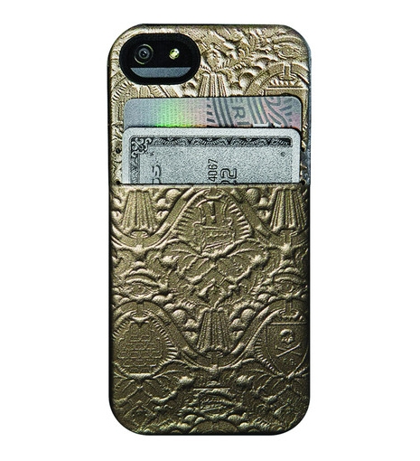
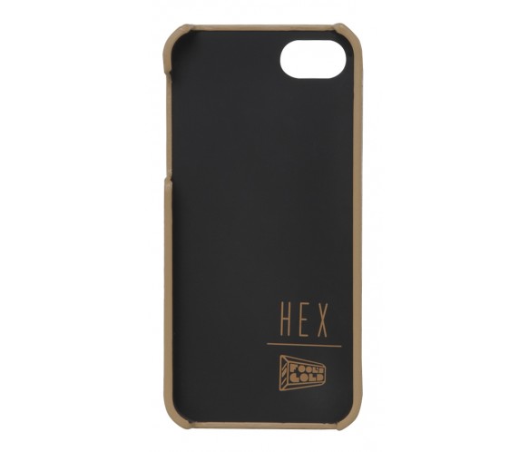
If you're somehow still on the hunt for an iPhone case after our round-up in January, and you happen to have Fool's Gold Records on your radar, their new wallet/iPhone collaboration with HEX might be a contender. The case comes in two colors, a more conservative black leather, and a very Watch the Throne gold edition, and each model can hold two cards. Not exactly George Costanza storage, but having a license and credit card handy is better than nothing.
Both colors are available from the Fool's Gold online store, and select HEX outlets.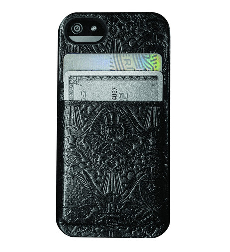
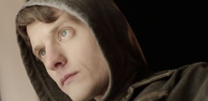
Last May, Julian Marshall, the 22-year-old director of Obey The Giant, a narrative biopic about the street artist Shepard Fairey, raised over $65,000 on Kickstarter. His initial goal was less than half that amount. For a student film, Obey's production values are extremely impressive. Marshall assembled a cast and crew of 150 and shot the entire film over eight days in and around RISD's Providence, Rhode Island campus using the Arri Alexa camera system. As one might expect, a biopic revolving around an artist and art school results in some heavy-handed dialogue, but Obey is an impressive project nonetheless that wouldn't be out of place on IFC, or the Lifetime network.
OBEY THE GIANT - The Shepard Fairey Story from Julian Marshall on Vimeo.
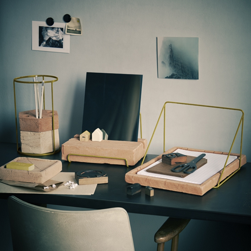
Ilaria Innocenti's "Adobe" collection of desk tools is somewhat of a geological history exercise. Using ancient brick building techniques, Innocenti formed the pieces using different proportions of clay, silt, sand, and plant fibers. The slight variation in coloring reflects the different qualities of soil in her native Italy. [via designboom]

