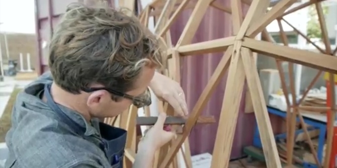
Designer Tracy Wilkinson and architect Simon Storey, the creative team behind the newly launched Store LA, are a bit like the handcrafted wares they produce: understated yet elegant. We spoke with the designers about launching Store LA, living and working in Los Angeles, and got the scoop on Simon’s much buzzed-about—and super cool—Wow & Flutter speaker system.
Hey Tracy. When and how did you and Simon cross paths and why did you decide to launch Store LA together?
We have known each other for 10 years and met through good friend and artist Zoe Crosher. We discovered that we shared a love of making items by hand, whether it was a piece of furniture, or a lamp, or wallpaper. Every time we would be at a gathering of friends you could find us sitting in a corner discussing ideas and sharing techniques. We both appreciated each other’s aesthetic, although we feel they are quite different, and felt that putting our work together in one place made sense.
You’re both expats living and working in LA. How does the art and design scene in LA differ from that of the UK and New Zealand?
Simon: New Zealand design is very isolated and regional. However, there are similarities with Los Angeles such as an appreciation of natural materials. I personally feel just as at home in LA as NZ, so right there is a very strong link.
Tracy: I think both places are vastly different in attitude but there is an eclecticism to British design that I see here, too. I spent my childhood in a small town surrounded by English countryside so I was exposed to natural materials that have shaped my work, as they have Simon's.
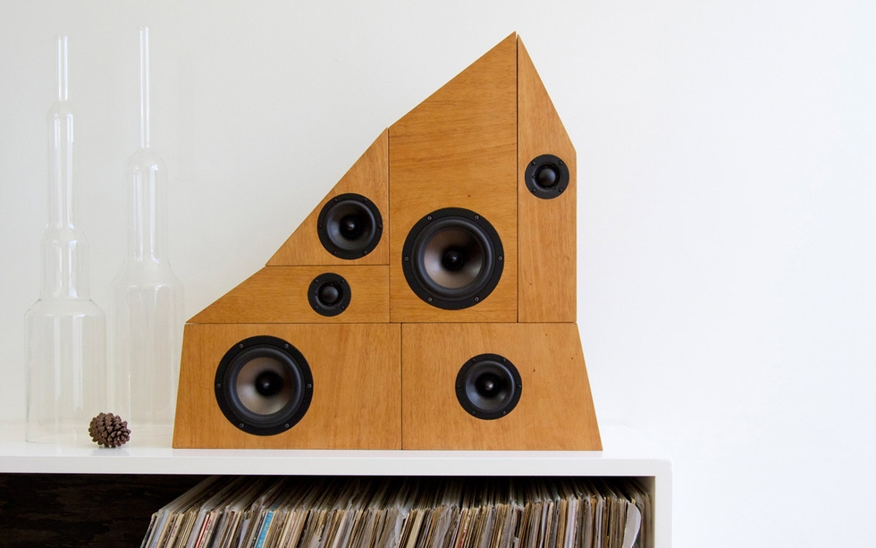
Simon, can you tell me about your Wow & Flutter speaker system? Did you design the speakers out of personal necessity or was it a project for a client? Are you a music buff?
The design is a personal project. It came after visiting a local thrift store known for its audio equipment where I found a virtual mountain of speakers piled high. I guess they had just received a big delivery. The jumbled pile stuck with me and I started sketching ideas. The outcome of all this is the Wow & Flutter speaker system which can be stacked and combined in endless ways. The name comes from an unwanted distortion that vinyl produces. And yes, I’ve always loved music and spent a lot of time in high school designing and building speaker systems. I was even a country music DJ at one point.
Do you have any plans to collaborate on a line of products together or introduce other artists and designers on the site?
We are planning on introducing other artists as they come along. As long as the aesthetic fits with the store, we would love to do it. We are also open to collaboration with other artists, as well as between the two of us.
What’s your favorite item on the Store LA site right now?
Tracy: Simon’s Wow & Flutter speakers.
Simon: It’s a tie between the Savannah Frankie vase and one of Tracy’s lampshades.
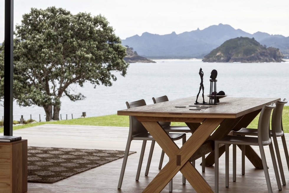
We think the goal of any great cabin is to make its occupants feel like a part of their natural surroundings. Cabins don't have to be elaborate constructions, but instead should help visitors reach a balance between a meditative state and a social setting for fellow travelers. In other words, they are a place of focus.
The Auckland-based architecture firm Fearon Hay completed a project called the Storm Cottage last year on New Zealand's Great Barrier Island, and we think it's a great example of a modern getaway cottage. The house itself is well designed, but the first thing we noticed was orientation toward the nearby water. The cottage is only slightly raised above the water, with just enough room to make a small lawn visible. Beyond the lawn is a view that puts both mountains and a clear lake right at eye level.
As it happens, the two-bedroom Storm Cottage is also completely off-the-grid. It has solar panels for electricity and self-sufficient systems for clean water and handling waste. It also boasts two symmetrical bedrooms and a wood-fired stove in the living room. With that view, we imagine meals at that table probably tend to linger.
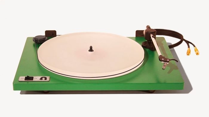
As vinyl has worked its way back into our hearts and music stacks, the modern music lover sometimes faces a dilemma. Sure, vintage turntables are an option, but they are becoming more difficult to maintain. New turntables are either prohibitively expensive (above $400) or cheaply-made USB units for the digital-transfer market.
Enter the Orbit Turntable by U-Turn Audio, an all-analog, precision turntable with a high quality needle that comes in at a fraction of the price of similar turntables on the market.
Designed by a group of young engineers, musicians, and entrepreneurs from the Boston area, the turntable prototype was created with a grant from Northeastern University. It should please audiophiles and casual listeners alike.
Naturally, with the stats and quality the Orbit is boasting at its nice price ($150 gets you one on Kickstarter, $250 the limited edition Kickstarter green edition), the Kickstarter fund has done quite well. That said, you can still nab one before tonight's deadline, or even pledge your way to a custom-painted, Renaissance Edition at $500, still a good deal for a turntable in its class.
Christian Flynn paints mostly empty spaces. But his empty spaces are only temporarily uninhabited. Whether it’s a fan in a window, a store locked from the inside, or windows taped for a hurricane, we never see Flynn’s characters, but we get a sense that their actions have just occurred.
Flynn’s paintings present potentially banal subjects in a warm and compelling way. He incorporates contemporary imagery, as in a projector left running in an empty classroom, and rich evocative color palettes to give his paintings a surprising amount of emotional weight. We see these works as the equivalent of a poem about using an iPhone or an interesting film that manages to use Twitter to advance its plot. [via booooooom]
christianflynn.com
This week, the pilot episode of Working Title, a collaboration between KQED and Little Paper Planes, hosted by Kelly Lynn Jones of LPP and Andrew Martin Scott, co-owner of Needles and Pens, debuted online.
The Working Title series will explore how local artist entrepreneurs are creating alternative economies in the Bay Area. In episode one, the program shows a lot of potential. It's highly conversational with the conversation wandering in fruitful directions (the high cost of living in SF for artists). Surfer/treehouse designer Jay Nelson is an engaging character. It also has some regional flavor, not just in Nelson's surfing lifestyle, but in the idealist, dare-to-dream attitude of all the participants. It is San Francisco, evidently, not Portland where one can work as a full-time treehouse builder.
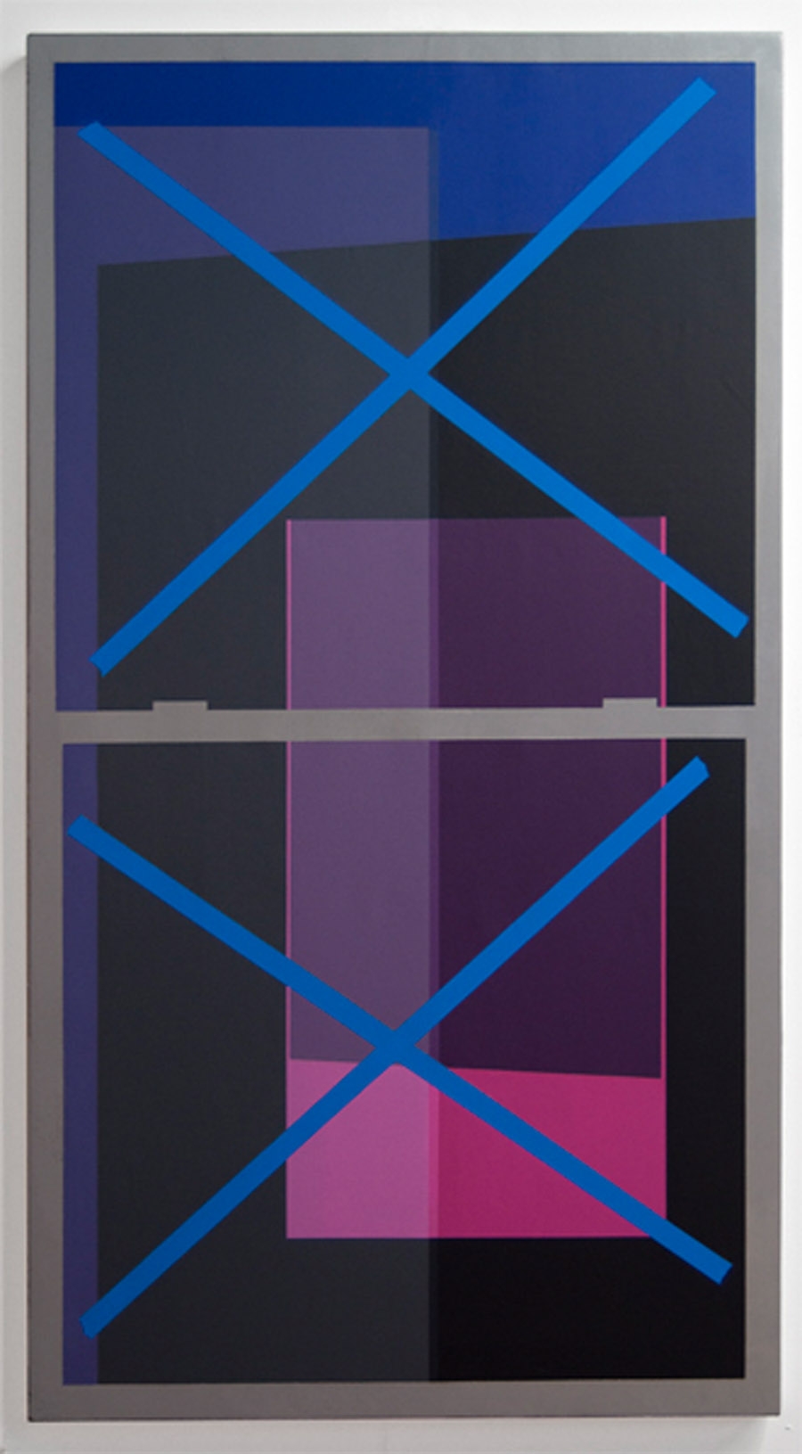
Christopher Derek Bruno wants you to think about relationships. His paintings force you to consider at least two. The first is a physical one, and it’s between the viewer and the painting. He builds three-dimensional shapes to manipulate the image the viewer sees depending on where they are standing in relation to the painting in a gallery. He considers the slow walk we all do at shows, and allows the three-dimensional structures to manipulate his painted forms as we leave a work.
The second relationship is between the enamel colors he paints onto those three-dimensional forms. He uses very transparent colors, and layers geometric shapes to achieve a similar effect to overprinting, most commonly seen in silkscreen printed work. We think his work is meant to be seen in motion [via booooom].
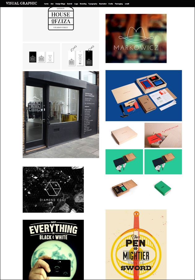
Put simply, the Visual Graphic Tumblr is an unending stream of great design. A day’s worth of images usually includes branding of everything from microbreweries to batteries, typography on posters and flyers, independent publishing, and sometimes album packaging. The images are presented without commentary, but confered with a silent seal of approval. And we're not exactly sure who's behind it.
Like a well-kept notebook, Visual Graphic makes a great resource for anyone with a looming creative project. The sheer quantity of images coupled with a high level of curation make it the perfect place to test your own ideas or take cues from a discipline other than your own. We guarantee it’s a great addition to your dashboard.
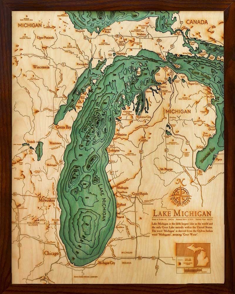
The proprietors of the Below The Boat store are adamant that they sell carved charts, not carved maps. They're correct. Underwater terrain is shown in a bathymetric chart not a topographic map. Cartography jargon aside, we're still pretty excited about these charts, designed and crafted overseas by a small family-run operation.
The content very much fits the medium. The original bathymetric charts that these pieces are based on have an extremely simple composition: usually just thin black lines on white paper, sometimes with a little blue shading for bodies of water. In this carved version, the precision of the original lines translates to the laser-cut wood forms, and the layering of the thin wood adds another dimension to an image that was, after all, designed to represent depth.
We can vouch for the wooden charts as navigation tools. Rather, Below The Boat sells them with a dark wood frame for wall hanging. You can see if your favorite body of water is currently for sale over at their online store.
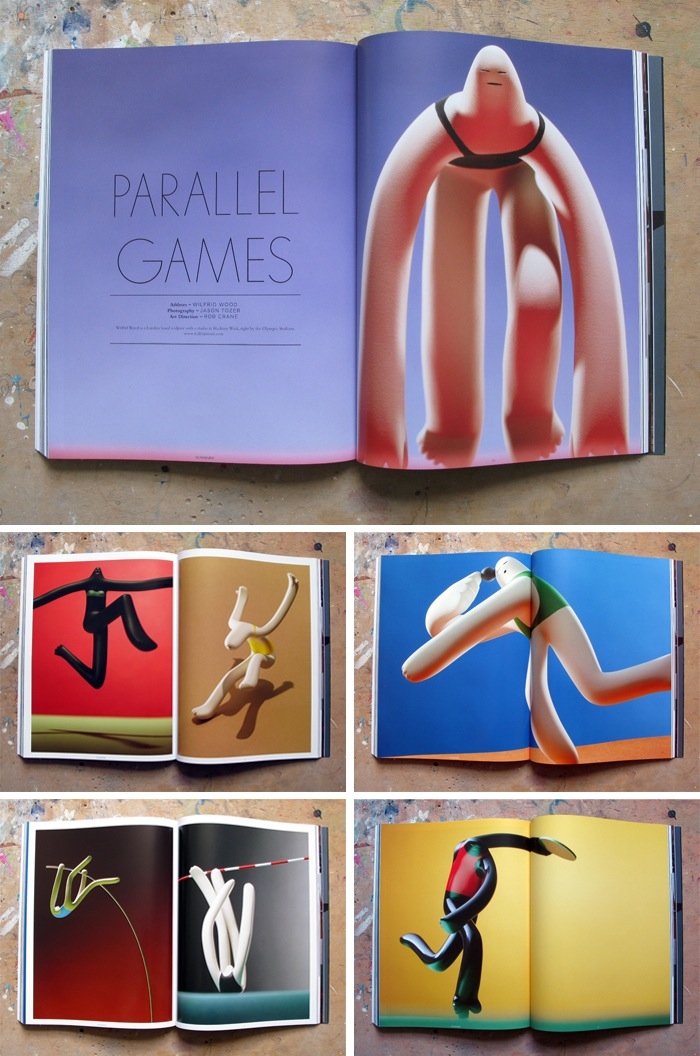
Wood's process begins with a drawing. He then builds a wire frame, wraps the frame in aluminum foil, and covers the foil with a polymer clay. After modeling the clay, he bakes it, sands the figure, airbrushes on the color, and varnishes the whole thing.
His work has the same hand-made, labor-intensive aesthetic of classic claymation films, but because Wood's works are single-form, still sculptures, his commentary comes in the characteristics he gives his figures. Things like the overly dramatic expressions of English soccer coaches, or the elaborate aging of Paul McCartney's face and even the child-like bum of a naked Justin Bieber give his work an element of comedic sarcasm rivaled only by his deadpan one-liner descriptions.
The multifaceted designer and Creative Director Michael Cina (of Cina Associates) is known, in part, for his typographic work. No wonder, he's been making his own fonts since 1995, founded type foundry Cinahaus as well as YouWorkForThem which he left in 2010, and works on many high profile branding projects which often include custom typefaces. This year, he's back in the font design game with Ramsey, his first font in five years.
We queried Cina on the inspiration for Ramsey and the ins-and-outs of font design in the digital age.
You mention that you were inspired by a typeface on an album cover. Would that suggest there was an existing typeface from the past that's been discarded that inspired Ramsey or is that not the case? Was it drawn?
Typefaces are all about details and nuances today. I have always been into inktraps and different ways of joining strokes together. So that was the main thing that I was inspired by.
Fonts have gotten so sterile lately. If you want to find a sans that has exactly what you are looking for, chances are that it is out there already. There are a lot of designers flogging a dead horse. I want to bring some character and life into the world of fonts. I have such a wide interest too, I could work for the rest of my life on just fonts, but that would be pretty boring.
Ramsey started off as some doodles from some type I saw on an old jazz LP cover. From there I redrew it many times, changing it up over the course of three years. I would take a break from it now and then but I worked every night on it for nine months straight. Typeface design is all about details so it is a lot of work. Think... you have to draw 350+ characters and have them all work together. Drawing the font is easy. The hard part is expanding out the font to all those characters and then kerning them. After that you are completely tired of the font and then you have to use it to show it off! hahah. It's maddening, but rewarding too.
Ramsey is your first font in some time, has font design become more complex because of the increasing importance of the various web platforms where a font may be utilized?
Font design has been more complex. With the introduction of OpenType, you can program a typeface to have as many alternate letters as you want it to have. Universal application support is not totally there yet though and web is also a bit far in the distance, but it is catching up fast.
There are a lot of people doing amazing things with type and the bar is much higher. I also know a lot more now than ever and it makes it harder to cut-corners like you could when you first were starting out. I want to make typefaces that stand the test of time, not the test of a fad.
This sounds like an after-work work project to me. Where do you get the energy and focus to pull those off?
You are actually correct, it was just that for me. I primarily worked on the typeface when my son was going down to sleep. So I would hit it each night in one or two hour chunks of time (or less). I have a really strong work drive. I don't show most of the work I do. I did spend months working on a typeface family for Disney last year and that really helped me focus more on type.
Lately I have been doing a lot of rebranding work through larger agencies. They hire me regularly as their 'hitman' to create a good ID and also to finish/refine a project they will sell to the client. In my time off I work on fonts and other projects that the studio gets in.
So, next font, in four years or sooner?
You should see a new font appear in the next week. There will be a campaign to introduce the font to the world.
Ramsey is available at Associated Typographics
Michael Cina Associates