The multifaceted designer and Creative Director Michael Cina (of Cina Associates) is known, in part, for his typographic work. No wonder, he's been making his own fonts since 1995, founded type foundry Cinahaus as well as YouWorkForThem which he left in 2010, and works on many high profile branding projects which often include custom typefaces. This year, he's back in the font design game with Ramsey, his first font in five years.
We queried Cina on the inspiration for Ramsey and the ins-and-outs of font design in the digital age.
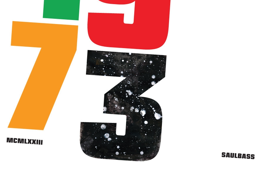
You mention that you were inspired by a typeface on an album cover. Would that suggest there was an existing typeface from the past that's been discarded that inspired Ramsey or is that not the case? Was it drawn?
Typefaces are all about details and nuances today. I have always been into inktraps and different ways of joining strokes together. So that was the main thing that I was inspired by.
Fonts have gotten so sterile lately. If you want to find a sans that has exactly what you are looking for, chances are that it is out there already. There are a lot of designers flogging a dead horse. I want to bring some character and life into the world of fonts. I have such a wide interest too, I could work for the rest of my life on just fonts, but that would be pretty boring.
Ramsey started off as some doodles from some type I saw on an old jazz LP cover. From there I redrew it many times, changing it up over the course of three years. I would take a break from it now and then but I worked every night on it for nine months straight. Typeface design is all about details so it is a lot of work. Think... you have to draw 350+ characters and have them all work together. Drawing the font is easy. The hard part is expanding out the font to all those characters and then kerning them. After that you are completely tired of the font and then you have to use it to show it off! hahah. It's maddening, but rewarding too.
Ramsey is your first font in some time, has font design become more complex because of the increasing importance of the various web platforms where a font may be utilized?
Font design has been more complex. With the introduction of OpenType, you can program a typeface to have as many alternate letters as you want it to have. Universal application support is not totally there yet though and web is also a bit far in the distance, but it is catching up fast.
There are a lot of people doing amazing things with type and the bar is much higher. I also know a lot more now than ever and it makes it harder to cut-corners like you could when you first were starting out. I want to make typefaces that stand the test of time, not the test of a fad.
This sounds like an after-work work project to me. Where do you get the energy and focus to pull those off?
You are actually correct, it was just that for me. I primarily worked on the typeface when my son was going down to sleep. So I would hit it each night in one or two hour chunks of time (or less). I have a really strong work drive. I don't show most of the work I do. I did spend months working on a typeface family for Disney last year and that really helped me focus more on type.
Lately I have been doing a lot of rebranding work through larger agencies. They hire me regularly as their 'hitman' to create a good ID and also to finish/refine a project they will sell to the client. In my time off I work on fonts and other projects that the studio gets in.
So, next font, in four years or sooner?
You should see a new font appear in the next week. There will be a campaign to introduce the font to the world.
Ramsey is available at Associated Typographics
Michael Cina Associates