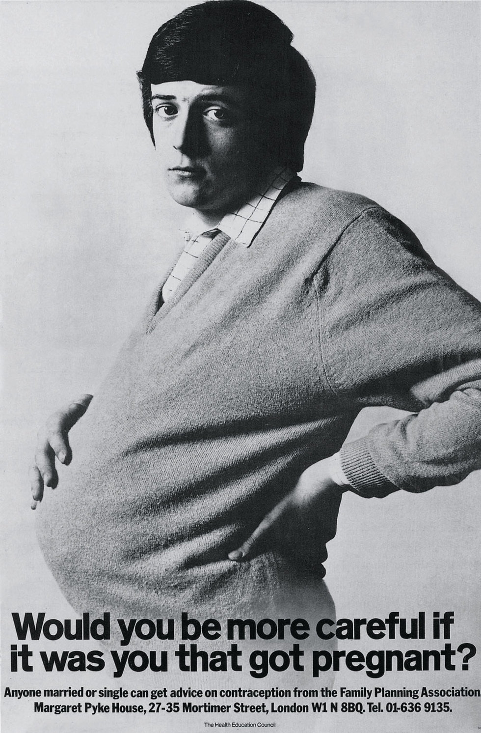
For those in the ad biz, the annual D&AD Awards (from the non-profit educational organization Design & Art Direction) are a big deal. The group promotes design excellence and counts the legendary photographer David Bailey among its founders. Every year, thousands submit their most eye-popping, smartest, and most provocative creations to the D&ADs. Panels of judges debate the best, select the best, and publish an annual book—which is a fantastic compendium of the year's most memorable creative work. Favorites win the Yellow Pencil while the most incredible work gets the coveted (only to be said in hushed tones) Black Pencil. With the D&ADs turning fifty, Taschen has issued a tome that celebrates the best from each year and traces the development of commercial art and creativity from the birth of advertising up to the digital upheaval.
And by the way, the D&AD Awards deadline for entry is Jan 30. This year's slogan: "Win one, die happy."
D&AD 50 is available soon.

The designers of Past.fm wanted to create an object that would let listeners explore their own music history. The problem they identified, however, is that, for a new generation of listeners, that history will mostly exist in a digital form.
The object is simple: it's a wooden speaker enclosure with an LCD screen, a single sliding handle, and a slot to insert an RFID token to switch between listeners' histories. The sliding handle is used to navigate through one's musical timeline (stored in a Last.fm account, naturally), playing a new track at every position using Spotify.
The success of the design is that Razan Sadeq, Hideaki Matsui, and Zubin Pastakia at the Copenhagen Institute of Interactive Design didn't try to mimic an experience younger listeners never actually had. There's no large color screen for album art, no liner notes, and no suggestion that albums should be listened to from start to finish. The experience is closer to finding an organized catalog of every vaguely-titled mixtape or burned CD you once made and excitedly clicking through old favorites.
But not everything about the way we listen to music has changed, and an important quality of the design is that past.fm is geared towards a shared listening experience. The Minority Report-esque token balls pop in and out, and are meant to be swapped with friends, just like mixtapes.
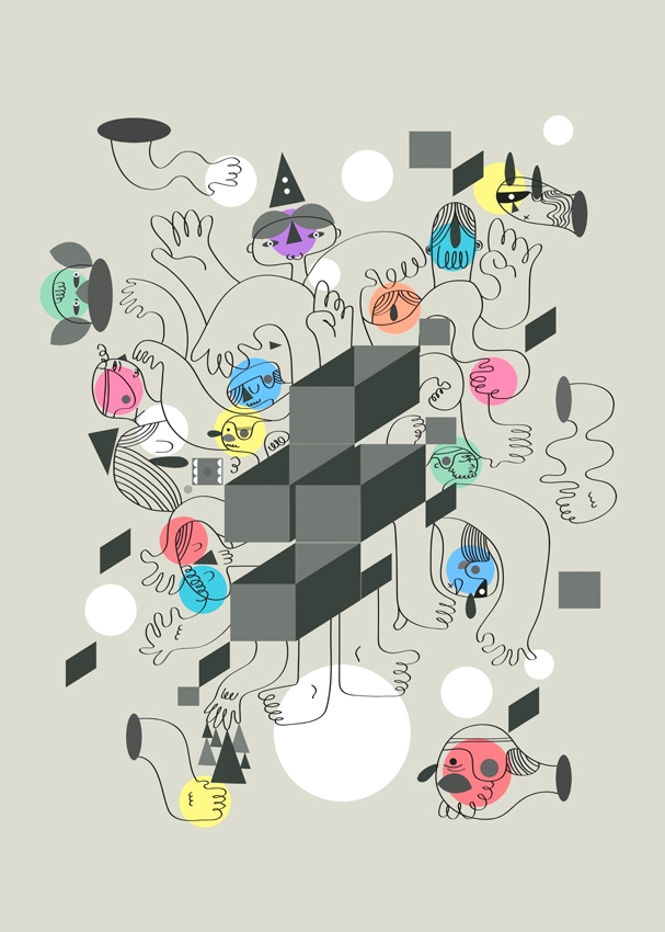
Where creative thinking is concerned, we're in a moment of wild appropriation. We have immediate access to every time period, every movement, and every artist. With all of this inspiration around, it's easy to get distracted and lose sight of one's own scope. We talked with UK-based illustrator Scott Balmer about his process, vintage video games, and why it's important to stay focused on one's own vision—even if it is informed by endless visions of the past.
I read somewhere that you were really into printmaking while you were studying. Did having a foundation in block and screen printing ultimately have an effect on your style and process as someone who primarily works on the computer?
For one thing, it made me think more about the many ways in which elements of my designs could relate to one another by using a medium where change isn't really that much of an option. It also gave me a better understanding of working with colors. Most folks go on about using paint to learn the basics of how to use color effectively, but personally I found it's best to use a process like block printing where not only are you limited on how many colors you can use, but also your color choices are pretty much set in stone once they are printed since it's not that easy to just cover it up with another hue like you can in painting.
Where do you start your work? On the computer?
It depends, really. There have been times when I just jump right in with a rough idea and see how things fall into place, but for most of the time my work starts off as some very simple rough thumbnails. Then it's either getting right into the action or, if it's for a client, I would flesh out the thumbnails towards something that shows the concept a bit more clearly.
All of your illustrations seem to come from the same world, but there are still a few very distinct groupings of style. Are these from different periods? Or are they in response to different types of atmospheres or objectives?
I think it's more to do with what best fits the initial concept and generally, the look and/or feel with what will work within the subject material. A style should be scalable in the sense that you should be able to reduce it to its bare essentials in the production of simple yet striking concepts, but it can also be taken into the more complex realms by trying to push the style to its limits and producing a piece with a dense illustrative landscape.
The illustration coming from the UK is just so great right now, especially where editorial is concerned. Would you agree? Is there any kind of scene or even just a collective consciousness that you're aware of?
There are a fair few great and diverse illustrative pieces coming out of the UK right now and I do keep up and look at what other illustrators/designers are doing. But I tend to follow what other creatives are up to more casually as I think it's important to have a balance in that you're not almost always looking up how someone else tackled a certain subject as to avoid subconsciously mirroring someone else's concepts. I find it also helps greatly in defining who you are and how your own work can be defined on its own without being overly influenced to the point where it's borderline mimicry. All in all it's basically the art of looking but also not looking.
I know you grew up in the '80s. How do you think your pop cultural knowledge of that era influences your work—do you draw on it? I noticed RoboCop in a recent piece.
Bits of the '80s has influenced some of my work, such as toys and their packaging to the cartoons usually aired on a Saturday morning. Mostly it comes from the old games like Zelda and Mario plus a few titles and systems that had some quirky charm to them back in the day, like the ZX Spectrum. I'm still thinking about making a piece just using the colors that the Spectrum used to produce in its heyday. For anyone thats not familiar with the graphics output of the Spectrum, it was almost always a black screen with about four to five vibrant colors being produced (usually bright neon pink, green, yellow, or blue which I felt really stood out back then), giving the spectrum a visual distinctiveness compared to its peers.
I've also been recently admiring the skill of the various artists who were hired to work on the title/loading screens on both the Spectrum and the C64, with the restrictions the system, its color pallete, and having to use a joystick to draw the design in most cases. I think that if I was working in that time period, I'd most likely be working on the cover art and/or loading screen graphics within a games company if that were possible.
In terms of illustration, what illustrators or elements of visual culture led you to your style? And what do you think this style says about you?
It's mostly been from my appreciation of old school illustration and design. Designers like Saul Bass with his simple poster designs and title sequences, Polish poster designs, the collective work of Pushpin Graphic, Paul Rand, and other great folks.
I think there's something about old illustrations/designs which hold up quite well and also carry a certain charm which I feel influenced me in some way. I guess that deep down when it comes to pushing myself forward, I want to make beautiful things. There may be a fair bit to go, but all in all, that's my ultimate goal.
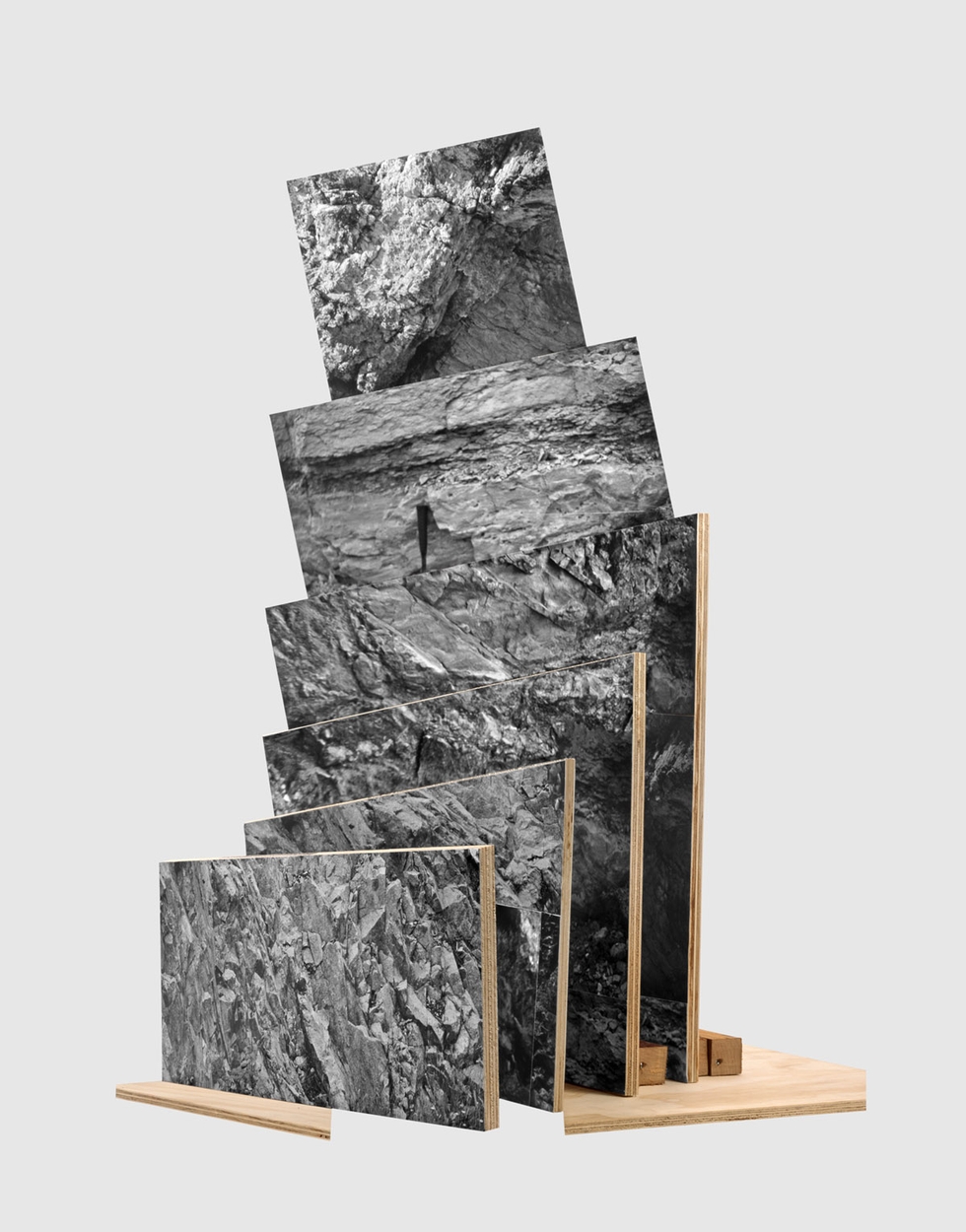
Photographer Jason Gowans happened upon a problem while shooting landscapes: "I stumbled into classic difficulties that occur when representing a space with multiple perspectives. I would go out into the landscape, be overwhelmed, come back into the city, and be confronted with images that were decidedly underwhelming. They conveyed none of the concepts I was interested in once they were bound to a rectilinear plane."
Undeterred, Gowans simply added another dimension to his work. Inspired by Western movie sets, Michael Snow’s La Région Centrale and particularly Robert Smithson’s Non-Sites, Gowans approached landscapes as a sculpture project. To create the physical objects, he built maquettes of found negatives, his own photos, and images from the internet. In "Five Landscape Modes," he pieces together the fragments to show multiple images, angles, and shadows.

Wednesday night fashion industry leader Fern Mallis spoke with thee Marc Jacobs in front of a packed audience at the 92nd Street Y on Manhattan’s Upper West Side as part of the Fashion Icons interview series. We laughed, we cried and we were inspired by the story of the 49-year-old designer overcoming setbacks in his health, addiction issues and bad press—and somehow prevailing.
Despite being the youngest designer to receive the coveted CFDA award in 1987, the name behind several successful clothing and accessories lines and the Creative Director at Louis Vuitton for 15 years, Jacobs appears remarkably down to earth. He even admits he's still insecure and questions whether he has “made it.”
That and he dropped hints about his upcoming Fall 2013 cosmetics line collaboration with Sephora.
Highlights from the talk below:
On Joan Rivers, who Jacobs’ father, talent agent Steve Jacobs, represented via the Morris Agency back in the day:
“I read in some article that she said, ‘If I knew that brat of Steve Jacobs was gonna grow up to be Marc Jacobs I would have been a lot nicer.’”
On creating the lower-priced, but equally cool, Marc by Marc Jacobs clothing line:
“It was our idea. Both Robert and I love things that are as honest as a cotton T-shirt for 12 bucks, just as we love a cashmere sweater, as we love a duchesse satin dress… it’s an opportunity for design. The integrity of design. You go at them all with the same passion, and it’s great to reach more people. You can’t do that with fur and sequins.”
On his love of tattoos:
“I have 33. My good friend who is an artist, he’s done most of [them]—Scott Campbell. My Favorite? A Jean-Michel Frank couch. And ask me ‘Why a couch?’ because everybody does. And there’s no reason; that’s exactly the reason.”
On why his critically acclaimed September 1992 Grunge Collection (that didn’t sell well at all, by the way) was his most memorable and liberating:
“It’s like the stars were all in line. I was very inspired by this certain group of girls who really were the antithesis of what was considered perfect, beautiful and glamorous. There was something awkward. There was Kate Moss... and photographers like Juergen Teller and Corrine Day, David Sims. There was music happening like Nirvana, Pearl Jam, Sonic Youth. I just felt like there were all of these forces saying the same thing. There was this angst and there was this sort of feeling like, ‘Something’s gotta change.’ And it wasn’t punk and it wasn’t hippie. It was a different kind of movement. There was something very honest, very real saying, ‘I’m perfectly imperfect and I’m just as glamorous as I want to be. I wear a flannel shirt and no makeup… and look as just amazing as you do.” So, I guess there was that ’FUCK OFF’ thing.”
On Jacobs’ desire to not handle the business side of things; in particular, his appointment at Artistic Director for Louis Vuitton in 1997:
“You’ll have to ask Robert [Duffy, Jacobs’ business partner since 1984]…. I don’t know. Lawyers start talking and I go zzzzzzzzz. If you want to show me 50,000 swatches of duchesse satin, I’m an attentive audience. But when lawyers start talking? Or an accountant? I’m not really good at staying within a budget.”
On his ulcerative colitis and becoming healthy after Sonic Youth’s Kim Gordon referred him to nutritionist Lindsey Duncan:
“I stopped believing in medicine and started believing in nutrition, and taking care of yourself. Lindsey Duncan said, ‘I’m going to change your life.’
I had to take a nap every day, I had to laugh every day, I had to sweat every day—go to the gym, do yoga, get out of the office. And I drank green kale, wheat grass, egg whites, juices. No white flour, no dairy from a cow, no caffeine for the first year at all. I was 100% compliant. It was incredibly hard. I cried.
I go to David Barton [gym] 5 days a week. 2 hours a day. There are a lot of really nice looking people there. I’m still insecure about the way I look… I have issues. But I feel better. And I have my colon.”
On the contents of his bucket list:
“What’s that?”
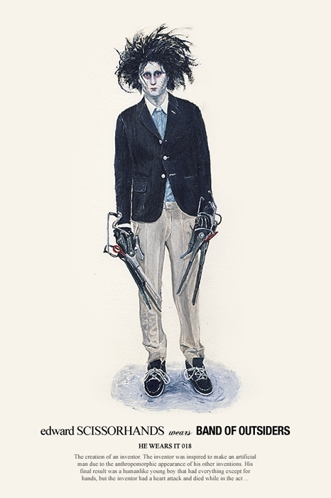
We're bonkers for the "He Wears It" series from Hong Kong-based designer/illustrator John Woo (not the director of Face/Off, or so he says). We just got word that Woo has released a new batch ("He Wears It 3") of his acrylic paintings of characters from Star Wars, Superman, Rambo and others sporting the most bloggable menswear. The new series includes a Clone Shock Trooper in Watanabe, Edward Scissorhands in Band of Outsiders and Superman in D&G. Better yet, he sells prints in his wooszoo Etsy shop, so we can proudly display our Woo wares at home.

Three designers in NYU's ITP program, Adrià Navarro and DI Shin, along with Ananya Mukherjee, have designed a desktop printer and browser extension that allows one to print the best moments of our online lives in the style of a Polaroid instant photo. The project is called the "Polaroid Cacher." After framing and "shooting" your screen with the Chrome browser extension, you can print the image to a Polaroid camera, actually the wireless printer built into the shell of an iconic Land Camera. By the way, even the printer pays homage to Polaroid. It uses the Polaroid-developed ZINK printing system.
What's significant about the project is that the designers aren't just using the Polaroid camera's form simply to add a level of kitsch or nostalgia to the modern habit of posting social media updates. Instead the Polaroid Cacher is designed to function in the same way as the original Polaroid instant camera: to make a physical, visual artifact from a fleeting moment or interaction. The designers aren't passing any judgments about the role of status updates or Tweets in our daily lives. The students believe digital updates are just as significant as instant photos were decades ago, but because they don't have a physical form, they can be easier to forget.


 Yesterday, The New Republic, the intellectually-engaging weekly on American politics and the arts published in Washington, D.C., revealed its new logo. Designed by new TNR Creative Director Dirk Barnett, the logo is meant to represent the publication across various platforms from the newsstand to the iPad. It stands tall and carries an authoritative bearing, but is decidely contemporary. Barnett chose Antenna by Font Bureau for the logo typeface. As you can read in this excellent interview, the logo is one facet of a total redesign that began in the digital realm, but will also encompass the print magazine, which reveals a new look later this month. We're anxious to see it all.
In the meantime, we asked graphic designer and Chunklet publisher Henry Owings what he thought of the logo and typeface. Never one to mince words, Owings weighed in.
Hey Henry, Any interest in weighing in critically on the new New Republic logo?
Hrm..... It seems very micromanaged. Having the "the" in the "N" is a bad call. Calling it a 'logo' is a stretch.
Right. How about the typeface itself? And how about compared to the current typeface on the mag?
The font itself I understand. They're just thinking iPad, mobile apps. But compared to where it was, it's drastic and almost.....too much?
It's micromanaged. It's people who think "Hey, how do we show we're new?"
Some idiot manager says "Let's get a new logo!" Horrible way to keep creative busy, but not productive.
Well, it's part of a total top to bottom redesign.
Which again, I defend. it's all like "Hey, let's do this for iPad" but the logo, wow, overthought.
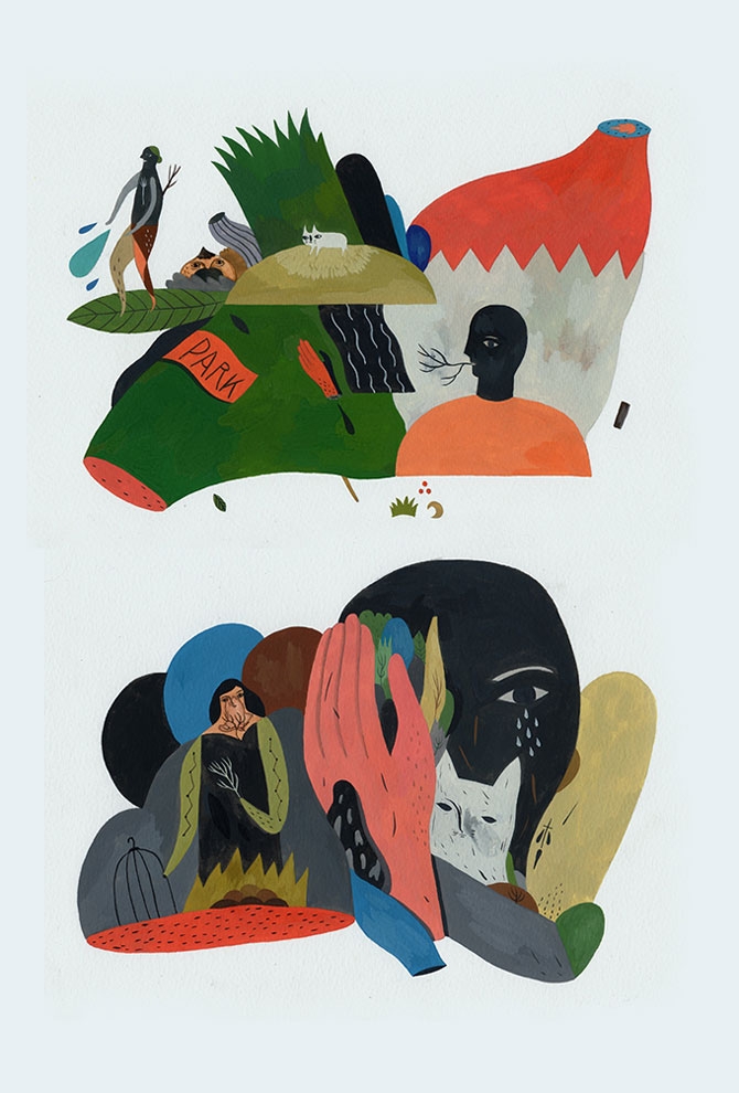
Illustrator Inca Pan's work primarly appears in the fiction section of a Taiwanese newspaper, but his illustrations are so visually striking they easily stand without their accompanying stories. Pan's images are folkloric and character-based, and his distorted figures always seem to be in the middle of a peculiar relationship with the natural world or one another. He has a knack for condensing the tension of a story into a compelling image, and he's got the best anthropomorphized woodland creatures this side of a Wes Anderson feature. Even if the conflicts he depicts deal with potentially serious struggles, or the banal tasks of everyday life, he uses delightful color and an endearingly accessible style to keep things from ever getting too gloomy. In addition to newspaper illustrations, he's also a gallery artist and currently has work in the group online exhibition, "Strangers In A Strange Land." We're not-so-secretly hoping he gets the chance to work with animation sometime in 2013.
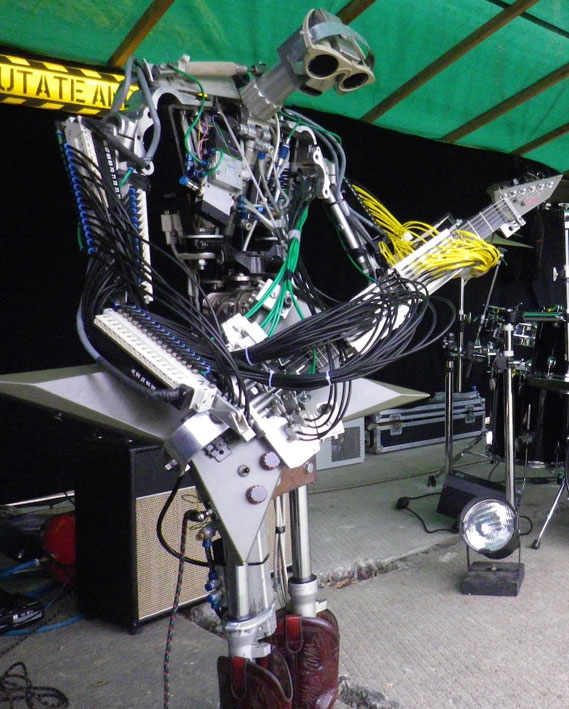
Remember these names: Stickboy, Fingers, Bones—all members of Compressorhead, the first real robot metal band—or in their words, "the world's heaviest metal band." Naturally, the rock trio's covers of Pantera, AC/DC and Motörhead are becoming YouTube sensations with us "meatbags." Quick bio: Four-armed drummer Stickboy was the first member and plays a 14-piece kit with double kick. Fingers features 78 fingers on the fretboard. And Bones, the most recent member, plays bass more precisely than either predecessor. Before you chuckle heartily, consider that the six-ton band is touring Australia through the end of the month.
Compressorhead plays "The Ace of Spaces."
Compressorhead plays Pantera.