
Brooklyn designer Kyle LaMar created the brand identity for Rebels in Paradise, which happens to be the name of a book on the LA art scene of the '60s as well as a show at NY gallery NYEHAUS. LaMar's brand concept for the gallery show puts it on the same plane as that of a clothing line, coffee house or whathaveyou—a clever way to get our attention, we tend to think.
Portland-based Alex Steckly is relentlessly creative. Upon walking into his studio loft you cross a threshold into his whole world, a wide and bright working space with a couple simple corners carved out for living, into what looks and feels like the surprisingly cozy diary of his brain spilled out onto the walls in various stages of completion.

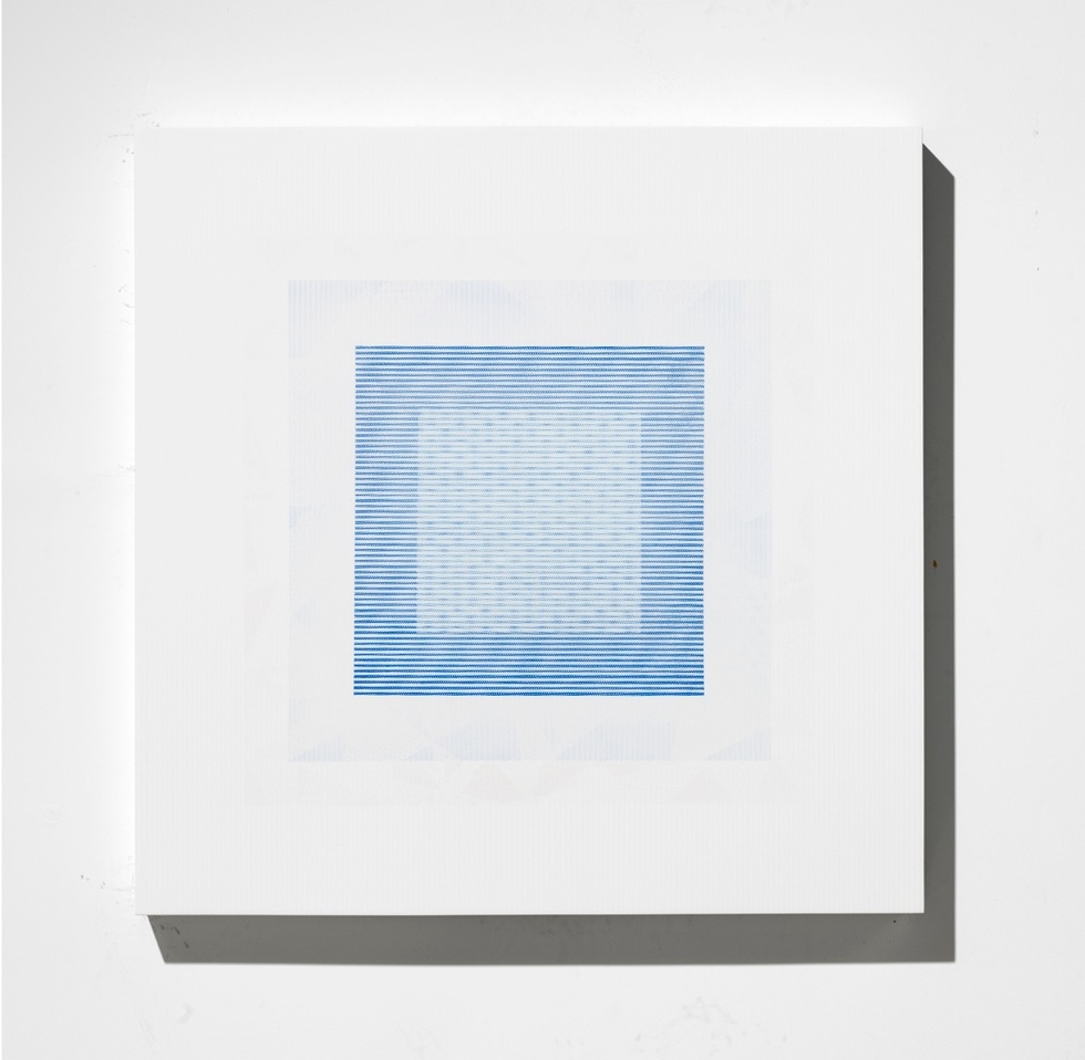
His process starts with a loose wash in oil, keeping canvases visceral, allowing the colors to be almost aggressively bright, building organic layers and letting gravity pull the pigments around whichever way it wants. From there he begins a long meditative process of weaving a mask of tape into precise shapes and patterns in a process he describes as nearing sculptural, allowing him to work and approach the painting in a physical manner. Opaque layers of tone on tone automotive enamels in alternating finishes are then spayed on, as the masks are stripped away to form patterns. Working strictly in daylight, his timeframe for each day’s studio time is limited, and his process can sometimes take months as he lives amongst his works and allows their growth to come at a natural pace.

Steckly’s paintings are deceptive; standing five feet back from one it’s tempting to see the canvas as a silky smooth surface with barely undulating colors and textures. But with closer inspection you start to become aware of the almost overwhelmingly elaborate surface, the sharp lines fade with a soft feel that carries a reminder of a grainy film stock or an image shown just slightly out of focus. Steckly’s obsession with light and texture reveals itself slowly, the complexities unfurling the longer you allow yourself to stand and be drawn in to the abstract images, discovering tiny variations amongst the strict order in the geometric shapes. Rich velvety textures zap the light and look dead flat while the luminous sheen of the enamel lines strike hard and vibrate lying next to them. Steckly’s voice is heard loudly and clearly through his work, through the repetition, exploration, and controlled, but obvious, joy in the colors and patterns he weaves into his paintings.
See more of his work at alexsteckly.com
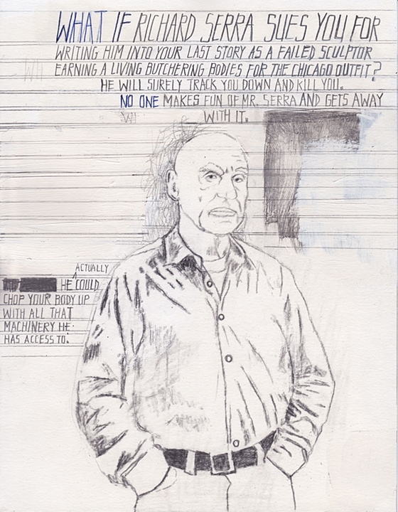
Chicago artist Deb Sokolow seems to be more influenced by Thomas Pynchon than by the Old Masters, and consequently it’s her blend of surreal humor and conspiracy theories that makes her art so refreshing. We love how Sokolow’s large, mostly paper-based works draw us into the text-based narrative of the pieces. Her works are like a giant, meandering comic book that place the viewer (“You”) into the narrative itself. The stories are always based on some stray fact or conspiracy theory—an anecdote from Willem de Kooning’s biography, the strangeness of the Denver International Airport—but the narratives take wild turns while collapsing fact and fiction.
Sokolow’s work is as visual as it is textual, and half the fun is in the irreverent asides addressed to the viewer. "Understanding Scarface" (2005) functions as a paranoid riff about how the film Scarface could be connected to Fidel Castro. We dig the homemade element of Sokolow’s art, too. Some pieces are over 40 feet long and held together by tape, filled with scratched out text, eraser marks, and additions. Sokolow’s hare-brained stories might try to convince us that Richard Serra is a mob hit man in "Dear Trusted Associate" (2008-2009), but her generous sense of humor is far from the paranoid theorists who inform her work.
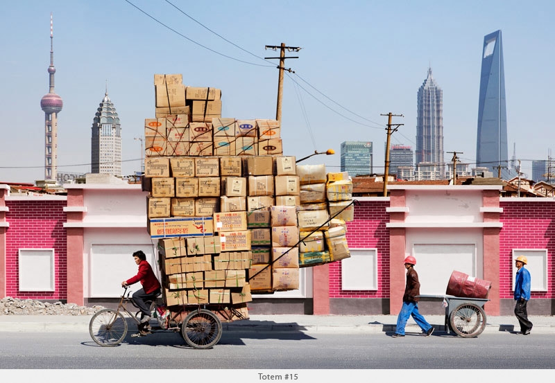
Before you even ask, the answer is "Yes, the loads these bicyclists of Shanghai carry are real." Photographer Alain Delorme shot them during an artist's residency in Shanghai, one in which he spent countless days biking and photographing the ordinary working folks of his temporary city of residence. We love the contrast of the modern and mechanical, the gritty and the sunny.
See more of the photographer's work at alaindelorme.com.
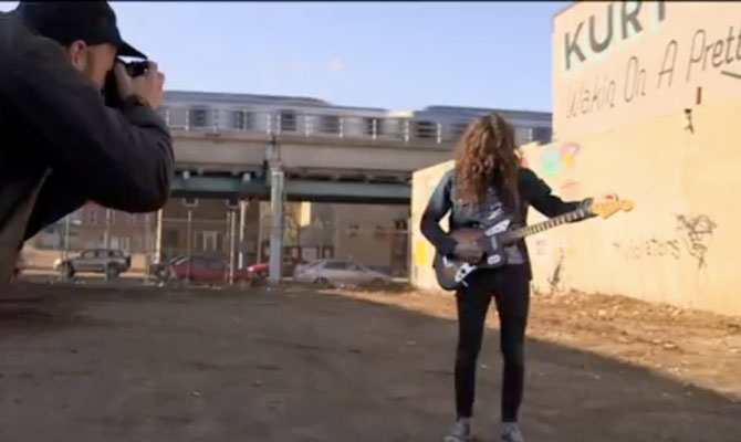
Talk about a perfect collaboration. To create the cover image and simultaneously promote the new album Wakin on a Pretty Daze from Philly's Kurt Vile, artist Steve Powers painted a giant wall-sign in the home of the Liberty Bell. The design by former graffiti writer Powers even draws on the tunes themselves, giving it some extra no-BS legitimacy for Philadelphians. Check out the video for more insight on the collaboration and some great views of work by Powers, then visit firstandfifteenth.net for more signs by Powers.
We don't know much about Bryan Olson. He's a collage artist based in North Carolina, that's about it. But his sci-fi collages excite our imaginations. They have the epic scale of the great Hipgnosis-designed album covers of the '70s, and some of the pop contrast of the now classic Guided By Voices collage art sleeves. Whatever the case, his images make us want to finish that sci-fi novel we've been secretly writing or start that prog band.
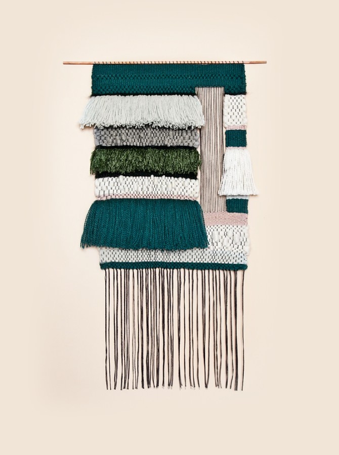
If you're like us, your bare walls are sorely in need of a 2013 update, perhaps some color and texture. These modern woven pieces by Mimi Jung are a beautifully composed version of something you might have made in grade school—and just the thing to enliven a space. Naturally, they're selling quick. To get dibs on Jung's new releases, you'll need to get on the Brook&Lyn Art Objects email list. To see how Jung makes the pieces, follow her on Instagram.
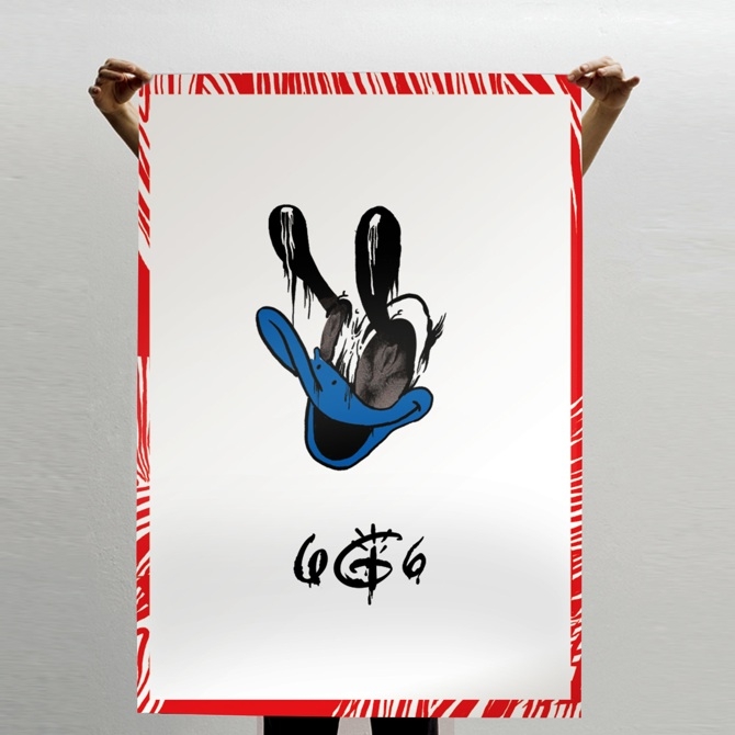
You might known Brazilian Gustavo Bockos AKA Vokos for his exuberant, graffiti-influenced art direction, fashion photography, and illustration work, but we think his "Dirty Land" series, opening tomorrow at Empty Frame in Oslo, Norway is more memorable.
As the name implies, Vokos delves into the darker reaches of Walt Disney's adult mind, playing with a theory he discovered in research that Walt himself infused those classic films with secret, somewhat unsavory messages. Whatever the man was up to, the collision of Mickey and adult content has a jarring appeal.
The opening is February 20, 7pm and followed by a talk at 8pm with Vokos and various guest artists. There's a Facebook event if you need more info.
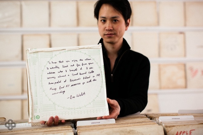
Artist Rutherford Chang has amassed quite a record collection. Sure, hardcore vinyl junkies might sniff at the size, 693, but they would have to be as impressed as we are by the obsessive lack of variety. Chang's collection consists of 693 copies of the first pressings of The White Album by the Beatles—some picked up for just a buck. Many of the album covers (originally designed by Richard Hamilton as either a blank canvas or a stark take on modern minimalism) are worn and naturally distressed, or customized (sometimes beautifully) by their owners past.
Dust & Grooves has a fantastic photo gallery and complete interview with Chang on the piece.
"We Buy White Albums" is showing at Recess (41 Grand St) in New York's SoHo through March 9. Chang is digitally recording every album he plays (and scanning the cover and gatefold covers) during the show and pressing a new double album of the layered version once the show concludes.
Visit dustandgrooves.com for more info.
In a typewritten letter, Lenka Clayton announced why she started her conceptual Artist Residency In Motherhood:
"I find now that many aspects of the professional art world are closed to artists with families. Most prestigious artist residencies for example specifically exclude families from attending…"
Her artist's statement finishes:
"I will undergo this self-imposed artist residency in order to fully experience and explore the fragmented focus, nap-length studio time, limited movement and resources and general upheaval that parenthood brings and allow it to shape the direction of my work, rather than try to work "despite it".
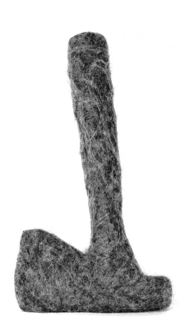
Since beginning her residency in September, Clayton has produced around 16 works and maintained an extensive studio diary. True to her original mission, her work explores the duties of motherhood including a sculptural proposal about child-proofing a curator's office, an archive of items found in babies' mouths, a pair of baby pants made from the child's great-grandfather's pants, and a collection of potentially dangerous items rendered in soft fabric.