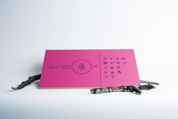
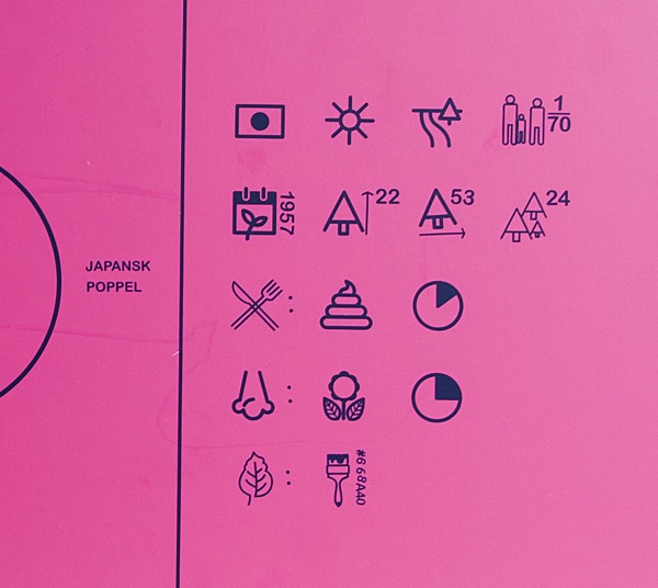
Designers Anders Wallner and Gustav Karlsson wouldn't have chosen such bright purples and pinks for their system of signs and symbols for the Gothenburg Arboretum if they wanted the signs to disappear. Instead, the bright colors reveal the signs almost instantly, and the symbols provide a relatively small amount of data about the surrounding area in the simplest way possible. Opting for symbols instead of verbal descriptions also adds flexibility for translating the data into different languages, as a simple key can be printed in infinite translations.
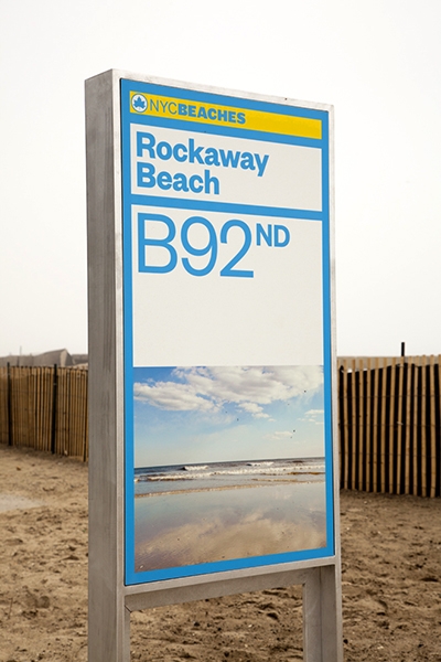
After sustaining extensive private and public property damage following Hurricane Sandy last fall, the preliminary restoration of NYC's beaches was completed just in time for a Memorial Day opening. Part of that restoration was the installation of a new highly visible, bright yellow and blue branding identity from Pentagram. The rebranding is a complete overhaul, and gives a cohesive visual theme from the street signs to the bathrooms.
Read more about the branding and restoration on Pentagram's site, and be sure to check the Parks Department Beaches site before making a trip to avoid any temporary construction closures. 


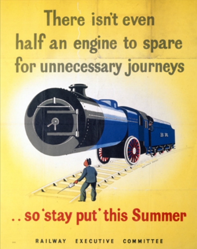
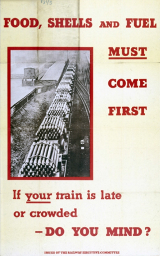
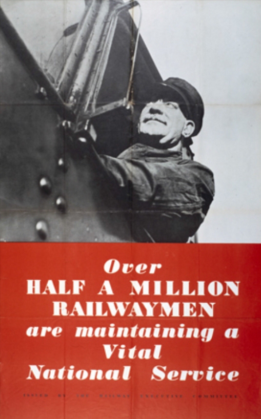
During the height of WWII, the English government wanted to discourage civilians from using trains for leisure travel. Instead of implementing restrictions, they launched a poster campaign with the intention of guilting potential vacationers. While some of the posters are innocuous boasting ("Over Half A Million Railwaymen Are Maintaining A Vital National Service") others are much more passive aggressive than your average PSA ("Now that our men have landed on enemy soil surely no one will endanger their supply of vital munitions by taking unnecessary journeys.") [via Retronaut]
Here in New York City, the MTA regularly reminds us subway riders of certain dangers in the system. Using posters featuring simple Helvetica text and sometimes stick figure illustrations, they warn us against things like riding outside the train, and venturing onto the tracks.
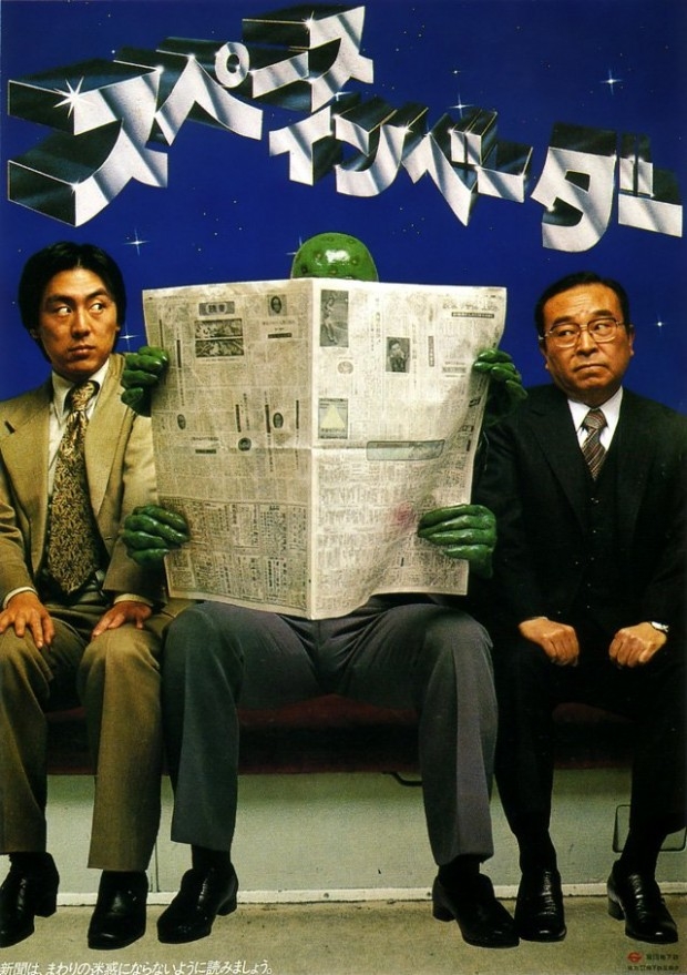
From the mid-'70s through the early '80s, the Toyko subway system also used posters to remind riders of the rules, except these featured super heroes, Hitler, aliens, Santa Claus, even Jesus Christ. The posters warned against more specific, but possibly annoying, behavior. Aliens told riders to not read newspapers too widely, Hitler and Charlie Chaplin illustrated the evils of spreading your legs too far apart while sitting, Jesus told you not to forget your umbrella, and Santa Claus reminded riders at the holidays not to get drunk and pass out on the train. [Images and translations from Retronaut via WFMU]
"Don't forget your umbrella." (October 1981) The text at the top of this poster—which shows Jesus overwhelmed with umbrellas at the Last Supper—reads "Kasane-gasane no kami-danomi" (lit. "Wishing to God again and again"). The poster makes a play on the words "kasa" (umbrella) and "kasane-gasane" (again and again).
"The Seat Monopolizer" (July 1976) Inspired by Charlie Chaplin's The Great Dictator, this poster encourages passengers not to take up more seat space than necessary.
"You've had too much to drink." (October 1976) This poster of a drinking Santa is addressed to the drunks on the train. The text, loosely translated, reads: "I look like Santa because you've had too much to drink. It's only October. If you drink, be considerate of the other passengers."
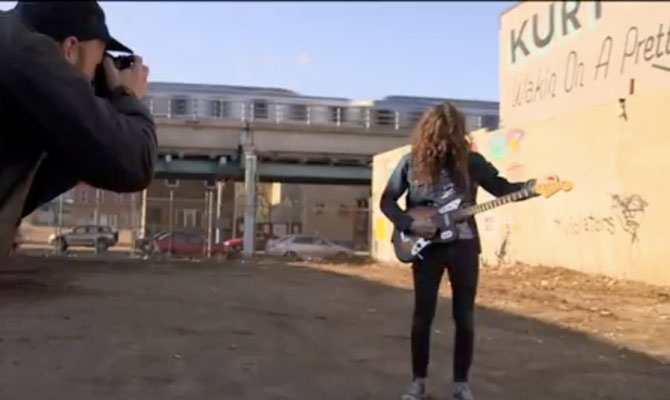
Talk about a perfect collaboration. To create the cover image and simultaneously promote the new album Wakin on a Pretty Daze from Philly's Kurt Vile, artist Steve Powers painted a giant wall-sign in the home of the Liberty Bell. The design by former graffiti writer Powers even draws on the tunes themselves, giving it some extra no-BS legitimacy for Philadelphians. Check out the video for more insight on the collaboration and some great views of work by Powers, then visit firstandfifteenth.net for more signs by Powers.
