
Fans of RAW artist Charles Burns may or may not know that The Believer magazine published the artist's work on covers between 2003-2013. Burns created the images of ink on paper in a strict format of 6x6. His distinctive black lines communicate sophisticated textures and lighting in the portraits. This summer, Adam Baumgold Gallery is featuring the many portraits Burns made for the magazine as well as a before-and-after series of works from comic Black Hole.
Over 300 drawings of artists, musicians, animals, and comic and fantasy characters as well as historical figures are included in the show. But today, we're focusing on the musicians Burns drew in yearbook style.
"Cover Portraits for The Believer 2003-2013 + Before & After Portraits from Black Hole" runs through July 26 at Adam Baumgold Gallery, NYC.

Stephen Malkmus
 Q-Tip
Q-Tip Kathleen Hannah
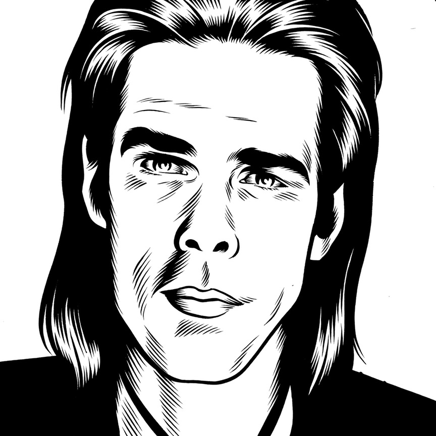 Nick Cave
 Liz Phair
 Devendra Banhart

The MOCAtv web series "The Art of Punk" we told you about is underway and the first installment on Black Flag and Raymond Pettibon is up. Pettibon's album art and logo were key bits of iconography for his brother Greg Ginn's hardcore act in the '80s. Pettibon's often captioned, often disturbing hand-drawn black and white images undercut the return to a golden age that the Reagan years promised mainstream America. Pettibon's work also turned up on Minutemen albums, and later Sonic Youth's major label record Goo. As great and lasting as Pettibon's work (he also named the band, we learn) has been on American punks, his Black Flag logo remains a masterpiece of underground artwork, expressing an attitude in a visual code that's both rebellious, mysterious, and incredibly powerful. The video features Keith Morris, Henry Rollins, and Flea as well as Pettibon himself talking about the Black Flag band name, logo, flyers, and album art.
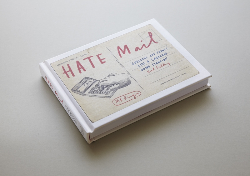
Last year, someone in the UK opened their mailbox and found a postcard that read only, "Fuck You and Fuck Your Cat," with an image of an expertly illustrated, and very sad, cat. While that aggression might be a shocking experience without context, the card was actually part of the illustrator Mr. Bingo's "Hate Mail" project.
The idea for the project came about after Mr. Bingo sent a drunken tweet that offered the first person to reply an insulting post card. In the first minute, about 50 requests came in. To keep up with demand he set up a store on his website where you could buy an insulting card or send one to a friend. About 400 pieces of hate mail later, he collected some highlights in a book called Hate Mail, and will exhibit 250 of the cards at a new show in London. If you're brave enough, and you buy a copy of his book at the show, he'll write you a personal insult on the spot. [via Ignant]
Mr. Bingo's "Hate Mail" show will open at KK Outlet in London on June 6. His book, Hate Mail, is available now. 


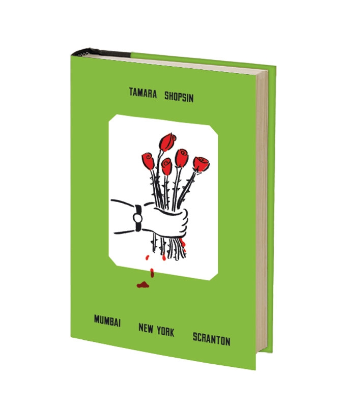
Originally drafted as part of a natural cure for insomnia, Tamara Shopin's new memoir, Mumbai New York Scranton, is part travelogue, part personal essay, and part creative journal. Naturally, Shopsin's day jobs enter the book in a big way. She spent formative time at her family's eponymous (and exclusive) Shopsin's store and restaurant, and received lessons in creative persistence and repetition while working in a printer repair shop. Shopsin keeps the photos in the book in the family as well: she sequenced the images which were shot by her husband Jason Fulford.
Grab a copy of Mumbai New York Scranton in the Nothing Major shop.
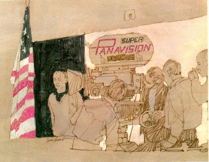
English illustrator Brian Sanders, the veteran illustrator behind the new "Mad Men" promo that circulated earlier this week, took an interesting assignment in the late 1960s. After submitting some concept collages, Sanders was chosen to be the on-set illustrator during the filming of Stanley Kubrick's 2001: A Space Odyssey. Apparently Kubrick didn't want any cameras around that weren't his own during the production, so he compromised with the studio by allowing Sanders to paint and draw what he observed for two days a week.
See more of Sanders' work from the shoot on Today's Inspiration.
Read up on Sanders' "Mad Men" promo.


Jasper Rietman's illustrations look great on the printed page. Actually, they look great on the screen as well. His work is bold and colorful, and his cartoon and comic book-inspired aesthetic has a way of making the images' meaning almost immediately apparent. Rietman's work with color has a lot to do with this immediacy. Many of his illustrations feature a solid color background, which gives them a weight suitable for a web or magazine layout.
In addition to his editorial work for clients like The New York Times and Bloomberg Businessweek, he also maintains a triptych, wordless comic series aptly called TRI/P.

Quayores is a collaborative illustration project organized by French illustrators Antoine Marchalot, Ophélie Bernaud, and Quentin Duckit. Their mission statement: "A picture, you click it, it's explained." Each post features a titled illustration, and clicking the image takes you to the French Wiktionary entry for the word.
But there's much more at work here than a charming illustrated dictionary. Each image incorporates surprising parts of each definition. For example, the "gastronomy" illustration depicts a solider attacking an enemy in the stomach with a bayonet, playing on the definition of the word broken down as "stomach," with a -tomy suffix, which originally meant "to cut." We've seen a similar project in the past from the Illustrated Etymology project, who also took a humorous look at word origins.
Follow Quayores on Tumblr.
You might known Brazilian Gustavo Bockos AKA Vokos for his exuberant, graffiti-influenced art direction, fashion photography, and illustration work, but we think his "Dirty Land" series, opening tomorrow at Empty Frame in Oslo, Norway is more memorable.
As the name implies, Vokos delves into the darker reaches of Walt Disney's adult mind, playing with a theory he discovered in research that Walt himself infused those classic films with secret, somewhat unsavory messages. Whatever the man was up to, the collision of Mickey and adult content has a jarring appeal.
The opening is February 20, 7pm and followed by a talk at 8pm with Vokos and various guest artists. There's a Facebook event if you need more info.
Despite being an English illustrator, and living and working in Cambridge, Thomas Matthews has a fascination with the American suburbs. His interest doesn't stem from a scarringly dull trip there as a child, but from characters in John Cheever and Raymond Carver stories and the prolonged anxious purgatory they live in.
Matthews' figures aren't far off from the middle-aged protagonists of American literary classics: they're presented at a moment of crisis. But, in broader terms, Matthews' minimal drawings and paintings focus on the banal. His simple composition allows things like subtle textures and strong colors to deliver the dismal personalities he's illustrating. The images are far from miserable; however, there's always a touch of black humor as well.
Julian Glander's work rarely stands still. The Detroit native's illustrations are hyperactive in the best way possible. Now living and working in Brooklyn, he uses almost exclusively bright colors and bold simple figures to give his animated GIFs, videos, posters, and branding work a distinctive look and humor. Glander's earliest design work was meant for T-shirts. Since then his subjects have included everything from Mountain Dew flavors to bears in headlocks and bummed-out, isolated humans. No matter the subject, Glander gives everything an ecstatic, clean look that betrays the influence of classic 8-bit animation.