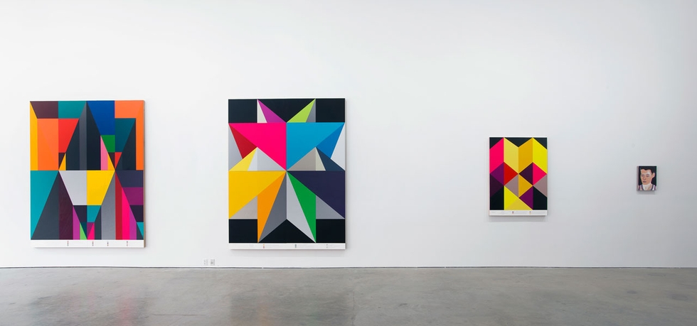
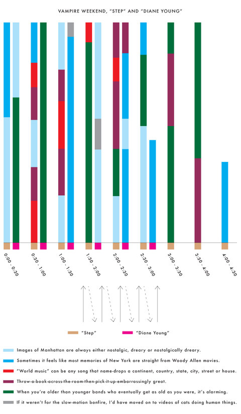
In recent years, it has been possible to see the data-driven work of Andrew Kuo in art galleries as well as the pages of the New York Times. His meticulously illustrated charts vary in purpose: some recounting the events of his day, while others dissect new music from Vampire Weekend and Odd Future. His neon-colored, overstated geometric patterns often represent linear time, telling stories in a compacted and distorted timeline. His annotations tie emotions, statistics, and opinions to the images, making sense of rigid patterns and intersecting lines.
Andrew Kuo's solo show You Say Tomato was held at New York's Marlborough Chelsea Gallery last month. Follow Andrew Kuo on Tumblr and Instagram. Or search his NY Times charticles online.


[images via New York Times]

Jasper Rietman's illustrations look great on the printed page. Actually, they look great on the screen as well. His work is bold and colorful, and his cartoon and comic book-inspired aesthetic has a way of making the images' meaning almost immediately apparent. Rietman's work with color has a lot to do with this immediacy. Many of his illustrations feature a solid color background, which gives them a weight suitable for a web or magazine layout.
In addition to his editorial work for clients like The New York Times and Bloomberg Businessweek, he also maintains a triptych, wordless comic series aptly called TRI/P.
Commercial Type's Berton Hasebe and Christian Schwartz have teamed up for Schnyder, a new serif display typeface for the 2013 redesign of T, the New York Times Style Magazine. While Schnyder is the sixth custom typeface they've created for the mag, it's the first they have co-designed.
Inspired by a piece of pointed pen lettering of Swiss origin, the typeface itself comes in two weights and three widths. Unusually, the stem weights in each weight are identical across the widths which allows the widths to mix freely in headlines, which will be fun for editors and designers. The lowercase version draws from turn-of-the-century German typefaces.
The type palette for T also includes Graphik and some styles from the X Condensed width. The text face is Imperial, the same found in the main NYT news sections.