
The MOCAtv web series "The Art of Punk" we told you about is underway and the first installment on Black Flag and Raymond Pettibon is up. Pettibon's album art and logo were key bits of iconography for his brother Greg Ginn's hardcore act in the '80s. Pettibon's often captioned, often disturbing hand-drawn black and white images undercut the return to a golden age that the Reagan years promised mainstream America. Pettibon's work also turned up on Minutemen albums, and later Sonic Youth's major label record Goo. As great and lasting as Pettibon's work (he also named the band, we learn) has been on American punks, his Black Flag logo remains a masterpiece of underground artwork, expressing an attitude in a visual code that's both rebellious, mysterious, and incredibly powerful. The video features Keith Morris, Henry Rollins, and Flea as well as Pettibon himself talking about the Black Flag band name, logo, flyers, and album art.
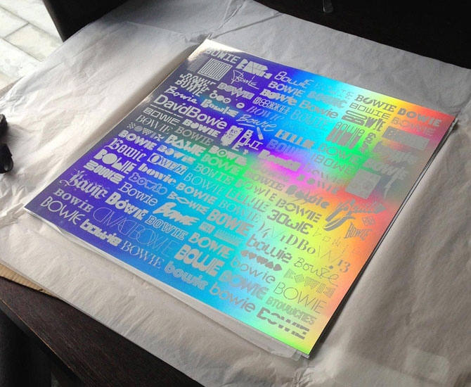
David Bowie is having quite a good 2013. And having recently discovered his scene in the 1981 German junkie film Christiane F. we're as obsessed as ever. We’re not alone. British designer Blam (AKA Mark Blamire) takes that OCD admiration to epic proportions with the "Changing Faces of Bowie Print" (2013). An array of 101 type styles, logos and symbols inspired by the former David Jones screen-printed onto 240gsm Mirri rainbow holographic paper, this 500x500 limited release print showcases the work of some very reputable artists, designers, and publications who are just as clearly enamoured of the legendary rocker. Pentagram, Stockholm Design Lab, Crispin Finn, Monocle, and Wallpaper are among the contributors. The print has been created exclusively for the David Bowie Is exhibition at London’s Victoria & Albert Museum which opens March 23.
"The Changing Faces of Bowie Print" is available for pre-order for £45 at vandashop.com.
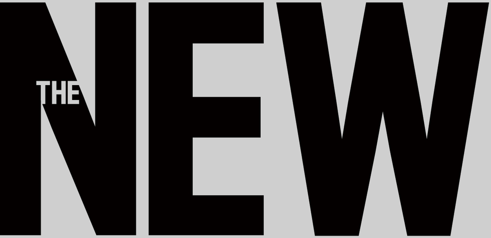

 Yesterday, The New Republic, the intellectually-engaging weekly on American politics and the arts published in Washington, D.C., revealed its new logo. Designed by new TNR Creative Director Dirk Barnett, the logo is meant to represent the publication across various platforms from the newsstand to the iPad. It stands tall and carries an authoritative bearing, but is decidely contemporary. Barnett chose Antenna by Font Bureau for the logo typeface. As you can read in this excellent interview, the logo is one facet of a total redesign that began in the digital realm, but will also encompass the print magazine, which reveals a new look later this month. We're anxious to see it all.
In the meantime, we asked graphic designer and Chunklet publisher Henry Owings what he thought of the logo and typeface. Never one to mince words, Owings weighed in.
Hey Henry, Any interest in weighing in critically on the new New Republic logo?
Hrm..... It seems very micromanaged. Having the "the" in the "N" is a bad call. Calling it a 'logo' is a stretch.
Right. How about the typeface itself? And how about compared to the current typeface on the mag?
The font itself I understand. They're just thinking iPad, mobile apps. But compared to where it was, it's drastic and almost.....too much?
It's micromanaged. It's people who think "Hey, how do we show we're new?"
Some idiot manager says "Let's get a new logo!" Horrible way to keep creative busy, but not productive.
Well, it's part of a total top to bottom redesign.
Which again, I defend. it's all like "Hey, let's do this for iPad" but the logo, wow, overthought.