Founded by the Italians Luca Bendandi and Matteo Cossu, SHS Publishing has a deceptively nondescript name, a roving area of operation, and almost microscopic print-runs. The small publishing house/collective of authors based in Berlin specializes in art, graphic design, typography, and architecture books and believes making small books for niche markets makes it more likely to get to the trends first.
Small means nimble for the publishers, who have a passion for ink on paper. "We don't believe in flooding bookshelves with a million copies. Isn't it better to print less and get them all on the right bookshelves, where they can be read, lived, and consumed?" writes Cossu.
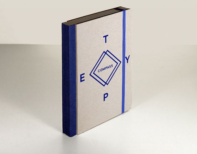
The company has an eclectic catalog. One Gear is about fixed gear bikes, while Studiospace is concerned with architecture practices, office space, and work in general. GrAphorisms features 59 insights set in innovative typography. And Totem shows off the handcut shapes of PIRO, an Italian artist favoring motifs inspired by the iconography of ancient religions. Printing methods vary by publication. "Depending on the printrun we'll either use conventional offset or resort to a low-fi Duplo that we have in-house," Cossu explains. Totem was made on the Duplo 63s printer (a "poor cousin" to the Risograph, he says) and handbound.
ToTeM from Roberto López Mélinchon on Vimeo.
It might be young and small, but SHS hasn't wasted time. Last year, it organized "Fahrenheit 39" in Barcelona, a mini-festival celebrating independent print culture featuring workshops and live music.
With "Fahrenheit 39"-type events in mind, SHS has advice for other would-be small publishers: The work isn't done when the books come off the press. "Once finished, we always try to take the book by the hand and accompany it out, organizing events, building a community, and including our readers in the discussion generated by the publication."
When Evangelia Koutsovoulou moved from rural Greece to Milan, Italy her cooking suffered. She realized city cooks didn't have access to the same herbs founds in the mediterranean country side, so she launched a Kickstarter campaign to start distributing fresher Sage, Bay Leaves, Oregano, and Thyme.
But because she's not the biggest fan of cameras, and Kickstarter campaigns require a video element, she commissioned friends to tell the story of her two-year search for the best herbs in a simple but impressive animated short. Koutsovoulou also designed a strong branding identity for the herbs: each package is shipped in a small foldable bag with a cleanly designed name and information card affixed to the front. A tiny yellow sun at the bottom of the card contrasts the blue sans serif type, and along with the market-style bag, connotes freshness.
Pledge some money and become an official "Oregano Tester"
Put simply, the colors in Nadja Staubli photos are surprising. Whether it's an image of a Martian red sky above an indoor pool, or a three-color pastel mansion shot from the parking lot, Staubli finds colors and shapes that don't seem of this world. Instead her collections read as a kind of happily distorted vacation diary that pays more attention to unexpected patterns in swimming pools, golf courses, and highways than documenting sights and people. [Via It's Nice That]
from Community
from Urtropica
from P.U.R.P.L.E
While it might be mid-May, it still gets a little chilly in Los Angeles at night. In an effort to help those stranded without a sweater and sell a few ponchos, the L.A.-based poncho company Señor Tyrone just launched a "Poncho Express" program that promises local delivery of one of its fine, made-in-the-Andes ponchos in under an hour with only a simple tweet. To get your hands on an emergency poncho, all you have to do is send a tweet to @senortyrone bearing the hashtag #ponchoexpress with your location. Delivery is free, and the messengers accept cash and credit. And the good news for cold folks in New York is that a similar service is planned for a fall launch.
Before you get stuck poncho-less out in the cold, head to Señor Tyrone to see if you're in the delivery zone.

After the end of World War II, a number of writers and creatives left home in Europe and immigrated to the United States and Canada. One group of Latvian writers and artists, who set up new lives in Canada, launched a magazine called Jaunā Gaita, or "The New Course," to create work about their unfamiliar surroundings. While the content was notable on its own, the magazine also developed a cohesive tone with their cover art for each issue, typically featuring a bold design and rarely more than three colors. The magazine is still active in the increasingly rare print format, and although printing technology has made full color images commonplace, Jaunā Gaita often still opts for the simplicity of a two-color design.
Check out the Jaunā Gaita archives to see even more covers and features.