
The excellent design blog Thisispaper is now available, wait for it, in paper. We queried editor Zuzzana Gasior on the new print mag.
What is Thisispaper for those unfamiliar?
As Thisispaper we are now running two different, but interweaving projects. Thisispaper Magazine is where we share our inspirations and obsessions from multiple fields of design. Our roots are in the digital world but we find print equally alluring. We started off as an online magazine and continue running it, by we have recently ventured into print and released Thisispaper Magazine Inaugural Issue in paper and ink. Thisispaper Shop is our second, younger brainchild. It’s an online store with hand made products.
Which designers have been selected for the issue, how did you decide who to include?
The full list of featured designers is as follows: Studio Glithero, Faye Toogood, Formafantasma, Phoebe English, Nina Donis, Feilden Fowles Architects; photographers Kanoa Zimmerman and Marcel van der Vlugt; artist Anouk Griffioen.
The selection process was simple. We decided to feature designers whose work we’re impressed by and who have a strong conceptual background behind their work. We were particularly curious to find out about their creative process so we chose the ones that put emphasis on the process, not just the finished product.
Why do you think a print publication was necessary?
As you will quickly discover when you open the magazine, some of the interviews are quite massive, and were intended to be so from the start. We wanted to explore the designers’ creative processes in depth. Such content lives better in a tangible book that online. While surfing the web, people focus on image and have a short attention span and it’s not the best environment to present content that requires a careful reading. Plus we’re really drawn to the beauty of a printed object, the texture of paper, smell of paint and so on.
Thisispaper.com was an ironic name, but now it has a literal meaning.
Good point. Since Thisispaper is an umbrella term for both the site and the magazine, it now means that digital and print can coexist without undermining one another’s position. This is due to the fact that they are good for different things. The content that we feature online is much more image-based, while for print we look for something that requires more time and effort to absorb.
You're based in Warsaw, does that surprise a lot of your readers?
It does come as a surprise sometimes, but mostly to people in Poland. When they see Thisispaper they don’t expect it to be a Warsaw-based endeavor (love the word).
The print publication is a very limited run. Why is that? Do you hope to expand? Is it harder or easier to do a print magazine in Poland?
The print publication is not a limited run. We will print as many copies as there is demand for. 250 is the minimal number that we need to reach in the pre-order period to print the magazine, but there is no maximum limit on how many copies we will print. That said, it’s hard to imagine a situation when Thisispaper is available on every newsstand
Nowadays when distribution mostly happens online, printing a ad-free magazine is a comparable experience in Warsaw and everywhere else. It would probably be harder for us, though, is we were trying to attract sponsors.
Where can one get the print magazine?
Online at thisispapershop.com/product/thisispaper-inaugural-issue or soon at some local stores worldwide.
Do you accept contributions and pitches?
We do. See here for possible ways of working with us: welcome.thisispaper.com

Ask anyone how they're enjoying the New York Art Book Fair and you'll likely get a response along the lines of, "It's great, but I'm overwhelmed." That's not a knock at the fair's organization, which was excellent, but instead a reaction to the sheer size of the event, both in the number of exhibitors and attendees.
Despite the evidence that the fair is primarily a "buyer's market," as confirmed by curator Shannon Michael Cane in our preview interview last week and the collectors leaving with bags full of books, the event manages to feel not entirely driven by pure commerce. No publisher makes a hard sell to those flipping through books, and while you'd surely be missing out on some great titles, it's entirely possible to get a lot out of the fair without making a purchase.
Those who braved the crowds and impressive roster of exhibitors saw plenty of Nothing Major favorites including Edie Fake, the Packet Biweekly Team, Gottlund Verlag, Nieves, Rollo Press, Bad Day, and Kayrock Screenprinting.
Check out our photos from photographer BJ Enright.
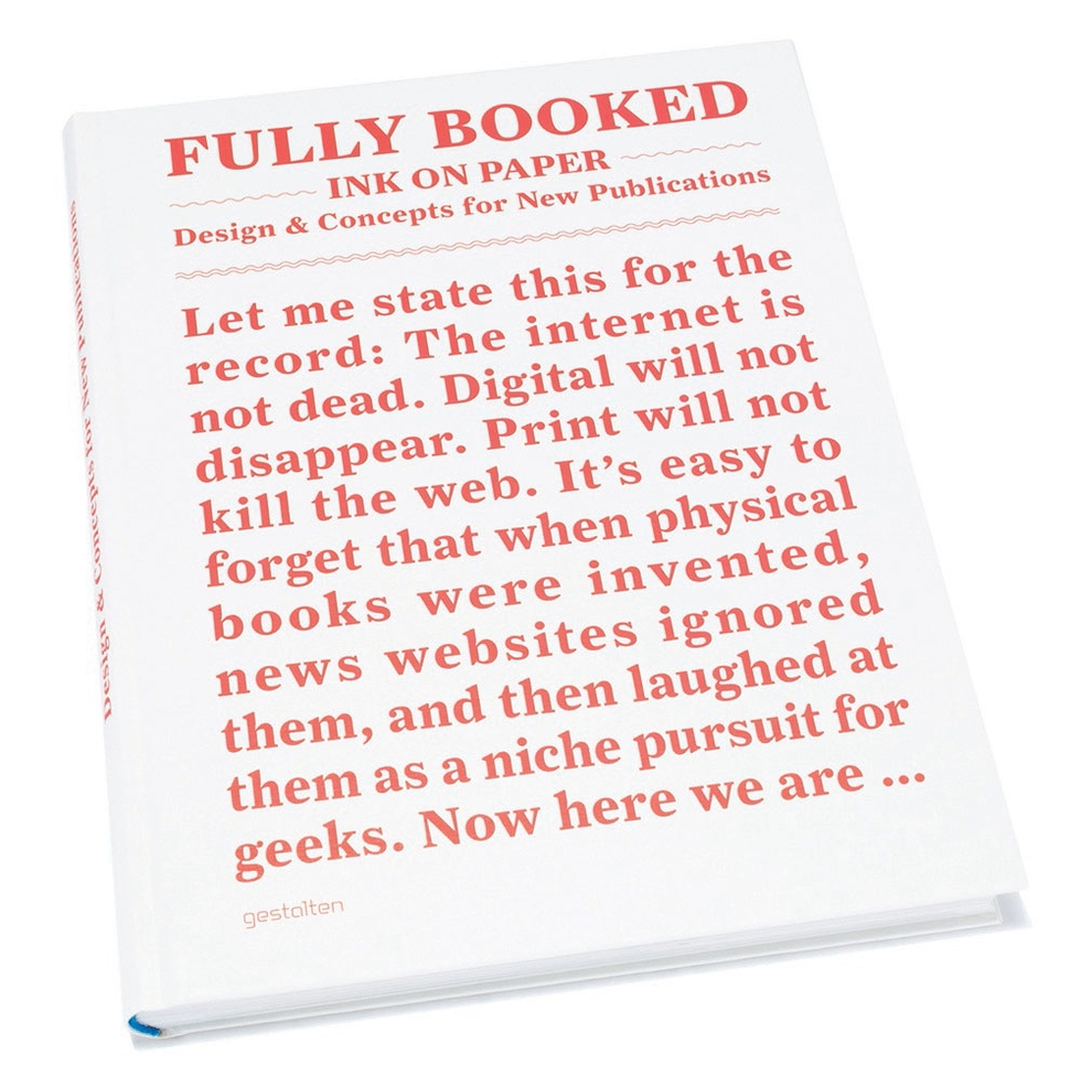
The group show at the Gestalten space in Berlin this month is a celebration of the new infusion of energy we're seeing in print, yes, print publication. It seems, perhaps in light of the Internet content explosion, that designers and publishers have gotten more inventive and creative with print. Gestalten thinks we've entered a new era in print publishing. The "Fully Booked" show celebrates the tactile experience of print and distinctiveness of design, materials, and technique. The show is broken up into roles that print can play: The Storyteller, The Teacher, The Collector, and so on. Featured designers among the 200 include Stefan Sagmeister, David Pearson, L2M3, Made Thought, and many more. Luckily for those that can't make it to Berlin, Gestalten has published Fully Booked: Ink on Paper, 272 pages of print design thrills.
Fully Booked is available at Gestalten.com


Founded by the Italians Luca Bendandi and Matteo Cossu, SHS Publishing has a deceptively nondescript name, a roving area of operation, and almost microscopic print-runs. The small publishing house/collective of authors based in Berlin specializes in art, graphic design, typography, and architecture books and believes making small books for niche markets makes it more likely to get to the trends first.
Small means nimble for the publishers, who have a passion for ink on paper. "We don't believe in flooding bookshelves with a million copies. Isn't it better to print less and get them all on the right bookshelves, where they can be read, lived, and consumed?" writes Cossu.
The company has an eclectic catalog. One Gear is about fixed gear bikes, while Studiospace is concerned with architecture practices, office space, and work in general. GrAphorisms features 59 insights set in innovative typography. And Totem shows off the handcut shapes of PIRO, an Italian artist favoring motifs inspired by the iconography of ancient religions. Printing methods vary by publication. "Depending on the printrun we'll either use conventional offset or resort to a low-fi Duplo that we have in-house," Cossu explains. Totem was made on the Duplo 63s printer (a "poor cousin" to the Risograph, he says) and handbound.
ToTeM from Roberto López Mélinchon on Vimeo.
It might be young and small, but SHS hasn't wasted time. Last year, it organized "Fahrenheit 39" in Barcelona, a mini-festival celebrating independent print culture featuring workshops and live music.
With "Fahrenheit 39"-type events in mind, SHS has advice for other would-be small publishers: The work isn't done when the books come off the press. "Once finished, we always try to take the book by the hand and accompany it out, organizing events, building a community, and including our readers in the discussion generated by the publication."
Commercial Type's Berton Hasebe and Christian Schwartz have teamed up for Schnyder, a new serif display typeface for the 2013 redesign of T, the New York Times Style Magazine. While Schnyder is the sixth custom typeface they've created for the mag, it's the first they have co-designed.
Inspired by a piece of pointed pen lettering of Swiss origin, the typeface itself comes in two weights and three widths. Unusually, the stem weights in each weight are identical across the widths which allows the widths to mix freely in headlines, which will be fun for editors and designers. The lowercase version draws from turn-of-the-century German typefaces.
The type palette for T also includes Graphik and some styles from the X Condensed width. The text face is Imperial, the same found in the main NYT news sections.
Jon Gray of Gray 318 is a master of typography-driven book designs. We're huge fans of his bold use of hand-drawn lettering. You might know his distinctive and ebullient work on Jonathan Safran Foer novels, for example, but that's just the tip of the iceberg. Gray gives so much personality to a book that it makes us want to drop everything, step away from the computer and read. No wonder he's in demand for major unit-moving, literary titles.
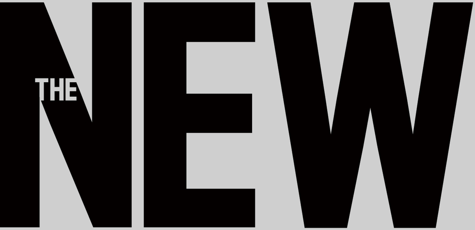

 Yesterday, The New Republic, the intellectually-engaging weekly on American politics and the arts published in Washington, D.C., revealed its new logo. Designed by new TNR Creative Director Dirk Barnett, the logo is meant to represent the publication across various platforms from the newsstand to the iPad. It stands tall and carries an authoritative bearing, but is decidely contemporary. Barnett chose Antenna by Font Bureau for the logo typeface. As you can read in this excellent interview, the logo is one facet of a total redesign that began in the digital realm, but will also encompass the print magazine, which reveals a new look later this month. We're anxious to see it all.
In the meantime, we asked graphic designer and Chunklet publisher Henry Owings what he thought of the logo and typeface. Never one to mince words, Owings weighed in.
Hey Henry, Any interest in weighing in critically on the new New Republic logo?
Hrm..... It seems very micromanaged. Having the "the" in the "N" is a bad call. Calling it a 'logo' is a stretch.
Right. How about the typeface itself? And how about compared to the current typeface on the mag?
The font itself I understand. They're just thinking iPad, mobile apps. But compared to where it was, it's drastic and almost.....too much?
It's micromanaged. It's people who think "Hey, how do we show we're new?"
Some idiot manager says "Let's get a new logo!" Horrible way to keep creative busy, but not productive.
Well, it's part of a total top to bottom redesign.
Which again, I defend. it's all like "Hey, let's do this for iPad" but the logo, wow, overthought.