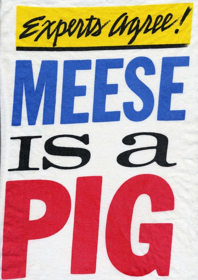
Those living in the Washington, D.C. area in the '80s circa the Iran-Contra scandal might remember the bold graphic poster emblazoned with "Meese Is A Pig" popping up around the city. They were hard to miss for commuters and locals alike. The posters appeared overnight and were visible on various public spaces. The graphics were clearly aimed at Reagan cabinet member and advisor Edwin Meese who was enmeshed in Iran/Contra and also the champion of various far-right causes in the administration. The poster campaign got national attention. Soon, the poster's creator, Jeff Nelson (of Dischord Records and Minor Threat fame) was revealed. With respect to Nelson's album sleeve and logo designs (among our favorites ever!), his "Meese Is A Pig" poster remains his masterpiece. Nelson sold T-shirts with the image, which covered his printing costs and the graphics lived on long after the street campaign was over. With Edwin Meese back in the news as the backer a government shutdown and national anti-Obamacare efforts, we're pleased to see "Meese Is A Pig" getting its due.
Read TNR's interview with Nelson and history of "Meese Is A Pig."

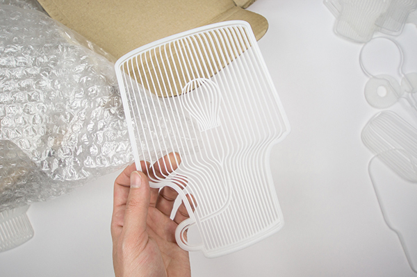
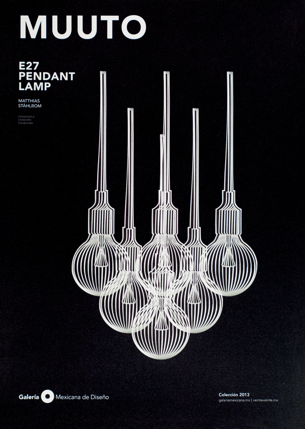
For the print and digital campaign promoting this year's collecton at the Galería Mexicana de Diseño in Mexico City, designer Tania Alvarez Zaldivar recreated the show's chairs, towels, and lights as all-white laser-cut renderings. Alvarez photographed the laser-cut models against white and black backgrounds and chose a bold sans serif typeface for the copy. Highlights from the collection include chairs from the designers at BD Barcelona and Hay, and lighting design from Mattias Stahlbom at Muuto. For comparison, photos of the original items are on the museum's site.
Find more projects from Tania Alvarez Zalidivar on Behance.


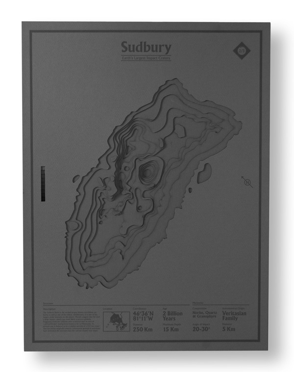
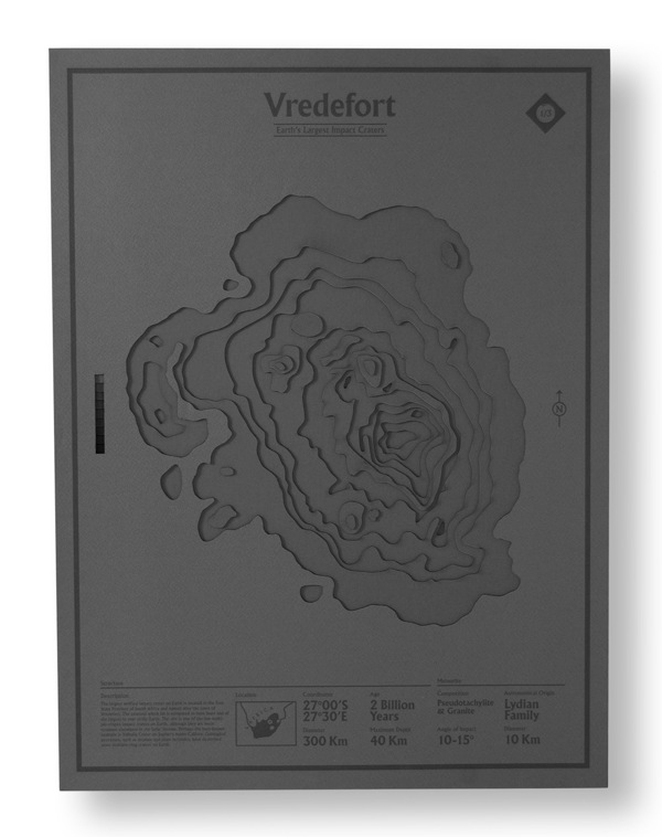
The closest impact crater to designer Nicholas Weltyk's studio at Pratt Institute in Brooklyn is an unconfirmed indent a few hours upstate at a site called Panther Mountain. That crater, however, was too small to make it into Weltyk's die-cut poster series documenting the world's three largest impact craters. To create the images of sites in Mexico, Canada, and South America, Weltyk hand drew about 30 die-cut patterns, which he used to cut and layer museum board for depth. For cartography diehards, each poster has a section of footnotes with topographical and geographical details.
Find more work from Nicholas Weltyk on Behance.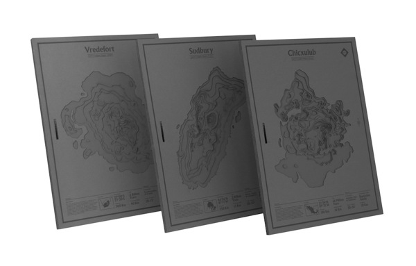


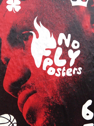
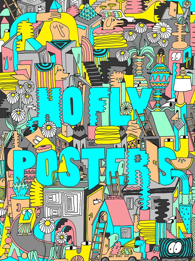
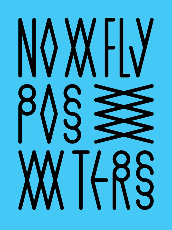
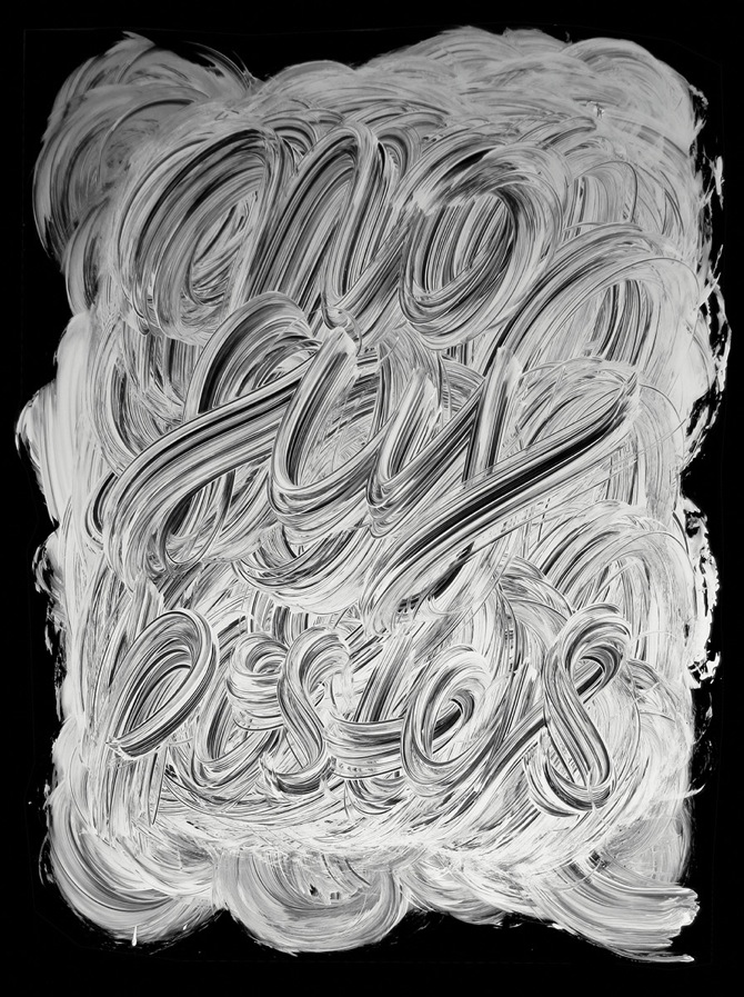
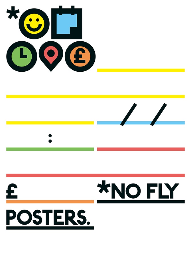
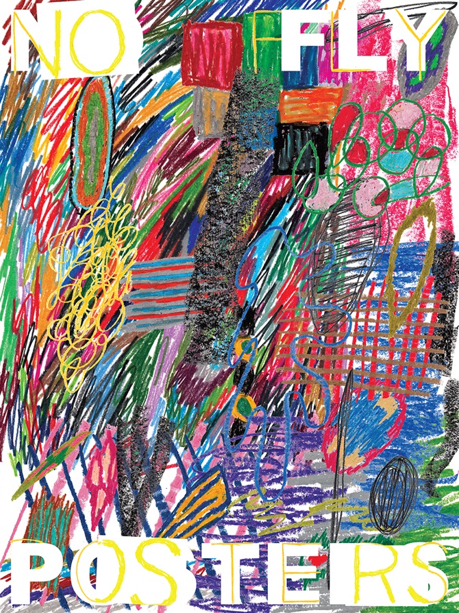
In the UK, wheatpasting posters in public spaces is often referred to as wild posting or flyposting. In the Manchester, UK project No Fly Posters, Jon Bland invites designers to produce unthemed posters for wheatpasting on the boarded windows of an abandoned building in the Ancoats area of the city. Seven posters in quad format by seven creatives are displayed in seven windows, each stating "No Fly Posters," a common admonition seen in urban spaces. Round 5 has gone up recently featuring designs by Dr. Me, James Joyce, Pascal Anson, Wim Crouwel, Atlas, Zoran Lucić and others. There are two more rounds yet to go up.


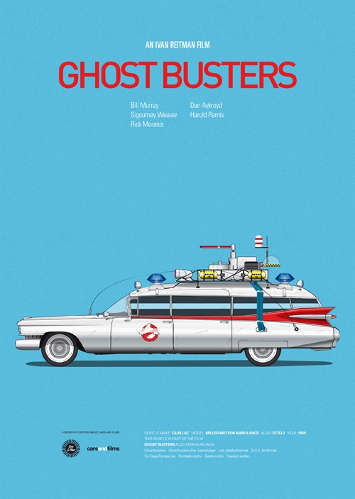
Seville-based graphic designer Jesús Prudencio makes the car the star in his poster series "Cars and Films," which commemorates iconic vehicles in Ghostbusters, Roman Holiday, and Deathproof among other films.
The posters are just €21 from his online shop.


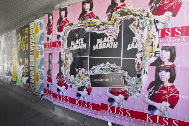
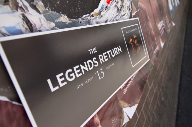
Advertising can be clever and get its message across when done well—even when advertising major label metal. In the case of the posters for Black Sabbath's 13, Janus Hansen and Andreas Rasmussen from McCann Copenhagen did well by Universal Music Denmark. The creatives dug their way deep through the many layers of new release and live show posters that cover the city's urban spaces, and placed the new and classic-but-tough design for 13 underneath. It appears as if the Black Sabbath poster has been there for years—or at least months. It's a brilliant way to remind passersby of the band's influence and legacy, considering it is its first new album in three decades. Rather than trade on new trends, it builds off a legendary past.


Graphic designer Zaven Najjar is a massive hip hop fan. On his Tumblr, Rap Posters, Najjar isolates single lines from new and old rap songs, and illustrates the lyrics in a bold graphic poster using a single image and a consistent typeface. He posts a new one every day, working in equal parts with silly lines from tracks like Lil Wayne's "Lollipop", more ominous verses from Mobb Deep, and French language rap verses from the Malian rapper Oxmo Puccino.


Last month we looked at the recent history of Olympic fonts, including images from the impressive new work for the upcoming Rio 2016 games. While the Rio games may be the first Olympics in the last few years to have a branding identity designers seem to agree on, 1972's Munich games had design contributions from Otl Aicher. In addition to the poster work shown here, Aicher is credited with designing the pictograms for the Munich games, which have become a very familiar sight.


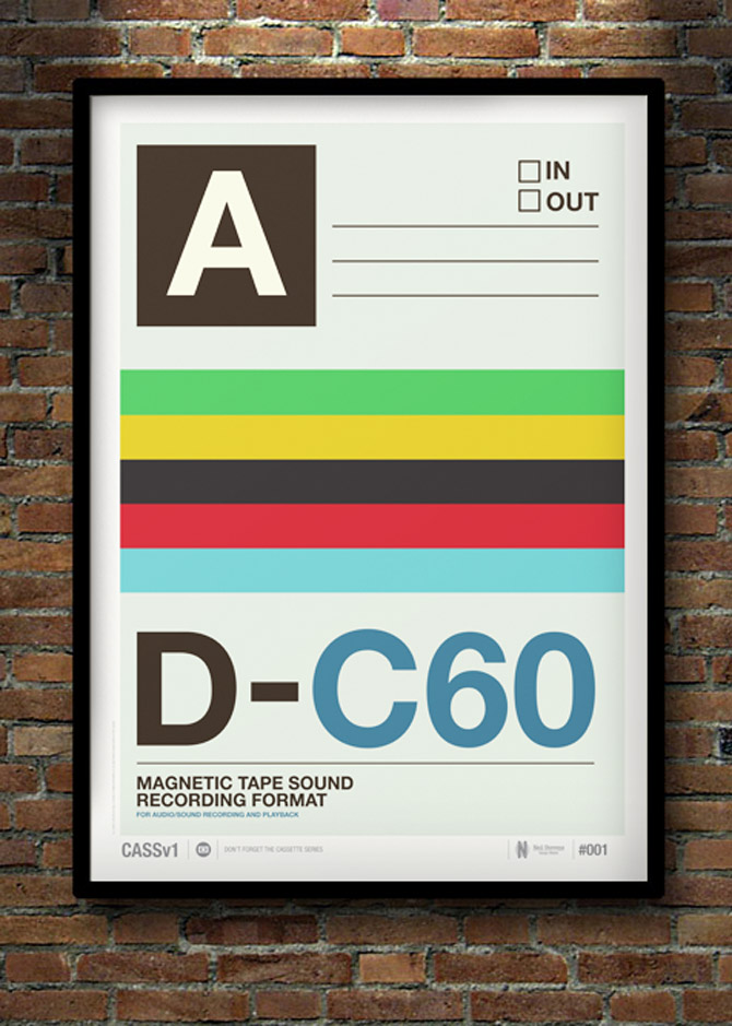
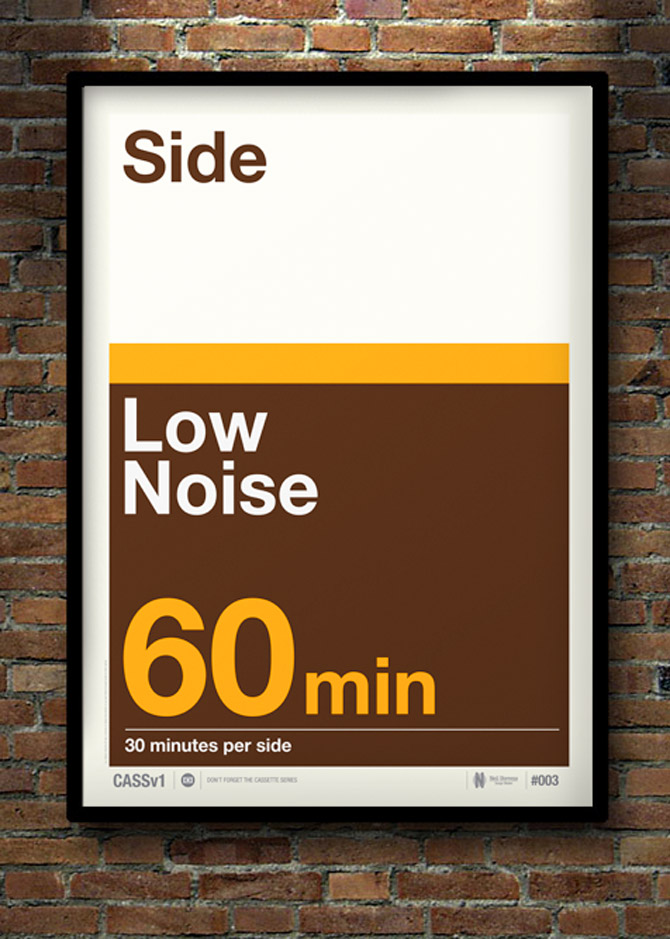
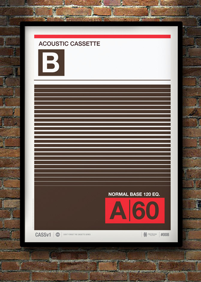
The vinyl revival has been mirrored by a resurgence of interest in cassettes—which many of us prized for their size, affordability and blank-canvas flexibility back in their heyday. Designer Neil Stevens like them, too, and has created a series of posters (30, in fact) based on the inlay designs for blank cassette tapes from various countries. Even if one can't get entirely behind the magnetic tape comeback—fidelity was never the cassette's strong suit—one must admit the bold and reassuring graphics of the "C30, C60, C90, Go" era would look very nice on a wall.
"Don't Forget the Cassette" posters are available from crayonfire.co.uk.


We're all for making the fine points of contemporary food culture as accessible as possible. When it comes to pairing food and wine, it sometimes feels as if some secret knowledge has been held back. That's why this chart from Wine Folly (available for purchase as a poster) is particularly welcome. It might not be the sleekest infographic we've seen this week, but it's the one we might actually tote in the wallet.