Where creative thinking is concerned, we're in a moment of wild appropriation. We have immediate access to every time period, every movement, and every artist. With all of this inspiration around, it's easy to get distracted and lose sight of one's own scope. We talked with UK-based illustrator Scott Balmer about his process, vintage video games, and why it's important to stay focused on one's own vision—even if it is informed by endless visions of the past.
I read somewhere that you were really into printmaking while you were studying. Did having a foundation in block and screen printing ultimately have an effect on your style and process as someone who primarily works on the computer?
For one thing, it made me think more about the many ways in which elements of my designs could relate to one another by using a medium where change isn't really that much of an option. It also gave me a better understanding of working with colors. Most folks go on about using paint to learn the basics of how to use color effectively, but personally I found it's best to use a process like block printing where not only are you limited on how many colors you can use, but also your color choices are pretty much set in stone once they are printed since it's not that easy to just cover it up with another hue like you can in painting.
Where do you start your work? On the computer?
It depends, really. There have been times when I just jump right in with a rough idea and see how things fall into place, but for most of the time my work starts off as some very simple rough thumbnails. Then it's either getting right into the action or, if it's for a client, I would flesh out the thumbnails towards something that shows the concept a bit more clearly.
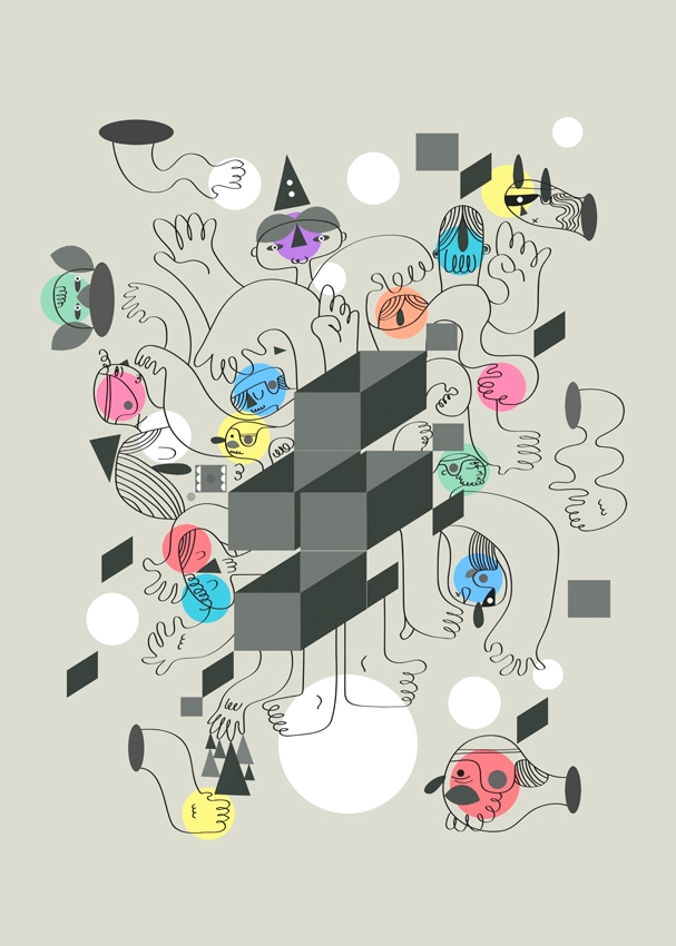
All of your illustrations seem to come from the same world, but there are still a few very distinct groupings of style. Are these from different periods? Or are they in response to different types of atmospheres or objectives?
I think it's more to do with what best fits the initial concept and generally, the look and/or feel with what will work within the subject material. A style should be scalable in the sense that you should be able to reduce it to its bare essentials in the production of simple yet striking concepts, but it can also be taken into the more complex realms by trying to push the style to its limits and producing a piece with a dense illustrative landscape.
The illustration coming from the UK is just so great right now, especially where editorial is concerned. Would you agree? Is there any kind of scene or even just a collective consciousness that you're aware of?
There are a fair few great and diverse illustrative pieces coming out of the UK right now and I do keep up and look at what other illustrators/designers are doing. But I tend to follow what other creatives are up to more casually as I think it's important to have a balance in that you're not almost always looking up how someone else tackled a certain subject as to avoid subconsciously mirroring someone else's concepts. I find it also helps greatly in defining who you are and how your own work can be defined on its own without being overly influenced to the point where it's borderline mimicry. All in all it's basically the art of looking but also not looking.
I know you grew up in the '80s. How do you think your pop cultural knowledge of that era influences your work—do you draw on it? I noticed RoboCop in a recent piece.
Bits of the '80s has influenced some of my work, such as toys and their packaging to the cartoons usually aired on a Saturday morning. Mostly it comes from the old games like Zelda and Mario plus a few titles and systems that had some quirky charm to them back in the day, like the ZX Spectrum. I'm still thinking about making a piece just using the colors that the Spectrum used to produce in its heyday. For anyone thats not familiar with the graphics output of the Spectrum, it was almost always a black screen with about four to five vibrant colors being produced (usually bright neon pink, green, yellow, or blue which I felt really stood out back then), giving the spectrum a visual distinctiveness compared to its peers.
I've also been recently admiring the skill of the various artists who were hired to work on the title/loading screens on both the Spectrum and the C64, with the restrictions the system, its color pallete, and having to use a joystick to draw the design in most cases. I think that if I was working in that time period, I'd most likely be working on the cover art and/or loading screen graphics within a games company if that were possible.
In terms of illustration, what illustrators or elements of visual culture led you to your style? And what do you think this style says about you?
It's mostly been from my appreciation of old school illustration and design. Designers like Saul Bass with his simple poster designs and title sequences, Polish poster designs, the collective work of Pushpin Graphic, Paul Rand, and other great folks.
I think there's something about old illustrations/designs which hold up quite well and also carry a certain charm which I feel influenced me in some way. I guess that deep down when it comes to pushing myself forward, I want to make beautiful things. There may be a fair bit to go, but all in all, that's my ultimate goal.