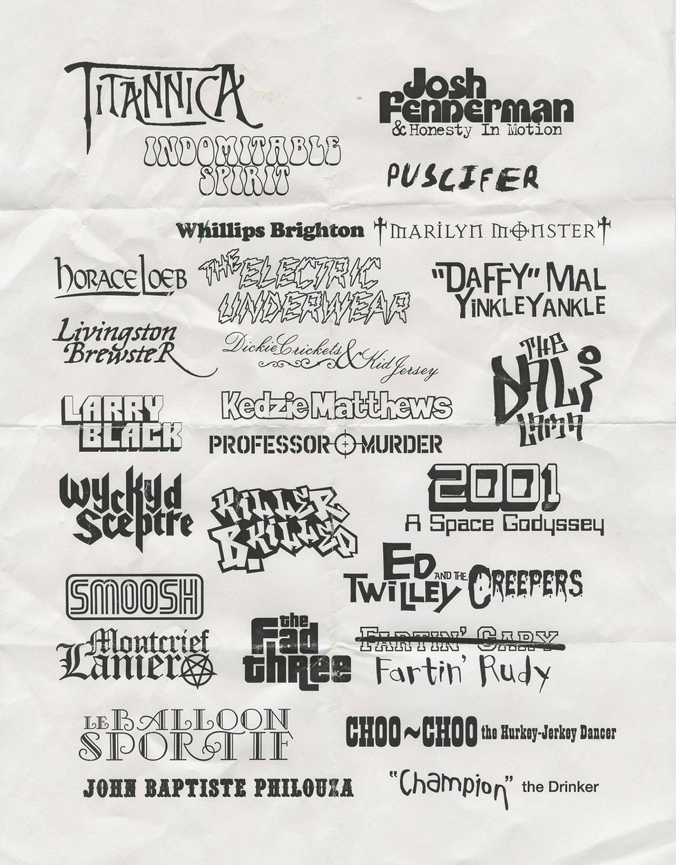
Logo designs by Chris Bilheimer, used with permission.
Eleven years ago, designer Henry Owings worked on the "Mr. Show" book What Happened? with his design mentor Chris Bilheimer. Recently, when Owings's dogs upended a filing cabinet in his home office, Owings discovered this sheet of logos that Bilheimer designed for the fictional bands from "Mr. Show." With "Mr. Show" back on the road this fall, it seems a good time to note that comedy isn't just about timing, it requires hitting the right tone with graphic design details.
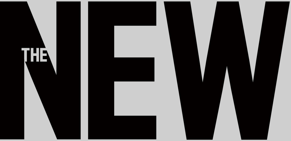

 Yesterday, The New Republic, the intellectually-engaging weekly on American politics and the arts published in Washington, D.C., revealed its new logo. Designed by new TNR Creative Director Dirk Barnett, the logo is meant to represent the publication across various platforms from the newsstand to the iPad. It stands tall and carries an authoritative bearing, but is decidely contemporary. Barnett chose Antenna by Font Bureau for the logo typeface. As you can read in this excellent interview, the logo is one facet of a total redesign that began in the digital realm, but will also encompass the print magazine, which reveals a new look later this month. We're anxious to see it all.
In the meantime, we asked graphic designer and Chunklet publisher Henry Owings what he thought of the logo and typeface. Never one to mince words, Owings weighed in.
Hey Henry, Any interest in weighing in critically on the new New Republic logo?
Hrm..... It seems very micromanaged. Having the "the" in the "N" is a bad call. Calling it a 'logo' is a stretch.
Right. How about the typeface itself? And how about compared to the current typeface on the mag?
The font itself I understand. They're just thinking iPad, mobile apps. But compared to where it was, it's drastic and almost.....too much?
It's micromanaged. It's people who think "Hey, how do we show we're new?"
Some idiot manager says "Let's get a new logo!" Horrible way to keep creative busy, but not productive.
Well, it's part of a total top to bottom redesign.
Which again, I defend. it's all like "Hey, let's do this for iPad" but the logo, wow, overthought.