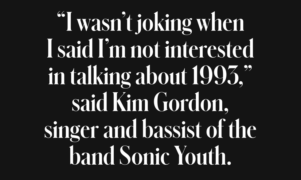
Commercial Type's Berton Hasebe and Christian Schwartz have teamed up for Schnyder, a new serif display typeface for the 2013 redesign of T, the New York Times Style Magazine. While Schnyder is the sixth custom typeface they've created for the mag, it's the first they have co-designed.
Inspired by a piece of pointed pen lettering of Swiss origin, the typeface itself comes in two weights and three widths. Unusually, the stem weights in each weight are identical across the widths which allows the widths to mix freely in headlines, which will be fun for editors and designers. The lowercase version draws from turn-of-the-century German typefaces.
The type palette for T also includes Graphik and some styles from the X Condensed width. The text face is Imperial, the same found in the main NYT news sections.
