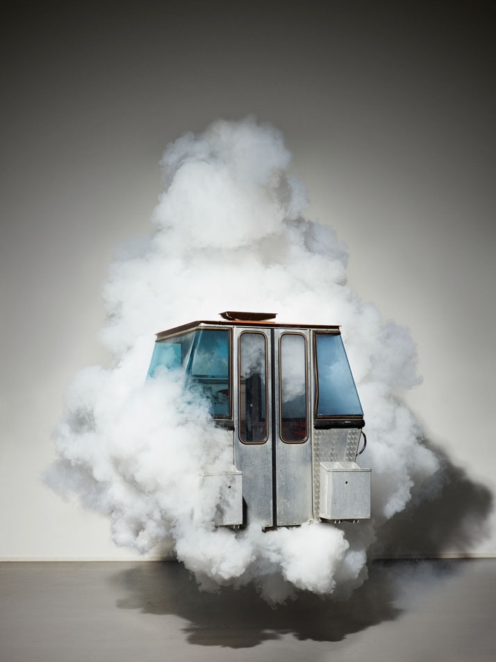
As part of an exhibit at this year's Design/Miami Basel fair celebrating Swiss design and promoting tourism, seven designers were given discarded gondolas from the Verbier resort in the Swiss Alps and told to use the materials to create new work. Some kept the basic form of the gondolas and created rocking benches and tables, while others deconstructed the cars entirely, creating new installations that only vaguely suggested the shape of the classic gondola. The seven designs will be shown during a brief tour of Switzerland, and auctioned by Christie's to raise funds for the Make-a-Wish foundation. [via Yatzer / photos © Annik Wetter]![]()
![]()
![]()
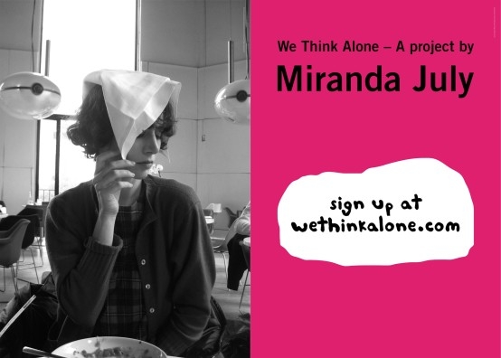
Miranda July's upcoming "We Think Alone" project will exist only in the intimate space of the personal inbox. Over the course of 20 weeks, July will send subscribers 20 emails containing excepts from actual email correspondence from Lena Dunham, Kareem Abdul-Jabbar, Kirsten Dunst, Sheila Heti, and more. The idea of sharing emails not meant for publication came about after July noticed the surprising amount of intimacy in mundane email composition. She writes, "How they comport themselves in email is so intimate, almost obscene — a glimpse of them from their own point of view."
We Think Alone is part of a show called "On The Tip of My Tongue" commissioned by Magasin 3. Read more and sign up.


“It’s like hunting for endangered species and putting the trophy of an animal’s head in your study.”
Meegan Czop, who works at Chicago’s Rebuilding Exchange, realizes the comparison she’s making between hunting and salvaging old buildings for raw material is a bit gruesome. But, she still gets a thrill finding a new purpose for the detritus of decades-old construction, and the hunting metaphor is apt.
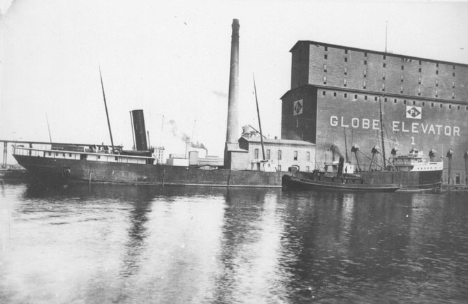
The Rebuilding Exchange has made a name for itself upcycling material for architects and designers—wood from a South Side bowling alley was used to build the offices of Trunk Club, the online bespoke fashion powerhouse, for example. And the RX recently collaborated with Strand Design to create stylish benches and clocks from reclaimed material. But the company’s current project, helping find a home for wood from the Old Globe Grain Elevator in Superior, Wisconsin, may be its biggest job yet. The eight-story mill, completed in 1887, is one of the largest in North America and could provide over five million board feet of lumber—“enough to rebuild Wrigley Field"—to designers. The wood is all old-growth timber that’s been smoothed out into intricate, wavy patterns by decades of erosion from falling grain. The RX crew is racing to get as much material as they can before the bank forecloses on the land, and have already found architects and designers interested in utilizing this rare cache of wood.
“People should have the same appreciation for this material as they have for finding old vinyl,” says Czop. “It can be dangerous working up there, wielding a chainsaw on a boom, but this is a salvager’s dream come true.
Put in an order for your old growth grain elevator wood at Rebuildingexchange.org


http://noma-cdn.s3.amazonaws.com/content/mill.jpg

There's no shortage of amazing facts about Brian Eno. And, no, we're not talking about the album he did with Television. It is only natural that the musical pioneer might enjoy a good feline cuddle once in a while like the rest of us. The Internet blogs would have us believe he once did a Purina ad, with his own cat, no less. But the original posting at Dangerous Minds seems to have gone offline, and while Boing Boing has a link to a large version, the image shows no trace of a moire pattern which would indicate it had been scanned from an old magazine. That's not a dealbreaker, of course, as moire patterns are easily removed by Photoshop experts, but it is slightly suspicious. We remain skeptical but intrigued.
Video by Score. Music by Boyton.
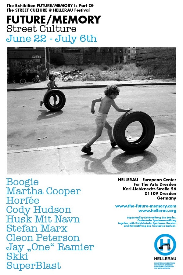
Curator and artist SuperBlast traveled the States from coast to coast to meet Cleon Peterson, Cody Hudson, and Martha Cooper—all artists represented in the upcoming "FUTURE/MEMORY" show opening June 22 in Dresden, Germany. Hudson talks about the relationship between his sculpture and painting—and his art as a means of expression. Peterson explains his attraction to dark subject matter. Also on the show flyer are Boogie, Horfeé, Husk Mit Navn, Stefan Marx, Cleon Peterson, Jay "One" Ramier, Skki, and SuperBlast himself. The show is for the Street Culture @ Hellerau, a festival at the European Center for the Arts Dresden.
FUTURE/MEMORY runs June 22—July 6, 2013, 4pm-8pm, free.
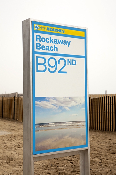
After sustaining extensive private and public property damage following Hurricane Sandy last fall, the preliminary restoration of NYC's beaches was completed just in time for a Memorial Day opening. Part of that restoration was the installation of a new highly visible, bright yellow and blue branding identity from Pentagram. The rebranding is a complete overhaul, and gives a cohesive visual theme from the street signs to the bathrooms.
Read more about the branding and restoration on Pentagram's site, and be sure to check the Parks Department Beaches site before making a trip to avoid any temporary construction closures. ![]()


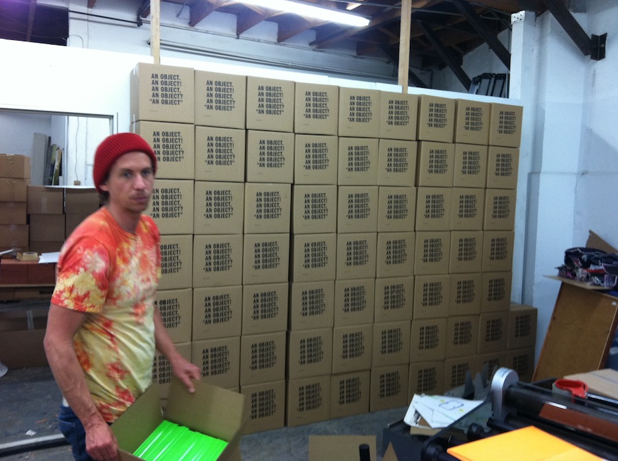
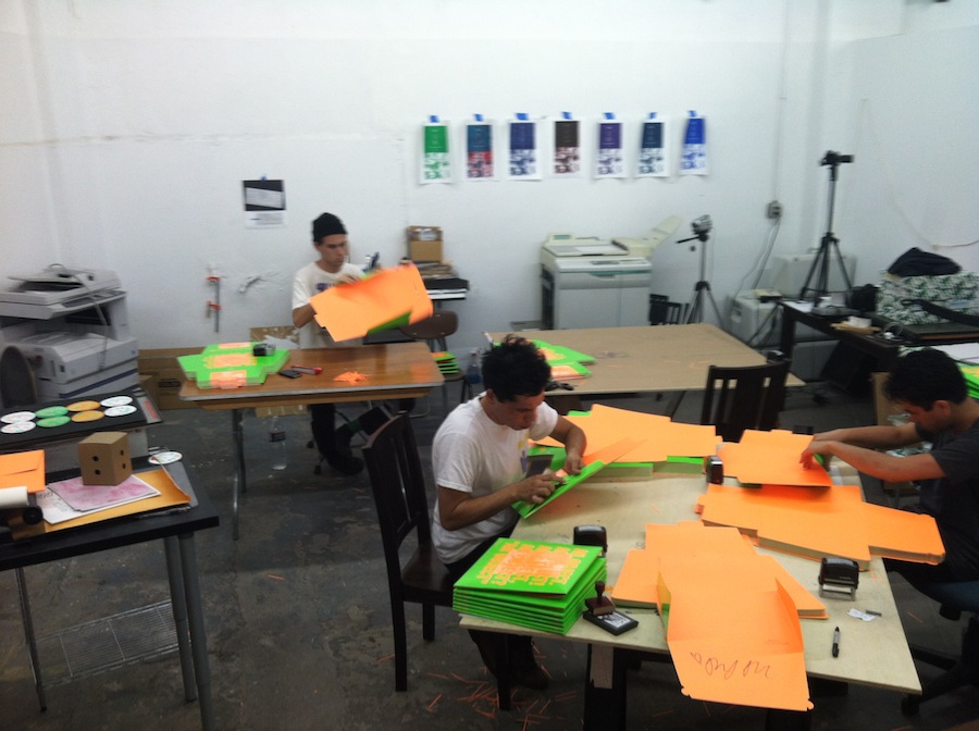
At the end of May, No Age surprised members of the press with an advance copy of its new album, An Object, in a box designed, printed, and manufactured by the band and their collaborator Brian Roettinger.
The physical object has a conceptual link to the writing and recording of the album, as the band approached the new record with a "sound as material" physicality during the mixing process, and shaped sounds with contact microphones and prepared speakers while recording.
The silkscreen-printed promo boxes and album packaging are in line with editorial philosophies of small presses like Rollo Press, where the artist is inextricably linked to the commercial production of the work. By acting as the physical manufacturer of the album, the band hopes "the roles [of manufacturer, artist, musician] trip on themselves, and individual parts lose their distinct meanings, demanding to be considered as a whole."
UPDATE: We just received some additional production details from Sub Pop. The band designed and manufactured a special edition of 10,000 copies of the album. Half of those are vinyl, and half are CD, but both will read "Manufactured by No Age" in the bottom left corner. After those initial 10,000 copies are gone, Sub Pop will produce a second, non-silkscreen printed version of the album with a reversed color scheme that won't have the same manufacturing message. The boxes seen in the first photo below were also printed by the band to deliver the covers to the manufacturing plant.
Check out photos of the production below, read Ian Cohen's recent interview with the band, and keep an eye out to pre-order a copy of the record from Sub Pop.


True to its name, Ten Dollar Fonts offers new fonts every week with licenses that only cost $10. The a la carte pricing is a huge cost-saving alternative for designers who can't afford pricey font packages, and because the site also works as a distributor for tiny type foundries, smaller projects see a much wider release.
Licenses for personal use are $10, while a commercial license is a still-reasonable $20.
Pincambrella
Modula Mono

At the Chicago Design Museum opening party on June 10, as attendees celebrated and congregated around banks of displays, designer Marian Bantjes stood aside, circling a table and slowly ripping up flowers. Delicately tearing petals and leaves to make a floral mosaic that spelled out the word “sorrow,” she was the picture of the concentrating artist.

A renowned Vancouver-based designer who has worked for clients such as Penguin Books and The Guardian, and a member of the Alliance Graphique Internationale (AGI), Bantjes turns fonts and phrases into something kinetic, where tightly wound letterforms spring loose. Her book “I Wonder,” and forthcoming monograph, showcase a career focused on rich ornamentation and constant exploration, from almost heraldic lettering to a piece for Stefan Sagmeister’s “Things I have learned in my life so far” series made with sugar, inspired in part by her fondness for breakfast cereal.

“I keep trying to do new things and follow what interests me, and it can be very hard to drag clients along with me,” she says. “Most people are shockingly unimaginative, and want me to do the same thing I’ve done before. The people who have trusted me to do whatever I want have always been really happy, as far as I know, and I’ve absolutely done my best work for them.”
How did you come to typography?
I didn’t. I just got a job. I was 18, and I needed work, and I saw a little job posted in a bookstore for a publishing company. And I applied for it and got it. It started out mostly filing magazines; quite quickly they trained me in paste-up and layout, and I became a typesetter, and learned a lot about typography. Typesetting is not a creative job, it’s basically following a designer’s directions exactly, but you learn the do’s and don’ts of typography, and you become an expert on how things are done, and some designers know more than others, and you add to that. Of course, they’re not going to handle all the details, like how you balance pages, rivers and things like that. You work really closely with type. You learn all the lingo and the whole thing; so over the period of ten years, I became an expert.
When did you start experimenting?
Not until much later. I became a type snob. The typesetting that I was doing before was just for books. It was very conservative. Once I started my design company, I started doing different kinds of things, business cards and brochures, which require more decisions about what you do with type. That was a new learning curve. But I wasn’t really experimenting. When I went out on my own, I felt like I had a lot of knowledge of type, but it’s not really a passion. I can’t really describe it.

A craft instead of an art?
That’s a close analogy. It was a craft I knew very well. But I had always been very conscious of doing things right. Even as a designer, I didn’t break the rules very much and, if I did so, I did it very carefully. When I went out on my own, I didn’t know what I wanted to do. I didn’t really know. Something happened, and I can’t explain it, but somehow my knowledge in typography, and an interest I have in ornamentation, they just sort of came together in a spontaneous way. And I started working with type in much more adventurous ways, and ways that I never would have dared to before, eventually making my own lettering. I’m not one of these people who goes around taking pictures of signs or identifying type. I’m not as much of a type geek as people might expect.

Is it that type is so proscribed, that it has so many rules, that there are infinite ways to play with it?
Yeah, I think I like the fact that you can push letterforms into so many different shapes. Like graffiti—I’m fascinated with graffiti—I think graffiti is so sophisticated typographically. I love the idea of something that’s recognizable and readable to those who know how to read it, but not everybody else. I like the continuum between the readable and unreadable, the variation there is within that. I just really love that ability to experiment with that and make forms that are interesting but that say something, but are not abstract.
Do you always feel the challenge to do something very ornamental, to top something, or does simple ever work?
That’s an interesting question. I do have a love for modernism, I love it so much, and I do have some ideas for some things that I’ve wanted to do that are very simple. But I have a double mental block about it. On one hand, I feel certain responsibilities to the people who like my work, to continue to do that, and on the other hand, simple seems so easy. I seem to exist on making things difficult for myself. It seems like cheating or something. Which is not to say I don’t respect other people’s work. When I look at those John Massey posters (on display at the Chicago Design Museum), I don’t think it’s easy, I think it’s so beautiful. When it comes to my own work and myself, I need to sweat it out.
Do you ever see yourself doing other types of design, like icon design?
Icon design doesn’t interest me. It has to be clear. It would be very frustrating for me to do that. I’ve done a little bit of illustration and stuff. Early on, I, when I figured out what I was doing, and I put the typography thing together, I was an illustrator, just not the kind that can draw you a cat. And now, I think about segueing into the kind of illustrator that can draw a cat.
A lot of your work has a childlike sense of play, like the macaroni art or the sugar art for Stefan Sagmeister. What informs this sense of wonder? What interests you outside of art and design?
All sorts of things. I’m interested in science. I’m an atheist, so I’m very interested in atheists and the atheist movement, and non-religious forms of gatherings sharing information and creation. I’m interested in animals, and started scuba diving a few years ago. I don’t know if I have a problem-solving mind. Maybe I do. I’m quite good at figuring things out. I can fix my own plumbing.
Why has there been such a resurgence of this handcrafted typography?
It always goes forward and back, clean and simple, always comes back into something else. A lot of people credit me with starting some kind of design revolution. I know I contributed to it, but that pendulum was just starting to swing. People are taking interest, there’s a move away from the computer into handwork.

I know you’re a big fan of The National. Can you tell me about those posters that you did for the band?
They hired me to do the Wiltern show poster, then had me do one for a gig at the Orpheum in Vancouver. The glass one for the Orpheum needed a little bit of negotiation. I convinced them to sell them for more than they intended to sell them for, so we could spend more on construction. The first one was supposed to be a little poster, and I hate little posters, so I made it bigger. Design diva, why the hell not.

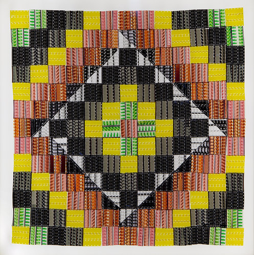
The 16mm films that Sabrina Gschwandtner uses as material for her quilts were originally part of the Fashion Institute of Technology's film library. After purchasing the lot of mostly instructional films about crocheting, sewing, knitting, and other textile work, Gschwandtner began the process of dyeing, painting, and bleaching the strips to color her geometric patterns. To complete the quilts, Gschwandtner includes segments from her personal films, and mounts each work on a surface illuminated by LEDs. [via Co.Design]
A collection of the film quilts are on display now at the Philadelphia Art Alliance until August 18.