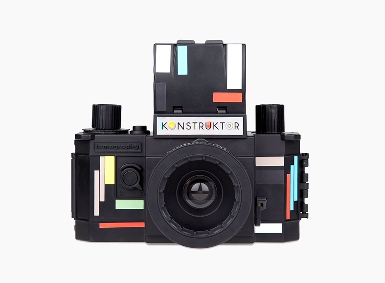
The latest camera from the shoot-now-look-later photographers at Lomography is meant to be a learning experience. The Konstruktor, the first build-it-yourself 35mm SLR, requires users to spend about 20 minutes assembling the lens, body, and other mechanicals, before snapping any photos. Once everything's assembled, the no-frills features make it an ideal first camera for learning how to focus and shoot manually.
Read more on Lomography's instructional page for shooting with the Konstruktor, and pick one up from their store for only $35.


Fans of RAW artist Charles Burns may or may not know that The Believer magazine published the artist's work on covers between 2003-2013. Burns created the images of ink on paper in a strict format of 6x6. His distinctive black lines communicate sophisticated textures and lighting in the portraits. This summer, Adam Baumgold Gallery is featuring the many portraits Burns made for the magazine as well as a before-and-after series of works from comic Black Hole.
Over 300 drawings of artists, musicians, animals, and comic and fantasy characters as well as historical figures are included in the show. But today, we're focusing on the musicians Burns drew in yearbook style.
"Cover Portraits for The Believer 2003-2013 + Before & After Portraits from Black Hole" runs through July 26 at Adam Baumgold Gallery, NYC.

Stephen Malkmus
 Q-Tip
Q-Tip Kathleen Hannah
 Nick Cave
 Liz Phair
 Devendra Banhart
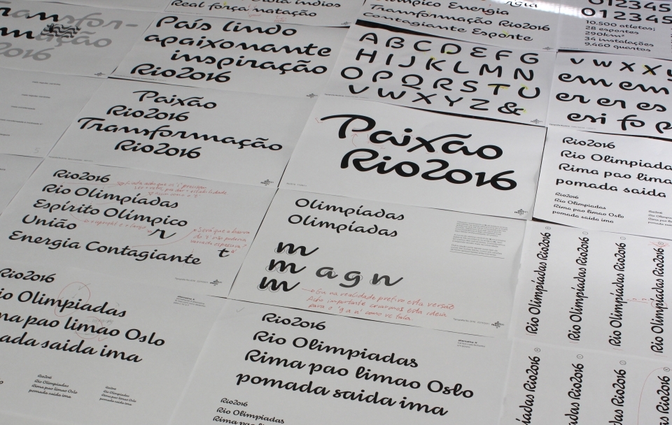
It's been a tough few years for Olympic typefaces. London's 2012 event used this sharp-edged, jagged, and much criticized font and the next Olympics, 2014's games in Sochi, will probably feature this futuristic heavyweight lettering. The good news is that the Rio Olympics may come out ahead of the three, with a conceptual typeface designed by the Rio-based studio Dalton Maag. To make the typeface site-specific, Dalton Maag incorporated lines and features of landmarks in Rio like the "Christ The Redeemer" statue, as well as the surrounding natural features. [via Typedeck]


Originally created by an indie film studio as a Tumblr to hype the A Band Called Death documentary, My Dad Was In A Band has taken on a life of its own. In fact, we wanted to post about it for a while, but it was jumping to a new URL and now enjoys the support of the mighty Dangerous Minds. In any case, the concept simply rocks: Users submit photos and stories of their dad's "vintage" bands from years gone by. The result: a treasuretrove of small-time New Wave, hair metal, punk, boogie, garage, and psych acts—with some jazzbos in there, too. We can't decide which we love more, the vintage glossy 8x10s or the band names for these mostly totally unknowns. Let's just say, if you're holding any archival evidence of your pop's longhaired gigging years, nows the time to make it known.
Here's a few faves from the site:

Burlington, ON Canada – 1981-1983 – Punk
I’ve known from the youngest age, that my dad ups the punx more than any other dad I will ever meet. –Brandon, Son of Chris Crash.

SOUTHERN COMFORT
BEAUMONT, TX – 1977-1986 – Rock/Country
My dad, John Smith, learned how to play guitar because he idolized Buddy Holly and he wanted to get girls. After serving in Vietnam he spent fifteen years as a professional musician in club bands in Europe and Texas. He met my mother, a waitress and bartender, while performing in Beaumont, Texas in the late 70s. –John W. Smith, son of Bassist John Smith.

For the packaging of their new collaborative LP, Run the Jewels, El-P and Killer Mike enlisted Brooklyn artist and photographer Nick Gazin for a series of new illustrations. Although the record will see release as a free download, Gazin contributed multiple images for a limited-edition physical release on vinyl, including original lettering work and a poster, plus two T-shirts only available on tour.
Preorder a physical copy of Run the Jewels (with an optional grinder) from Fool's Gold, and see a few more tour-only shirts over at El-P's Tumblr. 


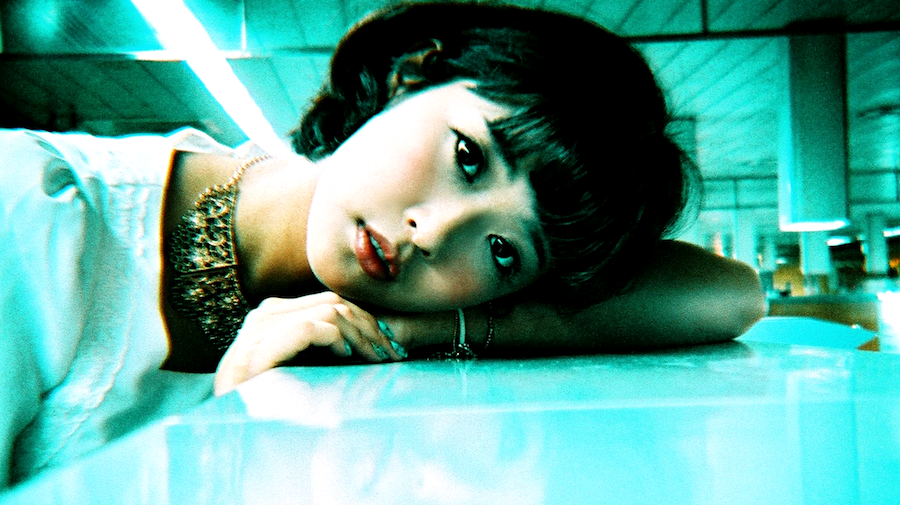
Photos by Yewon Kim
Chicago is awash in street fests each summer, but the Guerrilla Truck Show, hosted by Morlen Sinoway Atelier during mega trade fair NeoCon each year stands out for its relaxed vibe and focus on creative work from small studios. Hundreds of designers and artists from Chicago and beyond show their latest projects and current wares from rented Ryder and U-Haul trucks. As one attendee noted Tuesday night, "it's a bad day to move out of an apartment in Chicago." As usual, we were inspired and enlightened.


A few years ago Alyse Emdur found a photo of herself as a child posing in front of a mural of a beach with her two siblings. When she asked about the photo, her parents explained it was taken in a prison lobby during a family visit to see her then-incarcerated brother. After some research she found that these backdrop murals are actually a common practice for prisons, and in many cases are even painted by talented inmates.
The logic for prisons is that limiting photography to what's essentially an impromptu portrait studio protects potentially sensitive images of the prison's structure from being shared, while still allowing families to snap photos together that don't necessarily reveal that one member of the family is currently incarcerated.
When Emdur asked prisons for access to photograph a series of the backdrops for her book, almost every location denied her request. So instead of taking the photos herself, she collected images by exchanging letters directly with inmates asking if they'd share any family photos, and she eventually received 16 binders worth.
Head over to BLDGBlog to read an interview with Alyse Emdur about the project. Alyse Emdur's book, Prison Landscapes, is available now. 


Beck's art label bottles have featured images from artists like M.I.A., Yoko Ono, Damien Hirst, and even Andy Warhol, but the beer giant's newest art label does something—it's a different medium altogether. Beck's enlisted the Auckland-based designers at Gyro Constructivists, borrowing the form of Thomas Edison's wax cylinders, to build a custom lathe cutter to record music onto a bottle. The result sounds better than the cylinders from Edison's day, but requires a rather uncommon player to play back. The playable bottle is an almost all-New Zealand production, featuring a noisy tune from Auckland's Ghost Wave.

An LC VII floor lamp by Le Corbusier
"Architecture — you know, this one Corbusier lamp was like, my greatest inspiration."
John Caramanica's interview with Kanye West has people talking, even architects. The Chicago-bred rapper drops the name of French modernist Le Corbusier in reference to the songwriting and production on his new Yeezus. Few musicians have made their inspiration from the visual realm as explicit as the closely-watched hip-hopper does here.
West goes on to detail his conversion to minimalism via furniture museum shows and Corbusier creations.
"I would go to museums and just like, the Louvre would have a furniture exhibit, and I visited it like, five times, even privately. And I would go see actual Corbusier homes in real life and just talk about, you know, why did they design it? They did like, the biggest glass panes that had ever been done. Like I say, I’m a minimalist in a rapper’s body."
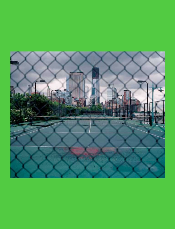
Photographer Giasco Bertoli says the image of an empty, but well-worn, tennis court possesses a "kind of eroticism, like the memory of a former lover one still feels for." While he's fascinated by the idea of the courts' histories and what he calls "the ceremonial combat" of an organized competition, his work also highlights the context and placement of the courts whether they be in cities, on rural landscapes, or within small villages. The courts are all in various states of disrepair, and the dilapidated ones in idyllic settings offer the most severe contrast.


