
Today, we're soothing our winter chill with thoughts of the shorts and linen jackets to come in the spring, like the ones in GANT Rugger's SS13 lookbook. In the tidy piece of video above, GANT creative director Christopher Bastin shows us the collection, uses the phrase "slow fashion" to describe Rugger's version of menswear, and calls out the line's color choices, details, and variations on traditional warm weather sportswear. Now, if only the mercury would rise.
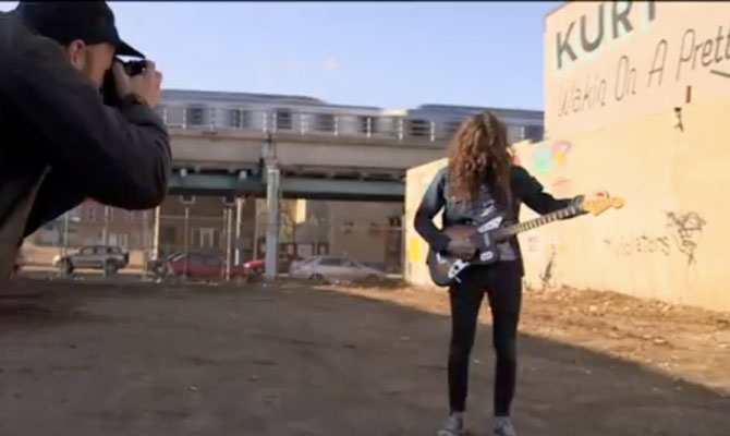
Talk about a perfect collaboration. To create the cover image and simultaneously promote the new album Wakin on a Pretty Daze from Philly's Kurt Vile, artist Steve Powers painted a giant wall-sign in the home of the Liberty Bell. The design by former graffiti writer Powers even draws on the tunes themselves, giving it some extra no-BS legitimacy for Philadelphians. Check out the video for more insight on the collaboration and some great views of work by Powers, then visit firstandfifteenth.net for more signs by Powers.

You've seen dozens of branding identities for new hoppy craft beers, or the latest micro-distilled Rye whiskey, but it's not every day a Slovenian brandy makes waves in the design world.
Design firm Loni DBS has just completed a new identity for an organic brandy called Doctor Shutz 38 Herbal Essences. The brandy takes its numerical name from the 38 herbs grown in Slovenian wine country and used in the recipe. The design firm chose a pharmaceutical theme, complete with green cross imagery, a typographic hierarchy reminiscent of medicine bottles, and a small pamphlet included in each package that's familiar to anyone who has ever received a prescription. Also worth noting, most of the bottle's copy is also printed in Braille.
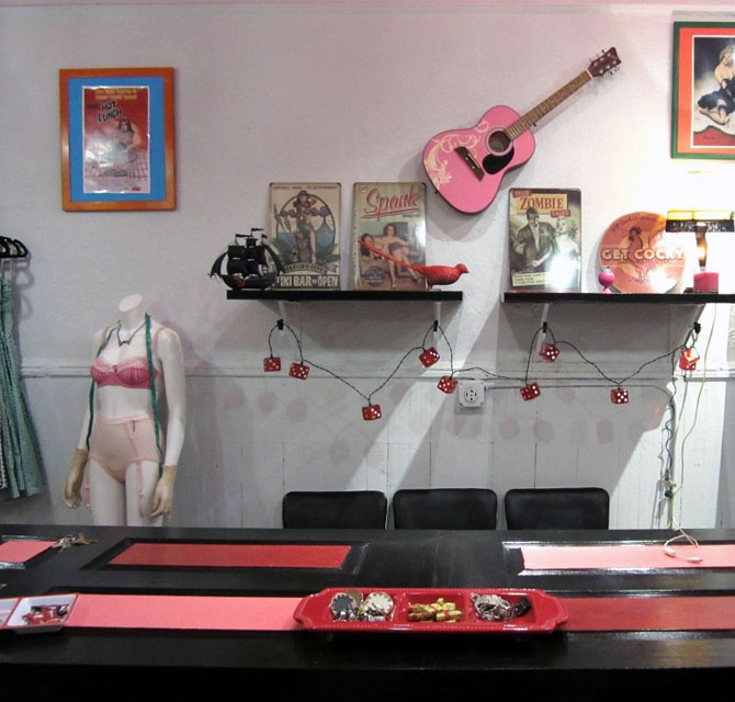
Retro pin-ups, leopard print sheath dresses, seamed stockings? Yes, please! In early February, the vintage-inspired shop SlapBack opened its doors in Williamsburg, Brooklyn—making dreams come true for Brooklyn bombshells who would much rather rock 50s glam than the oh so trendy 90s grunge.
Owned and operated by Greenpoint local Renee DiDio, a 15-year veteran in fashion and media, SlapBack feels like a walk through a cheesecake boudoir. Racks of rockabilly, vintage repro, and classic glam pieces line the walls—curve-hugging wiggle dresses by Bettie Page, high-waisted pencil skirts by Rocksteady, sweet cropped cardigans and polka dot cap-sleeve tops by Lolita Girl to name a few. A crimson velvet couch for lounging and a faux fireplace with flasks on the mantle warm things up quite nicely. And Dirty Dolls’ pinstripe pin-up lingerie is, well, hot as hell.
We asked DiDio, "Why 50s and why now?"
"For as long as I can remember I have been dressing in 50s fashion. Not only does it fit my body type better than a lot of modern clothes, but it really exudes femininity. For a long time the only way to purchase vintage reproduction clothing was online, as most of the designers are on the west coast. I really felt like there was a missing niche in New York. I wanted to be able to offer fashion for women, women with curves. I am giving them a place to feel like they could walk in and try on dresses without feeling they had to conform to the standards that are in most of the shops right now. Women should feel like women and be proud of their bodies no matter what their shape and size, because we are all beautiful, and this style really helps a woman embrace that!"
490 Metropolitan Avenue, Brooklyn, NY 11211; 347.227.7133; Mon-Sat 12pm-8pm, Sun 12pm-7pm

David Bowie's second single from his forthcoming album The Next Day is "The Stars (Are Out Tonight)." Bowie, as we might expect, takes it the extra mile in concept and visuals, turning the video for the tune into a short film featuring Tilda Swinton (as a suburban housewife) and directed by Floria Sigismondi (The Runaways), commenting on the nature of celebrity itself.
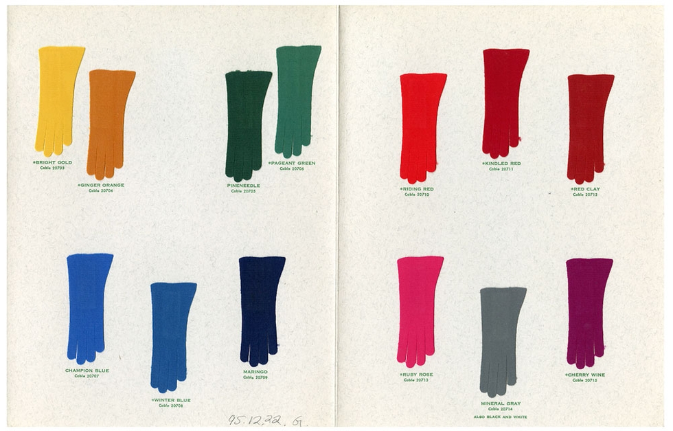
The Design Center at Philadelphia University maintains a massive textile and fashion library of over 200,000 fabric samples, books, and trade cards, and they've graciously started to share the collection via Tumblr.
The majority of the posts are small fabric samples sewed onto filing cards that date back over 100 years. The surprise is how modern some of the patterns look that are well over a century old. The sheer quantity of samples makes it possible to spot a few trends as well. For example, vegetable prints were apparently huge in the 1880s and 90s, and geometric patterns started making frequent appearances just after 1910. There's plenty of dated ephemera, like a color guide for choosing the right gloves and a Parisian "fashion forecast" book from 1966.
Whether you're a designer too far from Philadelphia to explore the collection in person, or you'd just like to have some fashion history in the dashboard, you should follow The Design Center on Tumblr.

Perhaps you're already bouncing around on it, but if you're like us you're just wondering what they feel like. Cork-soled shoes, that is. The resurgent material has already crept into out iPhone cases, and this season it is turning up on our feet. In Spring 2013, for example, Clae introduces the Mills, a runner with a cork-wrapped midsole. The mesh toe, neoprene details, and Vibram running outsole suggest that it's a shoe that can perform as well as it looks. Available in three colors (royal blue suede, gravel suede, and black leather mesh), in all cases the cork is the main attraction.
Get on the cork bandwagon with the Mills for $125 at clae.com.
It seems as if everyone we know has been jetting to warmer zones this month. If the option was available, we'd put Mojave Sands Motel on our winter roadtrip itinerary.
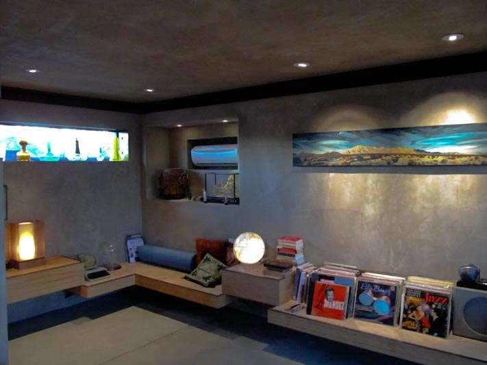
The five-room desert motel in Joshua Tree, CA is an alternative on the Gram Parsons fan's pilgrim trail to the Joshua Tree Inn & Motel, but more importantly, it's been updated in a really unique way. The bones of the space, an abandoned 1950s motel, were kept, but owner Blake Simpson (former furniture designer for Marc Jacobs) spent nine years renovating the place. The doors, windows, gates, and furniture were designed and built on site giving it a real personalized feel. The walls feature cedar plank, the concrete floors were refinished, and the new beds are made of black walnut. All five rooms are completed with a mix of vintage, mid-century furniture. Each room has unusual amenities such as a typewriter, record player with vinyl, and various objet d'art that encourage us creatives to find inspiration.
The hotel is already a hit with L.A. creative industry types looking for a getaway. Nearby, a music and film production studio beckons and Simpson says solar power and a diner are in the works for his compound.
This oasis isn't suited for the pampered. It's dusty, windy, laidback, and on the main road, evidently, but offers plenty of space for hanging out and making your own good times. That's what it's all about, anyhow.
Rooms begin at $200/night at mojavesands.com.
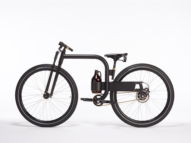
If you live at the intersection of joy and happiness, a.k.a. a city where a bike can be your primary mode of transportation and local breweries sell growlers full of fresh beer, we've found your next purchase. Industrial designer Joey Ruiter, who has a portfolio full of transportation and furniture design projects, has a new bicycle concept based around transporting the humble growler. Like his other bicycles, the design aims to strip the bike down to only the necessary components. He created a minimal, single bar frame and mounted a growler rack low on the bike to maximize stability. He incorporated wide "cruiser" wheels into his design to make the bike even more of an easy daily rider. Unlike his compact Inner City Bike, this model still has a chain.
Check out Joey Ruiter's other bike, boat, and furniture projects.
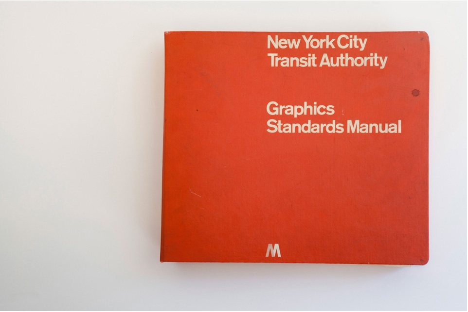
Oddly enough, it was a Chicago-based firm which issued the official Graphics Standards Manual for the New York City Subway system in 1970. The visual identity presented by Massimo Vignelli of Unimark International is in many minds the most iconic visual identity for a transit system in the world. Thanks to the efforts of Niko Skourtis, Jesse Reed, and Hamish Smyth the manual is now available to explore in digital form.
The manual itself is small in stature, but exhaustive. It contains the elements you'd expect: the ubiquitous circular letters and numbers and nine chosen colors, but it also contains a few entries explaining Vignelli's beliefs about civic design. The best example is probably his "information tree," meant to simulate a rider's experience using the signage system. At the very top, Vignelli includes the surprisingly strict design guideline, "The subway rider should only be given information at the point of decision. Never before. Never after."
Learn more about Vignelli's vision at StandardsManual.com