
We're all for making the fine points of contemporary food culture as accessible as possible. When it comes to pairing food and wine, it sometimes feels as if some secret knowledge has been held back. That's why this chart from Wine Folly (available for purchase as a poster) is particularly welcome. It might not be the sleekest infographic we've seen this week, but it's the one we might actually tote in the wallet.
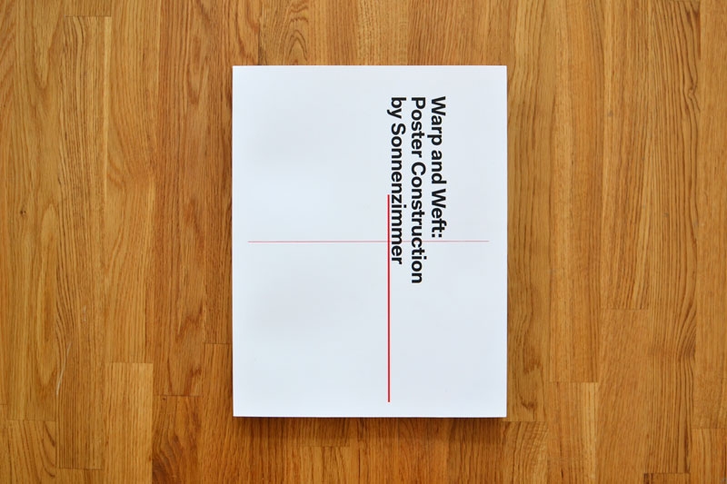
This Sunday, Brooklyn's Beginnings (110 Meserole Ave) hosts a book release for Warp and Weft: Poster Construction by Sonnenzimmer as well as a pop-up shop.
Curious about the new book on poster construction, we asked Chicago designer Zach Dodson (who co-edited the book with featherproof books cohort Jonathan Messinger) what he learned working on the project with "Wabi-Sabi design masters" Sonnenzimmer, AKA Chicago-based studio of Nick Butcher and Nadine Nakanishi. Here's what he told us.
1. How to approach things (and people) thoughtfully. Wabi-Sabi principles: Simplicity and Modesty
Anyone can stumble onto a good design. But how to achieve amazing results consistently? The answer: Process. Long, thoughtful, intentional process. And when it comes to process, the Chicago art and design studio Sonnenzimmer have got it down pat.
When they tapped Jonathan Messinger and I at the small press we run, featherproof books, to lend a hand editing their first ever full length book, we jumped at the chance to take a peak inside their process, and be part of the fun. Also, they were so kind and humble and funny in their approach, how could we say no? They acted thankful that we were working with them every step of the way, though we should have really been then thankful ones. This is a great approach to collaboration.
And the results are amazing. Sonnenzimmer has got a style all its own.
2. How to pay attention to the hiccups, go with the flow, and be patient. Wabi-Sabi principles: Imperfection and Acceptance
What's the Sonnenzimmer process like? In the limb-bound, foil-stamped Warp and Weft, they get down and dirty with some of their best posters, analyzing each in terms of pop culture, art history, and formal composition. If anyone knows how to take advantage of the ‘happy accident’ it’s Sonnenzimmer. The compositional reads are broken out into schematics to show you how each poster is meant to be read, graphically. He's responsible for the stunning look and feel of the entire book. There were hiccups editing and due to some crazy life circumstances I fell off the grid for a few weeks while Jonathan picked up the slack. The road was bumpy at times but without the struggle the book would be completely different.
The book (designed by by Alex Fuller of the hippie cult Post Family) provides a fascinating peak inside Sonnenzimmer's thoughtful poster-making process. They brought the same level of care and attention to the process of creating a book. Typically, we met at their space, they asked questions and debated (sometimes with us, sometimes with each other) every aspect of the book, and how it could get across what it was like to work inside their small art and design studio. We were on a schedule, and passed many rounds of revisions back and forth, pruning, editing, expanding, smoothing the edges, and tightening down the hatches until the book as a whole was a perfectly balanced, well-executed piece of art.
Just like their posters! Some of which subscribe to the Japanese principles of Wabi-Sabi.
3. Just what the hell Wabi-Sabi is.
A mystical, nostalgic Japanese philosophy of beauty, focused around the imperfections created by nature, aging, and accident. It’s the scar on the otherwise perfect face, the stains on a teapot from years of use, and the faded, cracking autumn leaves. You wanna see that philosophy exercised in the wild world of rock posters? Then you should buy and study your own copy of Warp and Weft.
Warp and Weft: Poster Construction by Sonnenzimmer
Book Release and Pop-up Shop
Sunday, Feb 24, 11–4pm
Beginnings
110 Meserole Ave
Brooklyn, NY 11222

In January of 1978, just a few months after the world experienced the first chapter in the Star Wars franchise on the big screen, a factory in Cincinnati, Ohio was hard at work producing the first line of Star Wars action figures. Kenner Products, famous for introducing Play-Doh, the Easy-Bake Oven, and many familiar childhood toys, produced official Star Wars toys for over 20 years until the brand was dissolved by its parent company Hasbro in 2000. Flickr user and Star Wars toy historian Darth Ray recently unearthed these photos from the original Kenner factory, including shots of the production line, a board showing employees how to assemble the Millennium Falcon, and some early promo photos featuring incredibly psyched little kids.

We’re not good at keeping secrets, and in the case of Jason Koharik, who collects and fabricates objects in his Echo Park garage under the moniker COLLECTEDby, we can’t keep quiet.
Koharik designed a weirdly elegant, Mouille-esque line of lighting that’s been making appearances around LA recently. His furniture collection, however, came as a bit of a surprise. Koharik has long been accumulating vintage furniture (mostly chairs) from the likes of Eileen Gray, Tobia Scarpa and Bruno Mathsson. Over time, he amassed a singular collection. Rather than leaving the pieces in their original, mostly unusable condition, Koharik meticulously retooled each object, leaving the essential structure and design unaffected, but contributing his own sleek, hewn-by-hand signature to the upholstery and finish.
The resulting collection is a warm, textured exploration of the merging of leather and line, metal, wood and otherwise, all observed from a reverent by reimagined viewpoint. His collection, which also includes new luminaires, handmade furniture, and original artwork, debuted at a public sale in November, 2012. Red dots came quickly.
Hopefully, the warm reception will carry his works beyond the confines of a draft warehouse on Glendale Blvd and into the foreground of contemporary design.
Visit collectedby.com to see Jason Koharik's latest work.

A brilliant concept—If best-selling albums had been books instead—executed cleverly is one thing. But Christophe Gowans takes it one step further, writing clever synopses for the imagined tomes he's designed. We've excerpted some of those descriptions in our captions above. If the Record Book was a book, we'd buy it. We've only posted a select few from The Record Books series, there's many more at ceegworld.com and hopefully more to come.

It's stunning how well the '80s underground has aged—and we're not just talking about the music. Take D.C. for instance. This weekend, the Corcoran Gallery in Washington, D.C. hosts "Pump Me Up, DC Subculture of the 1980s" which explores the capitol's thriving underground of that decade via surviving visual ephemera of the era. Go-go posters by Globe, photos of "Cool Disco Dan" graffiti, and handmade punk and hardcore flyers as album and single sleeve designs from the era will surely figure in. There's also a "Throwback Jam" concert at the 9:30 Club this weekend featuring Trouble Funk, Scream, Henry Rollins, Youth Brigade, Black Markey Baby, and more. To say we're jealous we can't make it (and a bit nostalgic) would be an understatement.
"Pump Me Up" runs Feb 23–April 7, 2013 at the Corcoran Gallery of Art, Washington, D.C.
Get more info at the Corcoran Gallery. The "Pump Me Up" exhibition catalog is $45.

Quayores is a collaborative illustration project organized by French illustrators Antoine Marchalot, Ophélie Bernaud, and Quentin Duckit. Their mission statement: "A picture, you click it, it's explained." Each post features a titled illustration, and clicking the image takes you to the French Wiktionary entry for the word.
But there's much more at work here than a charming illustrated dictionary. Each image incorporates surprising parts of each definition. For example, the "gastronomy" illustration depicts a solider attacking an enemy in the stomach with a bayonet, playing on the definition of the word broken down as "stomach," with a -tomy suffix, which originally meant "to cut." We've seen a similar project in the past from the Illustrated Etymology project, who also took a humorous look at word origins.
Follow Quayores on Tumblr.

For Fall '13, New York-based designer Jona recently released his first stand-alone women’s capsule collection via his avant-garde label, InAisce. Since 2009, InAisce (Gaelic for “in vain”) has explored menswear that embodies an aesthetic of sleek contours, modern androgyny, and lots of texture—a nomadic, almost Highlander-esque vibe.
And the women’s collection stays true to that plush, pastoral style. With a cool neutral palette of gray, black, and blue, shearling-lined jackets and draping felted wraps layer over silks and wool with sculpted hemlines that skim the floor. It’s an elegant approach to utilitarian dressing.

Devin Hunt, the man behind Hailpixel, is a designer's designer. I don't mean his work is inaccessible, but rather that he creates tools to make web designers' lives much easier. His latest project is a new web application that provides an intuitive way for web designers to choose a color pallete, complete with HTML color codes. The app works amazingly well for two reasons. First, the controls are as simple as possible: you simply move your cursor around the screen right or left to adjust the hue, up and down for lightness, and use the scroll feature to adjust saturation. You save a color with a single click. Even better, all the colors you've previously selected remain visible, which makes assembling a palette a painless experience.
Spend some time with the color selector at color.hailpixel.com.
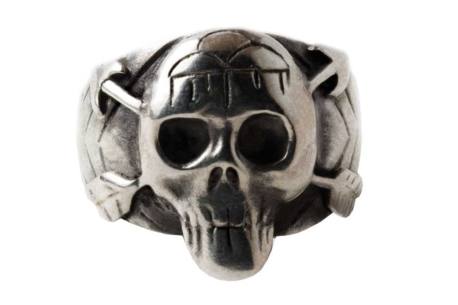
This may just be one of the most bad-ass rocker/designer collaborations ever. In partnership with record label Drag City, NYC-based jewelry designer Pamela Love and artist/musician Jennifer Herrema (Black Bananas, Royal Trux) have joined forces as Feathered Fish. What does this mean? The pair will produce four American-made, limited-edition artifacts each year, à la effortlessly cool jewelry, art objects, and clothing. Just for you.
The company’s name, inspired by a 1966 song by Arthur Lee of the L.A. psych band Love, speaks to the ultra-cool duo’s style similarities—both are Pisces and both rock a trademark look that’s a fantastic collision of classic Americana, rock 'n' roll, and ethereal glamour all at once.
First up is a remake of the Royal Trux skull ring in sterling silver, adorned with a traditional tribal motif and crossed arrows to replace the original version’s crossbones.
You can buy the Native American/RTX-inspired skull ring on the Feathered Fish website. But you better hurry, only 40 rings will be made.