
Neko Case is looking for a designer to create a new tour poster for some upcoming shows. Before you draw any comparisons to musicians looking for free help, rest assured, she's not looking to exploit enthusiastic fans for free design work, but instead offering a $1000 cash and a prize pack to the winning designer. There are some standard protocol requirements you can read about on the contest page, and a few simple requests: no Neko Case likenesses are allowed, the design should be "delicate yet powerful," and it doesn't hurt to incorporate the track list from her new album The Worse Things Get, The Harder I Fight, The Harder I Fight, The More I Love You. As a final stipulation, Case might even give you some input on the design.
Interested designers have until August 19 to submit work.

Photos by Yewon Kim
One couldn't help but notice that the Milwaukee Avenue Arts Festival was a cool affair—and we're not just talking about the mild temperatures. With design outfit Sonnenzimmer and poster maker Drug Factory Press well represented, Parson's and the Owl serving cocktails in a parking lot, bites from Chicago Diner, Longman & Eagle and the like and live sets from Football, Cave, Dam-Funk, Basic Cable, and many more plus an exotic animals petting zoo, it had an air of unforced, leisurely good times. Nothing Major was there, too with our Nothing Belongs to Ebbets Field caps and other festival-exclusive offerings in our pop-up shop. We were jazzed to meet so many NoMa fans in realtime. If you've forgotten what it was like, or missed it altogether, never fear, we took pictures.
Keep an eye on our journal for announcements regarding an upcoming pop-up.

Last month we looked at the recent history of Olympic fonts, including images from the impressive new work for the upcoming Rio 2016 games. While the Rio games may be the first Olympics in the last few years to have a branding identity designers seem to agree on, 1972's Munich games had design contributions from Otl Aicher. In addition to the poster work shown here, Aicher is credited with designing the pictograms for the Munich games, which have become a very familiar sight.


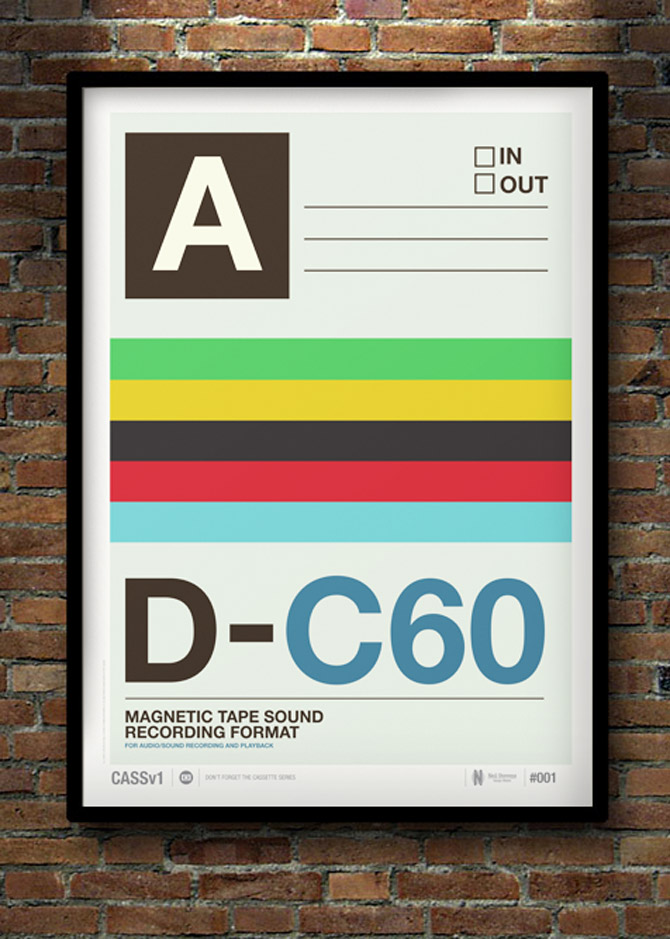
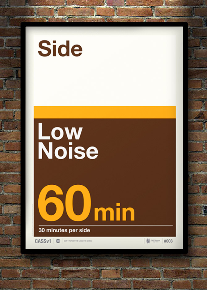
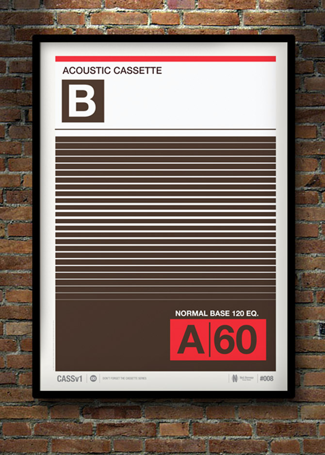
The vinyl revival has been mirrored by a resurgence of interest in cassettes—which many of us prized for their size, affordability and blank-canvas flexibility back in their heyday. Designer Neil Stevens like them, too, and has created a series of posters (30, in fact) based on the inlay designs for blank cassette tapes from various countries. Even if one can't get entirely behind the magnetic tape comeback—fidelity was never the cassette's strong suit—one must admit the bold and reassuring graphics of the "C30, C60, C90, Go" era would look very nice on a wall.
"Don't Forget the Cassette" posters are available from crayonfire.co.uk.


The xx and Grizzly Bear toured the U.S. and Canada together and Manchester's Dr. Me designed a very handsome poster available only at the shows. Some superfans couldn't make the gigs, however, and petitioned for their own posters. So the designer has wisely made the posters available to the rest of us.


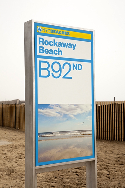
After sustaining extensive private and public property damage following Hurricane Sandy last fall, the preliminary restoration of NYC's beaches was completed just in time for a Memorial Day opening. Part of that restoration was the installation of a new highly visible, bright yellow and blue branding identity from Pentagram. The rebranding is a complete overhaul, and gives a cohesive visual theme from the street signs to the bathrooms.
Read more about the branding and restoration on Pentagram's site, and be sure to check the Parks Department Beaches site before making a trip to avoid any temporary construction closures. ![]()


True to its name, Ten Dollar Fonts offers new fonts every week with licenses that only cost $10. The a la carte pricing is a huge cost-saving alternative for designers who can't afford pricey font packages, and because the site also works as a distributor for tiny type foundries, smaller projects see a much wider release.
Licenses for personal use are $10, while a commercial license is a still-reasonable $20.
Pincambrella
Modula Mono

At the Chicago Design Museum opening party on June 10, as attendees celebrated and congregated around banks of displays, designer Marian Bantjes stood aside, circling a table and slowly ripping up flowers. Delicately tearing petals and leaves to make a floral mosaic that spelled out the word “sorrow,” she was the picture of the concentrating artist.

A renowned Vancouver-based designer who has worked for clients such as Penguin Books and The Guardian, and a member of the Alliance Graphique Internationale (AGI), Bantjes turns fonts and phrases into something kinetic, where tightly wound letterforms spring loose. Her book “I Wonder,” and forthcoming monograph, showcase a career focused on rich ornamentation and constant exploration, from almost heraldic lettering to a piece for Stefan Sagmeister’s “Things I have learned in my life so far” series made with sugar, inspired in part by her fondness for breakfast cereal.

“I keep trying to do new things and follow what interests me, and it can be very hard to drag clients along with me,” she says. “Most people are shockingly unimaginative, and want me to do the same thing I’ve done before. The people who have trusted me to do whatever I want have always been really happy, as far as I know, and I’ve absolutely done my best work for them.”
How did you come to typography?
I didn’t. I just got a job. I was 18, and I needed work, and I saw a little job posted in a bookstore for a publishing company. And I applied for it and got it. It started out mostly filing magazines; quite quickly they trained me in paste-up and layout, and I became a typesetter, and learned a lot about typography. Typesetting is not a creative job, it’s basically following a designer’s directions exactly, but you learn the do’s and don’ts of typography, and you become an expert on how things are done, and some designers know more than others, and you add to that. Of course, they’re not going to handle all the details, like how you balance pages, rivers and things like that. You work really closely with type. You learn all the lingo and the whole thing; so over the period of ten years, I became an expert.
When did you start experimenting?
Not until much later. I became a type snob. The typesetting that I was doing before was just for books. It was very conservative. Once I started my design company, I started doing different kinds of things, business cards and brochures, which require more decisions about what you do with type. That was a new learning curve. But I wasn’t really experimenting. When I went out on my own, I felt like I had a lot of knowledge of type, but it’s not really a passion. I can’t really describe it.

A craft instead of an art?
That’s a close analogy. It was a craft I knew very well. But I had always been very conscious of doing things right. Even as a designer, I didn’t break the rules very much and, if I did so, I did it very carefully. When I went out on my own, I didn’t know what I wanted to do. I didn’t really know. Something happened, and I can’t explain it, but somehow my knowledge in typography, and an interest I have in ornamentation, they just sort of came together in a spontaneous way. And I started working with type in much more adventurous ways, and ways that I never would have dared to before, eventually making my own lettering. I’m not one of these people who goes around taking pictures of signs or identifying type. I’m not as much of a type geek as people might expect.

Is it that type is so proscribed, that it has so many rules, that there are infinite ways to play with it?
Yeah, I think I like the fact that you can push letterforms into so many different shapes. Like graffiti—I’m fascinated with graffiti—I think graffiti is so sophisticated typographically. I love the idea of something that’s recognizable and readable to those who know how to read it, but not everybody else. I like the continuum between the readable and unreadable, the variation there is within that. I just really love that ability to experiment with that and make forms that are interesting but that say something, but are not abstract.
Do you always feel the challenge to do something very ornamental, to top something, or does simple ever work?
That’s an interesting question. I do have a love for modernism, I love it so much, and I do have some ideas for some things that I’ve wanted to do that are very simple. But I have a double mental block about it. On one hand, I feel certain responsibilities to the people who like my work, to continue to do that, and on the other hand, simple seems so easy. I seem to exist on making things difficult for myself. It seems like cheating or something. Which is not to say I don’t respect other people’s work. When I look at those John Massey posters (on display at the Chicago Design Museum), I don’t think it’s easy, I think it’s so beautiful. When it comes to my own work and myself, I need to sweat it out.
Do you ever see yourself doing other types of design, like icon design?
Icon design doesn’t interest me. It has to be clear. It would be very frustrating for me to do that. I’ve done a little bit of illustration and stuff. Early on, I, when I figured out what I was doing, and I put the typography thing together, I was an illustrator, just not the kind that can draw you a cat. And now, I think about segueing into the kind of illustrator that can draw a cat.
A lot of your work has a childlike sense of play, like the macaroni art or the sugar art for Stefan Sagmeister. What informs this sense of wonder? What interests you outside of art and design?
All sorts of things. I’m interested in science. I’m an atheist, so I’m very interested in atheists and the atheist movement, and non-religious forms of gatherings sharing information and creation. I’m interested in animals, and started scuba diving a few years ago. I don’t know if I have a problem-solving mind. Maybe I do. I’m quite good at figuring things out. I can fix my own plumbing.
Why has there been such a resurgence of this handcrafted typography?
It always goes forward and back, clean and simple, always comes back into something else. A lot of people credit me with starting some kind of design revolution. I know I contributed to it, but that pendulum was just starting to swing. People are taking interest, there’s a move away from the computer into handwork.

I know you’re a big fan of The National. Can you tell me about those posters that you did for the band?
They hired me to do the Wiltern show poster, then had me do one for a gig at the Orpheum in Vancouver. The glass one for the Orpheum needed a little bit of negotiation. I convinced them to sell them for more than they intended to sell them for, so we could spend more on construction. The first one was supposed to be a little poster, and I hate little posters, so I made it bigger. Design diva, why the hell not.
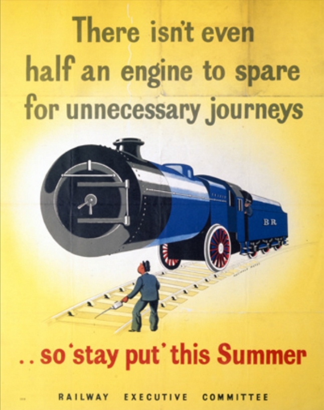
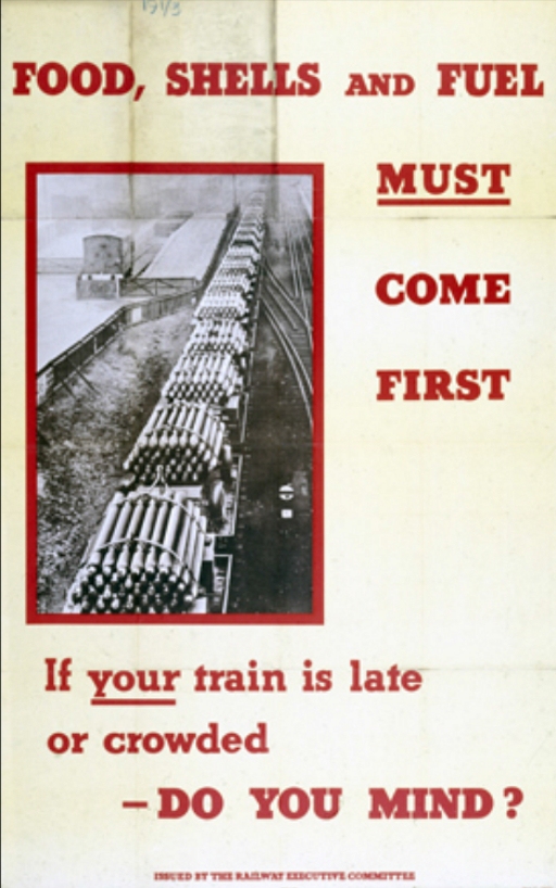
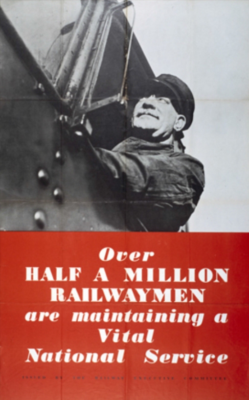
During the height of WWII, the English government wanted to discourage civilians from using trains for leisure travel. Instead of implementing restrictions, they launched a poster campaign with the intention of guilting potential vacationers. While some of the posters are innocuous boasting ("Over Half A Million Railwaymen Are Maintaining A Vital National Service") others are much more passive aggressive than your average PSA ("Now that our men have landed on enemy soil surely no one will endanger their supply of vital munitions by taking unnecessary journeys.") [via Retronaut]

While the Red Bull Music Academy has just wrapped up its month-long string of shows in New York, its publication of record, The Daily Note, is finishing its season strong with a feature decoding a whopping 22 iconic music logos—most, if not all, originating in NYC. The list leans heavy into hip hop, with stories behind the the Run DMC double bars logo, Wu Tang's bat wings, and the gold brick of relative newcomers Fool's Gold. The feature also reopens the debate about who sketched the original DFA lightning bolt, which James Murphy claims as his.
Read the full list over at the Red Bull Music Academy. Or screen their DFA documentary.