
Alex Beltechi's visual identity project for the artist Peter Andras is actually a passing of the torch between the two. Andras, a Romanian artist, was Alex Beltechi's mentor in the early stages of his career.
Beltechi's process for the identity began with the creation of a color palette inspired by a sunset. Noticing that one can only observe the colors in motion, he rendered a graphic using 3D software to animate the palette, which allowed it to mutate, expand, and create a series of original images. He captured some of the resulting images for a line of stationary and show posters. In addition to the heat-map-like image and color palette, Beltechi chose the classic sans-serif typeface Akzidenz-Grotesk, which, despite giving the identity a modern look, was originally designed in 1898.
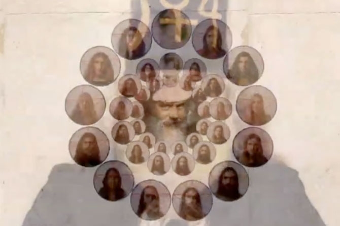
A radical, utopian cult/commune based in Los Angeles in the early '70s, the Source Family took the sex, drugs, and rock 'n' roll lifestyle to an extreme. Father Yod had thirteen wives and led the group, which ran a restaurant and also functioned as a rock band. If it sounds like a story fit for the big screen, that's because it is. Directors Maria Demopoulos and Jodi Wille have secured distribution for their documentary film, The Source Family, with a May 1st theatrical release. The film features original interviews, unearthed Source Family home movies, and original tunes from the Source Family band circa 1971-1975.
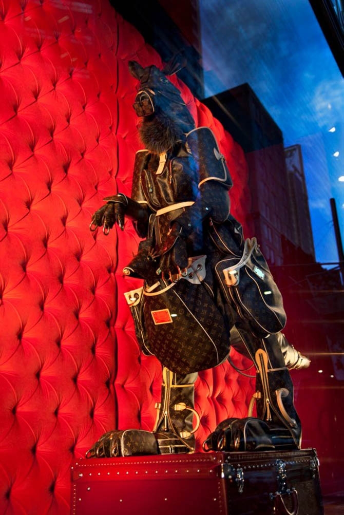
A creative window display is something we love. Too many stores simply prop up creepy mannequins (the equivalent of a fashion editorial with a model in front of a gray backdrop) and call it a day. And then there's the current visual merchandising trend where shops hastily imitate American Apparel, filling windows with 30 items in a rainbow of colors. It gets so boring to see over and over again on our daily commute.
That's why we are deeply grateful to Louis Vuitton for having beautiful and intriguing windows. In the past year, our local windows have featured displays ranging from hot air balloons to a moving carousel. Australia's Louis Vuitton windows even had a kangaroo crafted out of Vuitton bags (with a baby roo in her pouch!).
Who is behind this magic? After digging a bit, we discovered it's all thanks to Chameleon Visual, out of London. They've worked for Chloe, LOVE Magazine, and of course Louis Vuitton, among many more. You can find out the behind-the-scenes tricks on their blog, and keep an eye out for their work in a window near you.
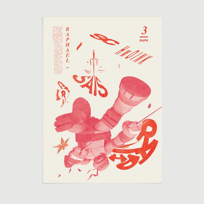
When he's not perfecting the look of SpongeBob or the Teenage Mutant Ninja Turtles for Nickelodeon, Michael Robert Boswell does some great work on his own. Boswell's portfolio is split between fine arts work and graphic design projects, and we get the feeling that, for Boswell, those worlds aren't mutually exclusive.
To appreciate Boswell's work there's really no need to distinguish between the two. His site boasts an impressive selection of skateboards, branding work, posters, sweatshirts, artist books, prints, and sculptures that form a more or less cohesive group.
Boswell's posters are a great example of the playful experimental nature of much of his work. He approaches his posters with methods outside of traditional printmaking. He's used a laser cutter to make piece interact with a gallery's lighting and laminated prints from an inkjet printer with sticky notes for a hip-hop gig poster.
He's a bit of a prankster, too. At a recent show, he rested his prints on what look to be bars of solid gold.

The Smoking Gun reports that a hacker going by the alias of "Guccifer" has gotten into a few e-mail accounts associated with the Bush family. He uncovered a trove of personal information including cell phone numbers, family pictures, and what appear to be self-portraits of George W. Bush in the shower and tub, which were sent by the former President to his sister. Are they any good? Doesn't really matter. These two weapons of mass introspection remind us of Al Gore's post-election weird beard and the Romney gas-pumping media frenzy. We didn't think it was possible to have much empathy for the man, and yet, here we are. It's strangely comforting to think of the little guy just looking at his wet, shriveled body in the mirror wondering, "Who am I?"

Venice, California-bsed artist (and co-founder of Okla Press) Becca Mann returns to her former homebase of Chicago for "Wane's World: A History of 'Things'"—a gallery show featuring her painting and drawing. There's an opening tonight featuring a live set from the band Running.

Mann's work might make you uneasy at first. She makes drawings and paintings from photographs. Her subtly edited final images are analogues of the original photo. Most interestingly, Mann uses a color layering process in creating her images that she likens to the mechanics of CMYK printing. The results are images that are quite realistic on one level, but not obviously hand-made. That might be part of the point. Mann plays with the relationship between objects and their context within the photographic or painter's frame.
"Becca Mann: Wane's World: A History of 'Things'"
Feb 8–Feb 28, 2013
The Soccer Club Club
2923 N Cicero Ave, Chicago, IL 60641
Opening Reception: Friday, February 8, 8-11pm with a special live performance by Running
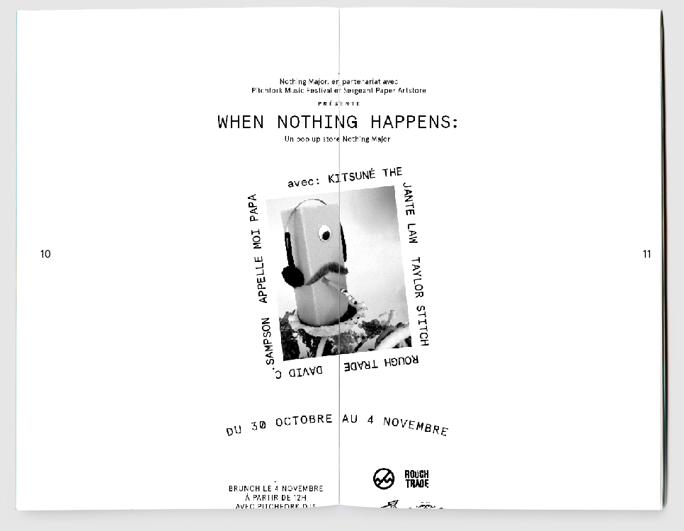
Artist Karolis Kosas just launched Anonymous Press, a new project that allows visitors to create a zine online, add the issue to the free public library, and even order physical copies for just three dollars. The process is simple: using the site's automated zine software (most likely the first of its kind), users input a few key words, and Anonymous Press automatically generates a 12-page zine using results from a Google image search of the chosen words.
But before zine purists mourn the downfall of DIY culture, consider that the significance of the press isn't to exist as an on-demand printing service, but instead as a means to create and maintain a free, collaborative library of user-generated art. By automating the zine design process, the project confronts the ideas of digital appropriation and authorship. Instead of attributing the zines to a particular person, the artist deems every issue a collaboration, or "a byproduct of an individual and a database, i.e. Google image search."
The image above are from Anonymous Press No. 1797, also known as the Nothing Major issue.
[via It's Nice That]

Inspired by a recent trip to the Catskill Mountains, Lauren Moffatt’s Fall 2013 collection is a breath of fresh upstate air in the sea of bleak colors for which wintry season shows are typically known. We checked out Moffatt’s presentation at 94 Prince Street yesterday and felt as though we had just embarked on our first day of summer camp, or stumbled onto the set of Wes Anderson’s Moonrise Kingdom, in all its vintage, Kodachrome glory.
And now for the details:
The scene:
Models standing on large discs of lumber showcased Moffatt’s charming pieces—a quirky, indie touch that wasn't lost on us. A bearded musician sat in the corner of the room strumming an acoustic guitar. Next to him, a rustic wooden plaque engraved with Lauren’s name was mounted on the wall. The tiny space was packed with well-heeled editors, photographers, and likely a few downtown NYC socialites.
The collection:
Moffatt’s knack for pairing traditional silhouettes with intricate prints and patterns abounds. The dreamy, muted color palette is whimsical, with shocks of brightness sprinkled in to amp up the looks. Embroidered silk dresses, pintuck tops, chevron-striped dresses—even a gold sequin mini—are tempered by adorably cozy beanies and hand muffs, along with the occasional lantern. Can a tomboy be sophisticated? Absolutely.
Our favorites:
A chevron print mini-dress in red, white and blue, anchored by a navy coat with cream lapels. Incredibly feminine yet sensible, the look is comfy enough for an autumn night by the campfire.
A cream/navy pintuck top embellished with gold buttons, paired with silk floral pants. The effortless mix-and-match vibe is chic, yet restrained.
Hair/Makeup:
Simple vintage waves—so very Lauren Moffatt. Prim and charming, not prissy. The makeup? Barely there with a strong brow.
Shoes:
Casual lace-up oxfords and ankle boots by Dieppa Restrepo in neutral tones of tan, cream, and gray looked polished yet practical.
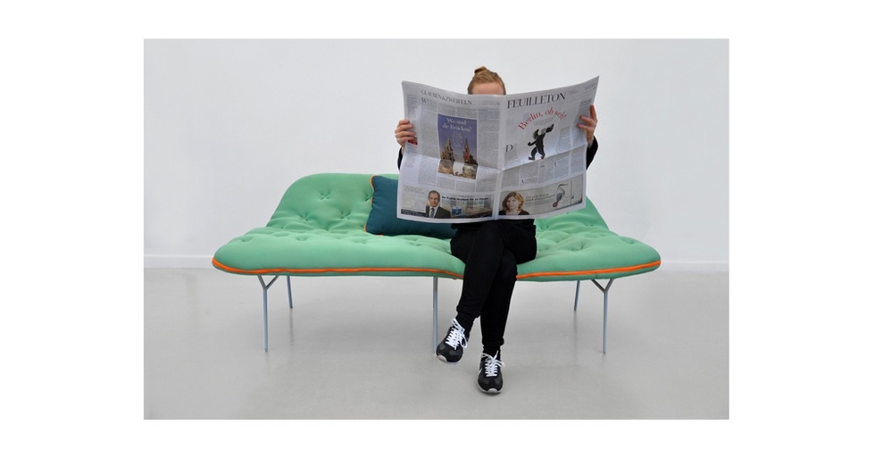
Anyone who has ever spent a cold night on a friend's sofa has probably thought a few design changes might have made the overnight more comfortable. Industrial designer Stephanie Hornig has done a public service for couch-surfers everywhere by making a few simple modifications to the daybed that make crashing on the couch a little bit less of a bummer.
This modified daybed, which is part of her new Camp line of furniture, has two major modifications. First, she eliminated the moving parts inherent in futons and pull-out couches and gave her daybed a shape that's suitable for sitting and a width that's suitable for sleeping. Second, she sliced the daybed mattress in half and added a zipper to give the bed a built-in blanket, not unlike a sleeping bag. The clear separation between the couch and the bed will definitely keep germaphobes happy, and the bright fabrics add some punch.
See the entire Camp line at stephaniehornig.com.
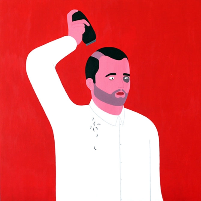
Despite being an English illustrator, and living and working in Cambridge, Thomas Matthews has a fascination with the American suburbs. His interest doesn't stem from a scarringly dull trip there as a child, but from characters in John Cheever and Raymond Carver stories and the prolonged anxious purgatory they live in.
Matthews' figures aren't far off from the middle-aged protagonists of American literary classics: they're presented at a moment of crisis. But, in broader terms, Matthews' minimal drawings and paintings focus on the banal. His simple composition allows things like subtle textures and strong colors to deliver the dismal personalities he's illustrating. The images are far from miserable; however, there's always a touch of black humor as well.