Commercial Type's Berton Hasebe and Christian Schwartz have teamed up for Schnyder, a new serif display typeface for the 2013 redesign of T, the New York Times Style Magazine. While Schnyder is the sixth custom typeface they've created for the mag, it's the first they have co-designed.
Inspired by a piece of pointed pen lettering of Swiss origin, the typeface itself comes in two weights and three widths. Unusually, the stem weights in each weight are identical across the widths which allows the widths to mix freely in headlines, which will be fun for editors and designers. The lowercase version draws from turn-of-the-century German typefaces.
The type palette for T also includes Graphik and some styles from the X Condensed width. The text face is Imperial, the same found in the main NYT news sections.
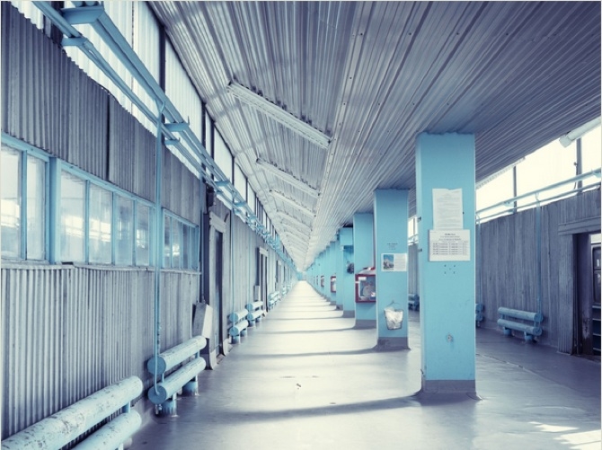
Greg White's Chernobyl series is surprising. Sure he captures the "ruin porn" that's kind of inevitable when photographing a decades-old disaster site, but his knack for framing patterns and unexpected color palettes, like cool fluorescent hues, gives his photos a sense of character and narrative.
That narrative includes the 1986 Chernobyl meltdown in the Ukraine, but White's series manages to extend beyond the disaster. He depicts relics from life before the meltdown, including the beautiful swimming pool and Ferris wheel found on site, while also illustrating present day life in the region, marked by a single general store and a team of scientists and engineers working on a project to contain the radiation.
Greg White's Chernobyl series was shot while on assignment for Wired UK. The images appear with permission from the photographer.
In a typewritten letter, Lenka Clayton announced why she started her conceptual Artist Residency In Motherhood:
"I find now that many aspects of the professional art world are closed to artists with families. Most prestigious artist residencies for example specifically exclude families from attending…"
Her artist's statement finishes:
"I will undergo this self-imposed artist residency in order to fully experience and explore the fragmented focus, nap-length studio time, limited movement and resources and general upheaval that parenthood brings and allow it to shape the direction of my work, rather than try to work "despite it".
Since beginning her residency in September, Clayton has produced around 16 works and maintained an extensive studio diary. True to her original mission, her work explores the duties of motherhood including a sculptural proposal about child-proofing a curator's office, an archive of items found in babies' mouths, a pair of baby pants made from the child's great-grandfather's pants, and a collection of potentially dangerous items rendered in soft fabric.

St. Mark's Church in-the-Bowery has always been a somewhat subversive space, especially considering it's a place of worship. The church is also one of the few community art spaces left in Manhattan's East Village and, since the summer of 1966, a side-room in the gated complex has been the home of the venerable Poetry Project.
The space made sense for Chloë Sevigny's Opening Ceremony presentation: a mod-influenced line inspired by the clothes of Occupy Wall Street, modeled with faux protest signs and straight-faced, stone-still models.
The church was outfitted with five music stages, including a main stage that included Sevigny herself and the drum duo I.U.D. The models flanked the other four stages, two women at each end. There was something awkward about the arrangement at first. The stillness of the models placed directly in front of the bands seemed to disarm the performers. Plus for full bands like Bleached, with four members, things were more than a little crowded. After the first round of songs (the bands alternated performances), the musicians figured out how to share an extremely limited amount of space.
Bleached's garage pop paired well with the clothes on their stage, which included a crowd favorite pair of shoes made of clear plastic.
Light Asylum shared their stage with model Kish Robinson, who you may know as Kilo Kish.
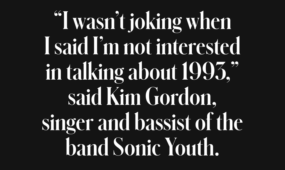
Kim Gordon, a longtime friend and collaborator of the designer, who has her own fashion line and has featured Chloë Sevigny as a model in the past, hosted a few headline items on her stage including a hip-length corduroy jacket, a high-waisted pants suit, and a bright red skirt.
It turns out the way we watch concerts is also a pretty great way to see a new line. By dressing both the bands and the models in the collection, the audience was able to maintain an intense focus. The bands commanded attention, and the models stared blankly through the audience. While waiting their turn, most bands took swigs from provided tiny Champagne bottles.
At hour two, the room hit a sort of equilibrium. The crowd finally seemed comfortable with the routine of rotating to each stage, snapping photos, and squeezing past aggressive networking in progress. The straight-faced models fidgeted only slightly. A few minutes before 3:00PM the house lights went off, the PA was cut, and without an announcement every model and every band disappeared backstage.

Justin Hopkins, who makes music and visual art under the name RareBit, created this series of drawings using only Micron pens, regular 8 1/2" x 11" computer paper, and a photocopier. He calls the series "Give Up The Headache," and with each image he explores a different relationship between the texture and color of his background and the static image of a brainy-looking skull. Hopkins calls the series an "experiment in Xerox and image layering" and we like the idea that some level of chance was incoporated to make such intricate images. By the way, that skull is actually somewhat of a recurring image in RareBit's work.
In addition to his drawings and music as RareBit, Hopkins also moonlights as a sound designer.

Coffee changes lives. Today, many of us can't imagine life without it. But cafés where they put the swirl in your latte? Not always worth the effort. For those who prefer a more straightforward cup of artisanal coffee, brewed at home from beans delivered straight to your door, there’s Regular Coffee. Seriously, that’s the name of Grand Rapids, Michigan-based Rowster Coffee’s new subscription service. Regular Coffee offers a convenient way to purchase and experience your daily black magic.
How it works: Subscribe online via RegularCoffee.com. Each month a perfectly portioned 30-day supply of specialty brew for one arrives. Order as much as you want. Change up your subscription or cancel at any time. Easy.
Where it’s from: Regular Coffee is grown on small farms in Huehuetenango, Guatemala and then roasted after hours at Rowster’s micro-roaster café. Packaged in a special tube to keep it fresh, it is then shipped from Grand Rapids to your doorstep. A pretty valiant crack at farm-to-mug if you ask us.
What you pay: 20 bucks per tube.
How it tastes: According to the folks at Rowster, Regular Coffee has "a lightly-roasted yet full-bodied taste with a caramel sweetness and dried fruity aroma."
Why you’ll feel good: You’re supporting small farms and small business while enjoying a damn good cup of coffee. Special Agent Cooper would totally have this delivered to his hotel room in Twin Peaks.
Bonus: Clean, minimal packaging. Futura Bold type on a cardboard tube just feels honest, modern, and kinda Wes Anderson-ish.

For its Spring/Summer 2013 collection, Maison Kitsuné channelled Southern California prep to achieve a look that's as versatile as it is distinctive. So it makes perfect sense that they brought in Oliver Peoples to collaborate on their first foray into the eyewear game. Inspired by 1950s minimal elegance, the two unisex models (called "Tokyo" and "Paris") are each available in four different colorways. We especially love the removable clip-on sunglasses on the Tokyo. These are available tomorrow in Kitsuné and Oliver Peoples locations, just in time for a last-minute gift for your four-eyed special someone.
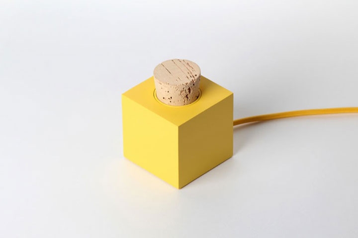
Norwegian design studio Skrekkøgle obviously has fun with their work. Everything they do has an element of whimsy and cheekiness to it, which somehow never seems to take anything away from the functionality of the concept. The Plugg radio is no exception; the sunny little cube is simply operated by removing the cork from the top. Much like the satisfaction in uncorking a bottle of wine, as soon as you uncork the Plugg, the sounds start spilling out. The kind of tactile relationship this creates with something we tend to take for granted is a welcome idea. Unfortunately, it's still just a prototype. Any angel investors reading this?

Help Remedies, the design-centric indie pharmaceutical company known for its line of help I have a (fill in the blank) products, is branching out. For its latest product launch, the drug company turned to the prophylactic category for a little inspiration. The help I’m horny kit, which includes two lubricated thin natural latex condoms, was launched out of a desire to help people have the best sex possible. But don’t get too excited just yet, the kit is currently only available at select W Hotels. “We’re not interested in making condoms for pedestrian, uninspired sex,” says help’s co-founder and creative director, Nathan Frank. “We’re only interested in being a part of the best sex possible, which is why we’re working exclusively with luxury hotels at this time.” For those of you who don’t have plans to check into a W Hotel any time in the near future, you can apply to purchase the product for home use via helpimhorny.com. But be prepared to answer a few personal—and performance-related—questions first (check out Help's graphic illustration for a little inspiration). If your application passes their rigorous approval process, you’ll be granted access to a link where you can purchase the product online.
And, as with all of Help’s products, instructions come included. According to its earth-friendly paper pulp label, “You are probably busy licking or rubbing someone. We don’t mean to interrupt. These condoms are made of thin natural latex so as to be as inconspicuous as possible.” How’s that for clever marketing?
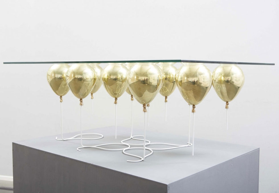
The decadent UP coffee table, recently released by design studio Duffy London, is a glass panel supported by a group of small metal balloons. If you can get past that there's something slightly Entertainment 720 about it, the goofy elegance and implied weightlessness would make any living room a little more buoyant. Christopher Duffy (who also designed the swing chair) is limiting this run to twenty. Details on how many he has left are up in the air.