
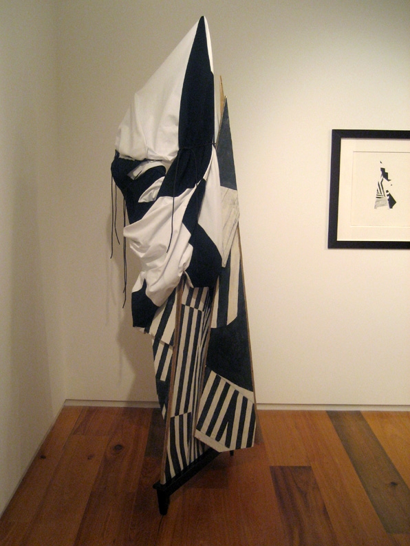
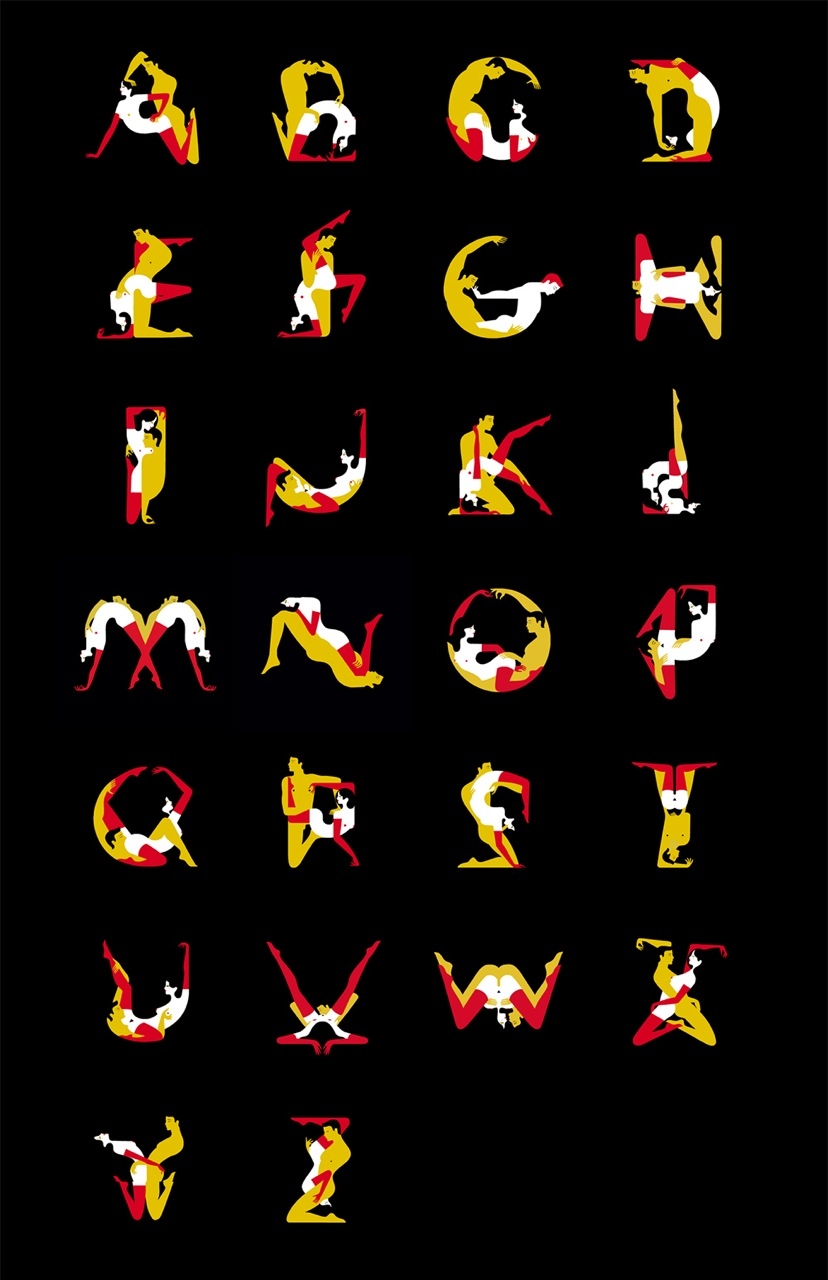
The negative space in Anna Peaker's record covers, tape packages, and posters has a more active role than expected. For her Hookworms single cover for "Too Pure" (top of the post), the isolation of each image makes the collection of objects look more like a series of important symbols instead of a narrative image. Her Risograph posters show a similar restraint, while incorporating elements of collage.
Anna Peaker lives in Leeds. Keep track of her work on Tumblr. 

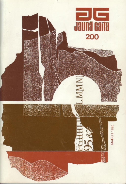
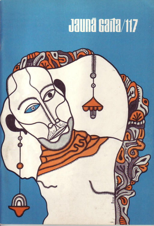
After the end of World War II, a number of writers and creatives left home in Europe and immigrated to the United States and Canada. One group of Latvian writers and artists, who set up new lives in Canada, launched a magazine called Jaunā Gaita, or "The New Course," to create work about their unfamiliar surroundings. While the content was notable on its own, the magazine also developed a cohesive tone with their cover art for each issue, typically featuring a bold design and rarely more than three colors. The magazine is still active in the increasingly rare print format, and although printing technology has made full color images commonplace, Jaunā Gaita often still opts for the simplicity of a two-color design.
Check out the Jaunā Gaita archives to see even more covers and features.


Here in New York City, the MTA regularly reminds us subway riders of certain dangers in the system. Using posters featuring simple Helvetica text and sometimes stick figure illustrations, they warn us against things like riding outside the train, and venturing onto the tracks.
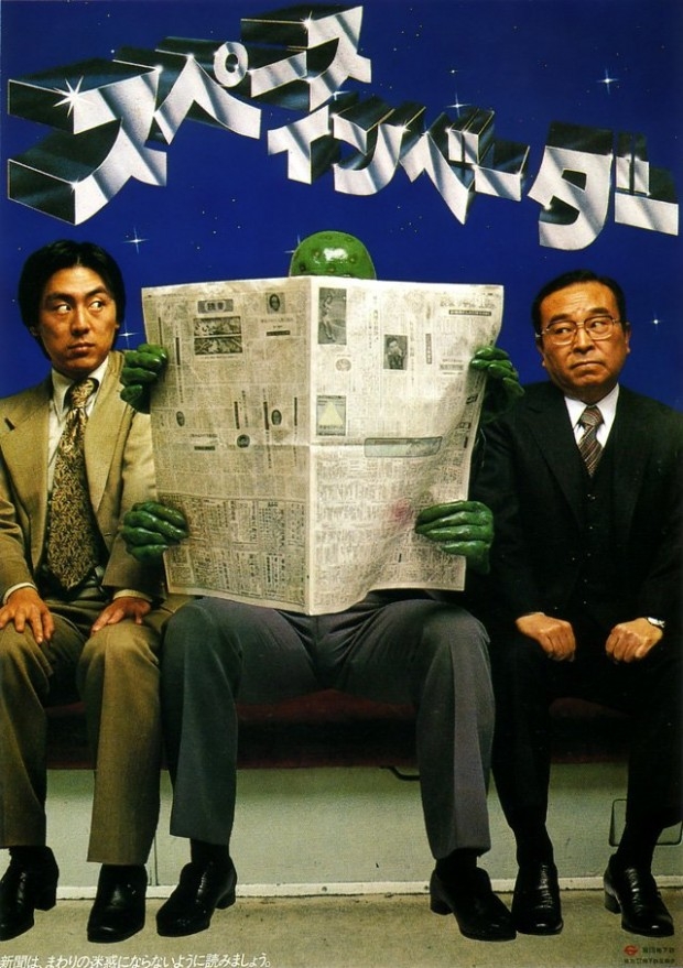
From the mid-'70s through the early '80s, the Toyko subway system also used posters to remind riders of the rules, except these featured super heroes, Hitler, aliens, Santa Claus, even Jesus Christ. The posters warned against more specific, but possibly annoying, behavior. Aliens told riders to not read newspapers too widely, Hitler and Charlie Chaplin illustrated the evils of spreading your legs too far apart while sitting, Jesus told you not to forget your umbrella, and Santa Claus reminded riders at the holidays not to get drunk and pass out on the train. [Images and translations from Retronaut via WFMU]
"Don't forget your umbrella." (October 1981) The text at the top of this poster—which shows Jesus overwhelmed with umbrellas at the Last Supper—reads "Kasane-gasane no kami-danomi" (lit. "Wishing to God again and again"). The poster makes a play on the words "kasa" (umbrella) and "kasane-gasane" (again and again).
"The Seat Monopolizer" (July 1976) Inspired by Charlie Chaplin's The Great Dictator, this poster encourages passengers not to take up more seat space than necessary.
"You've had too much to drink." (October 1976) This poster of a drinking Santa is addressed to the drunks on the train. The text, loosely translated, reads: "I look like Santa because you've had too much to drink. It's only October. If you drink, be considerate of the other passengers."
Miami-via-NYC group Lansing-Dreiden released a trio of well-regarded and influential long-players in the aughties, all refining an original blend of '80s synthpop and galactic space rock. But L-D isn't a typical band—in fact, it calls itself a "multimedia company" and has created visual art, graphic design, installations, and a free literary journal, Death Notice, all under the L-D name. Famously, Lansing-Dreiden featured a band in its video that was not Lansing-Dreiden. This year, the Mexican Summer label reissues three Lansing-Dreiden albums on vinyl, so we thought we'd check in with the directors of the multimedia company and see if we could find out more.

"iii"
What was Lansing-Dreiden all about? It was a "collective" and also made up of visual artists, right?
We refer to Lansing-Dreiden as a company instead of a collective. Collective implies a group of artists working together on a single project whereas a company has a mission and aesthetic that must be maintained regardless of who the members are. Some members were visual artists and some were musicians, some both, but the company was set up in a way where everyone could take part in all of the decisions since they were ultimately meant to reflect the company itself and not any individual.

"SmallM4"
And then it became more about art than music? What kind of art?
It has never been an either/or situation. The entire body of work we make all comes from the same place. Our favorite medium has been misinformation.
What's the connection with Violens?
Apparently one of Lansing-Dreiden's members is part of a guitar pop group named Violens. We have never listened to it.

Why are the L-D albums being reissued? I always thought they should have gotten a bit more attention.
We appreciate that. They are being reissued because the label asked us if we wanted to have the records printed on vinyl, and we did. Over the years, the number of people we've met that found the work interesting in some way have far outnumbered the ones that have initially dismissed it. These re-releases are for them.

Can you tell us about the album packaging design?
It is pretty minimal, just black and white. A double-matte coat with silver foil stamp logo and song names on the back. Three releases are being reissued on 12". Each record cover is a more minimal spin on its original packaging.

L-D has been fairly media shy, but Violens has done interviews. Is that about creating a mystique or just more about time management?
Lansing-Dreiden has never really been media shy, we answer most questions. The press have accused us of using our anonymity as a gimmick—perhaps that's laziness on their part? The point of Lansing-Dreiden was to produce works in various mediums that were thematically and aesthetically in harmony, following a set of rules. We chose anonymity because we wanted the audience to relate to the work on its own terms, without needing to have a media personality to refer to.
For more Lansing-Dreiden, visit lansing-dreiden.com

Moving downtown from last year’s inaugural exhibition inside a Humboldt Park warehouse, the Chicago Design Museum, a month-long pop-up exhibition opening June 1, won't lose any of its curatorial edge this year.
For 2013, ChiDM’s sharp yet eclectic lineup unites different disciplines of art and design under the theme of "play," and seeks to "speak to an underlying discussion in the design community about whether design is art, designers are artists, and if either a pursuit to create work that was personal (content self-generated) or commercial (content from/for a client) could be deemed a nobler pursuit than the other," according to design director Jim Thomas.
(Images below are meant to showcase the work of some of the featured artists; they may not be included or displayed at the museum)

"Hemlock," Marian Bantjes
Featured designers for this year's exhibit include: Vancouver-based Marian Bantjes, a graphic artist whose kinetic typesetting led Stefan Sagmeister to call her “one of the most innovative typographers working today”; local ad-world icon John Massey, who worked at Container Corporation of America and the Center for Advanced Research in Design (CARD) and made these amazing Chicago posters; New Wave Swiss typographer and graphic designer Wolfgang Weingart; and Michael C. Place, founder of Build and a former member of Designer’s Republic, the seminal Sheffield studio responsible for many famous record designs for labels like Warp.

John Massey, Flag
“The board members of ChiDM talked a lot about designers who experimented with creating new ways to present visual information,” says Thomas, “whether it be through simplifying elements to include only those that communicate the intended message, like John Massey, or pushing the limits of new technology (or old technology used in new ways), like Wolfgang Weingart. We also have two designers in the exhibition, Marian Bantjes and Michael C. Place, who quit established practices to create work that was more personal to them, both in content and context. These second two are still very much in the prime of their design practice and we are excited to watch where their experimentation will lead them, and the design community, in the years to come.“
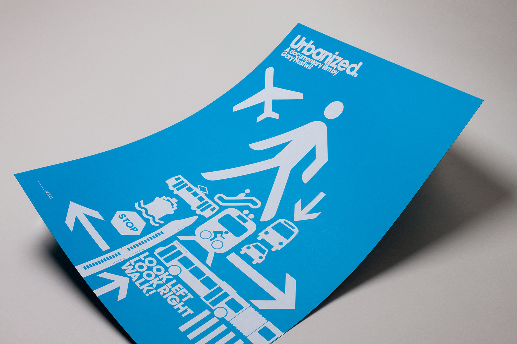
Urbanized poster by Build
The museum, which opens at Block 37 in Chicago's loop, will also showcase its own curated exhibition of new work, Re/view, based around the theme of optical illusions.
“Pieces in Re/view play with the idea of illusions as something that takes more than one look and multiple vantage points,” says Reina Takahashi, special exhibits curator. “Artists pushed this in a number of different ways—pieces that make you step back, look closely, stand on a specific point in the room, or even turn the viewer into the subject of an illusion. Interpretations of the theme varied from those that took a historical look back at the traditional optical illusion, to those that incorporated their own personal narrative.”
The Chicago Design Museum will be open June 1–30, and host a variety of special events. On June 6, 6-8pm, Pop-up Art Loop will host a First Thursday's Gallery Walk. Marian Bantjes will give a design talk on June 8 from 2-4pm. The museum’s kick-off reception will be held in the ChiDM space June 10 at 7pm. Adobe will host a Create Now event, showcasing new developments with the Adobe Creative Cloud on June 18. Visit ChiDM online for more information.
Advertising’s ubiquitous nature makes it hard for a single message or image to break through the white noise in 2013. But there’s something eye-catching about handmade signs that manages to cut through the clutter.
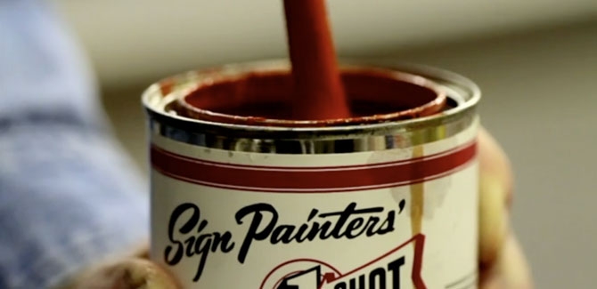
Attracted to the craft behind traditional public advertisements and handmade signage, authors and filmmakers Faythe Levine and Sam Macon set out in 2010 to make Sign Painters, a documentary and book about the subject. A few years and 40-plus interviews from across the country later, they’re screening the movie and raising awareness of the art form, which was hurt by the introduction of cheaply made vinyl signs in the late ‘70s and early ‘80s, but is now experiencing a resurgence due to a rising awareness about authentic craft and better design.
“Once you become aware of the basic elements of sign painting, it makes you walk down the street and ingest the information you’re seeing in a different way,” says Levine. “It makes you become conscious of your visual landscape in a very different way.”
SIGN PAINTERS (OFFICIAL TRAILER) from samuel j macon on Vimeo.
Nothing Major spoke to Levine and Macon about covering the craft.
Nothing Major: While traveling around the country and talking to people in different cities, did you discover that certain regions had their own styles of sign painting?
Faythe Levine: It was more attached to a person than a region. So-and-so worked at a shop with this guy or under this guy, this is Gary’s 'R' or so-and-so’s 'I'. You’d meet people who knew where that particular 'S' originated.
Sam Macon: The main regional thing, and it’s not a perfect example, would be window splashes, the bright, often temporary window painting that’s done for a sale. It was very big in Southern California in a way that we didn’t see elsewhere, where the climate allowed you to be outdoors every day painting.
Levine: The easiest way to explain it to our generation is graffiti. There’s a lot of crossover for a certain style in a certain place.
Nothing Major: How did sign painting and graphic art inspire one another?
Levine: The influence [on graphic design] is more direct than most people realize. Sign painting was prevalent until we were kids. Vinyl signs really took over in the late ‘70s and early ‘80s, within our lifetime. That’s why it’s such an important conversation to have. The amount of time a sign painter spends talking to people on the street versus sign painting is 50/50 sometimes. People keep asking, "What are you doing? Are you doing that?" What does it look like they’re doing, they have a paint brush in their hand? People are amazed to see people painting things on the street.
Macon: Sign painters were always tied into current trends and designs. Only recently have more people become aware. It’s more a product of a more aesthetically aware culture, especially among younger professionals. Everything needs to look cool.
Nothing Major: How would you qualify the health of the craft right now?
Levine: People are excited about it. I feel like it’s a growing part of people’s general awareness of their surroundings.
Macon: You have the first generation really tuned into graphic design and aesthetics. There are so many more branding executives or design specialists. One person we interviewed was saying, “I need to sell myself and sign painting to these people. I just need to go to them and say 'Listen, people are coming from the building from this side and that side, and we need to play off the sign on the next building, and it needs to stand out from the sign next door.'” If you don’t know that’s an option, the default is going to your corporate office, and getting a sign, the same image they send everywhere, regardless of local aesthetics and geography.
Levine: You don’t need to go to a fast-and-easy sign shop where they crank out this ugly vinyl banner. You can actually go to this skilled person. There’s a lot to the trade, you don’t put certain colors together, for instance. To make a 45- to 60-minute film about the history and how things happen, that was probably our biggest challenge. We started off not knowing if we had enough content, and all of a sudden we could make a miniseries. Call Ken Burns.
Nothing Major: Were there any pieces or murals you saw that you thought were masterpieces of the craft?
Macon: Probably the coolest things were old ghost signs from unnamed people. I can’t believe that nobody knows, or has any information about, how this stuff was made. People will pay extra for a refurbished old loft apartment with a fraction of a ghost sign. And some of the most dynamic stuff I’ve seen goes uncredited. I think scale is always impressive. Anyone who does something big, it takes an incredible amount of work. The guys at Colossal, who often do something really big, do some amazing projects, painting 70-foot-plus sides of buildings in the middle of winter hanging over the streets of Manhattan. There’s really too much to name one. Gary Martin in Austin doing flash art design style in his work. A lot of his work has this really cool wild style. There’s someone in Chicago like Bob Behounek, or John Downer in Iowa, their knowledge of alphabet styles, and the ability to wield a brush on a small scale. When they’re done painting, it looks like it was printed out. They can just go through fonts, whole alphabets are learned and programmed in their brains.
Levine: They have the muscle memory. John Downer can paint out the perfect Helvetica alphabet. One of the guys we interviewed said sometimes the best hand-lettered signs are the ones you don’t notice. You just don’t realize it’s there, it’s doing its job so well. He took us to this black-paint-on-white-board "no parking" sign on a church and said this was the best sign in all of Cincinnati. “Look at the brushstrokes, you can see how quickly the sign painter knocked it out.” He picked apart the sign like a science. It was the plainest sign, but it had been there for 50 years doing its job. It was perfectly done.
Levine and Macon will be on hand for a reception and screening of the film May 17 at Chicago's Logan Theater. Future screening dates in San Francisco, Boston, Minneapolis, and other cities in the U.S., Canada, and worldwide, can be found online.
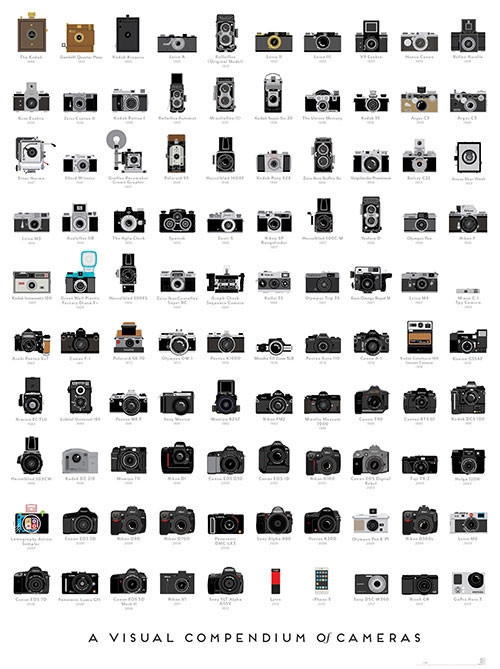
We tend to think that many vintage cameras are more fun to look at than to use—look no further than our bookshelf full of Brownies and old Polaroids for evidence of that. But, for a nice timeline of the look and evolution of the camera without the dust-collecting artifacts themselves, this offset litho-printed poster (available for pre-order for $22) from Pop Chart Lab does a pretty nifty job.
Is it really necessary to reissue the Kama Sutra at all? Used copies aren't exactly hard to find. But perhaps, the opportunity to update the looks of the classic sex manual was just too good to pass up for Penguin Classics. Malika Favre's cover illustration and typography is both erotic, slightly cheeky, and graphically bold. With art direction from Paul Buckley, the deluxe edition will surely find its way into a many bedside tables.


Storm Thorgerson, the English graphic designer responsible for Pink Floyd's iconic Dark Side of the Moon album cover, died Thursday at the age of 69. In addition to his solo work, Thorgerson was also a major part of the design team Hipgnosis, which later included Peter Christopherson from Throbbing Gristle, and produced surrealist designs for bands like Led Zeppelin, Electric Light Orchestra, The Hollies, and many more. His designs could be witty (10cc) or cryptic (Pink Floyd's Wish You Were Here), and often invited the viewer to personal interpretation, not unlike rock music itself. Thorgerson believed in producing his surrealist images through elaborately staged photography, rather than photo effects or digital techniques. More recently, you may have seen his work on covers for Muse and The Mars Volta.
We've collected a gallery of his design work (above) and his video work (below).
Watch an interview with Storm Thorgerson about the influence of Magritte on his work.
Robert Plant - "Big Log"
Pink Floyd - "Learning to Fly"
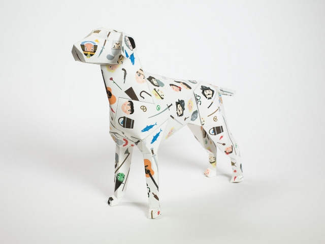
In short, Gerald is a paper dog, originally concepted in 2008 for the rebranding of UK design studio Lazerian. After much trial and error, Lazerian's Liam Hopkins and 3D designer Richard Sweeney came up with a pattern that could be easily reproduced, handcut, folded, and glued into a free standing dog. Anyone can make Gerald with the blueprint, sharp knife, glue, and "a healthy degree of patience." Eventually, a small dog version was developed with just nine panels, while the studio created an 88-component larger version for itself. Gerald is based on the look of an Italian gun dog, which is perhaps why he looks so eager, loyal, and a bit hungry.
After a quick sell out of the flatpack at design events, the designers played with customizing their own Geralds, then launched the Gerald Project in 2011, shipping out flat dogs to their fave artists, designers, and creative folk.