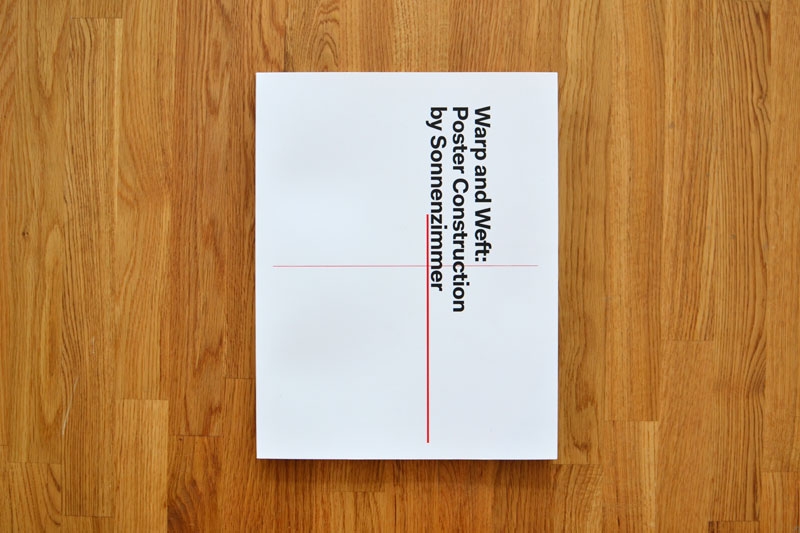
This Sunday, Brooklyn's Beginnings (110 Meserole Ave) hosts a book release for Warp and Weft: Poster Construction by Sonnenzimmer as well as a pop-up shop.
Curious about the new book on poster construction, we asked Chicago designer Zach Dodson (who co-edited the book with featherproof books cohort Jonathan Messinger) what he learned working on the project with "Wabi-Sabi design masters" Sonnenzimmer, AKA Chicago-based studio of Nick Butcher and Nadine Nakanishi. Here's what he told us.
1. How to approach things (and people) thoughtfully. Wabi-Sabi principles: Simplicity and Modesty
Anyone can stumble onto a good design. But how to achieve amazing results consistently? The answer: Process. Long, thoughtful, intentional process. And when it comes to process, the Chicago art and design studio Sonnenzimmer have got it down pat.
When they tapped Jonathan Messinger and I at the small press we run, featherproof books, to lend a hand editing their first ever full length book, we jumped at the chance to take a peak inside their process, and be part of the fun. Also, they were so kind and humble and funny in their approach, how could we say no? They acted thankful that we were working with them every step of the way, though we should have really been then thankful ones. This is a great approach to collaboration.
And the results are amazing. Sonnenzimmer has got a style all its own.
2. How to pay attention to the hiccups, go with the flow, and be patient. Wabi-Sabi principles: Imperfection and Acceptance
What's the Sonnenzimmer process like? In the limb-bound, foil-stamped Warp and Weft, they get down and dirty with some of their best posters, analyzing each in terms of pop culture, art history, and formal composition. If anyone knows how to take advantage of the ‘happy accident’ it’s Sonnenzimmer. The compositional reads are broken out into schematics to show you how each poster is meant to be read, graphically. He's responsible for the stunning look and feel of the entire book. There were hiccups editing and due to some crazy life circumstances I fell off the grid for a few weeks while Jonathan picked up the slack. The road was bumpy at times but without the struggle the book would be completely different.
The book (designed by by Alex Fuller of the hippie cult Post Family) provides a fascinating peak inside Sonnenzimmer's thoughtful poster-making process. They brought the same level of care and attention to the process of creating a book. Typically, we met at their space, they asked questions and debated (sometimes with us, sometimes with each other) every aspect of the book, and how it could get across what it was like to work inside their small art and design studio. We were on a schedule, and passed many rounds of revisions back and forth, pruning, editing, expanding, smoothing the edges, and tightening down the hatches until the book as a whole was a perfectly balanced, well-executed piece of art.
Just like their posters! Some of which subscribe to the Japanese principles of Wabi-Sabi.
3. Just what the hell Wabi-Sabi is.
A mystical, nostalgic Japanese philosophy of beauty, focused around the imperfections created by nature, aging, and accident. It’s the scar on the otherwise perfect face, the stains on a teapot from years of use, and the faded, cracking autumn leaves. You wanna see that philosophy exercised in the wild world of rock posters? Then you should buy and study your own copy of Warp and Weft.
Warp and Weft: Poster Construction by Sonnenzimmer
Book Release and Pop-up Shop
Sunday, Feb 24, 11–4pm
Beginnings
110 Meserole Ave
Brooklyn, NY 11222

A brilliant concept—If best-selling albums had been books instead—executed cleverly is one thing. But Christophe Gowans takes it one step further, writing clever synopses for the imagined tomes he's designed. We've excerpted some of those descriptions in our captions above. If the Record Book was a book, we'd buy it. We've only posted a select few from The Record Books series, there's many more at ceegworld.com and hopefully more to come.
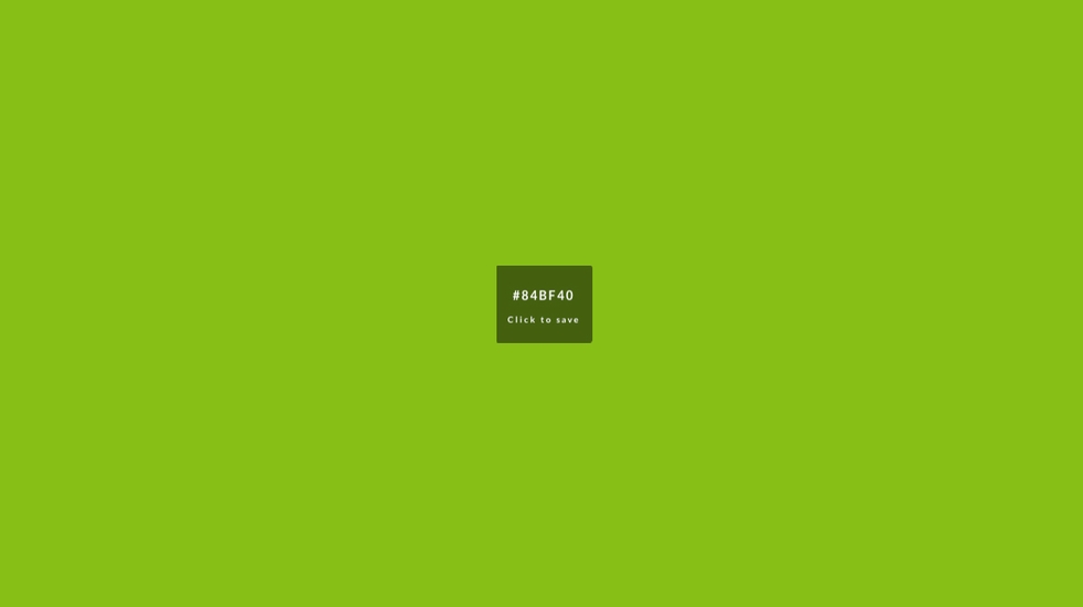
Devin Hunt, the man behind Hailpixel, is a designer's designer. I don't mean his work is inaccessible, but rather that he creates tools to make web designers' lives much easier. His latest project is a new web application that provides an intuitive way for web designers to choose a color pallete, complete with HTML color codes. The app works amazingly well for two reasons. First, the controls are as simple as possible: you simply move your cursor around the screen right or left to adjust the hue, up and down for lightness, and use the scroll feature to adjust saturation. You save a color with a single click. Even better, all the colors you've previously selected remain visible, which makes assembling a palette a painless experience.
Spend some time with the color selector at color.hailpixel.com.
Founded by the Italians Luca Bendandi and Matteo Cossu, SHS Publishing has a deceptively nondescript name, a roving area of operation, and almost microscopic print-runs. The small publishing house/collective of authors based in Berlin specializes in art, graphic design, typography, and architecture books and believes making small books for niche markets makes it more likely to get to the trends first.
Small means nimble for the publishers, who have a passion for ink on paper. "We don't believe in flooding bookshelves with a million copies. Isn't it better to print less and get them all on the right bookshelves, where they can be read, lived, and consumed?" writes Cossu.
The company has an eclectic catalog. One Gear is about fixed gear bikes, while Studiospace is concerned with architecture practices, office space, and work in general. GrAphorisms features 59 insights set in innovative typography. And Totem shows off the handcut shapes of PIRO, an Italian artist favoring motifs inspired by the iconography of ancient religions. Printing methods vary by publication. "Depending on the printrun we'll either use conventional offset or resort to a low-fi Duplo that we have in-house," Cossu explains. Totem was made on the Duplo 63s printer (a "poor cousin" to the Risograph, he says) and handbound.
ToTeM from Roberto López Mélinchon on Vimeo.
It might be young and small, but SHS hasn't wasted time. Last year, it organized "Fahrenheit 39" in Barcelona, a mini-festival celebrating independent print culture featuring workshops and live music.
With "Fahrenheit 39"-type events in mind, SHS has advice for other would-be small publishers: The work isn't done when the books come off the press. "Once finished, we always try to take the book by the hand and accompany it out, organizing events, building a community, and including our readers in the discussion generated by the publication."

Commercial Type's Berton Hasebe and Christian Schwartz have teamed up for Schnyder, a new serif display typeface for the 2013 redesign of T, the New York Times Style Magazine. While Schnyder is the sixth custom typeface they've created for the mag, it's the first they have co-designed.
Inspired by a piece of pointed pen lettering of Swiss origin, the typeface itself comes in two weights and three widths. Unusually, the stem weights in each weight are identical across the widths which allows the widths to mix freely in headlines, which will be fun for editors and designers. The lowercase version draws from turn-of-the-century German typefaces.
The type palette for T also includes Graphik and some styles from the X Condensed width. The text face is Imperial, the same found in the main NYT news sections.
When he's not perfecting the look of SpongeBob or the Teenage Mutant Ninja Turtles for Nickelodeon, Michael Robert Boswell does some great work on his own. Boswell's portfolio is split between fine arts work and graphic design projects, and we get the feeling that, for Boswell, those worlds aren't mutually exclusive.
To appreciate Boswell's work there's really no need to distinguish between the two. His site boasts an impressive selection of skateboards, branding work, posters, sweatshirts, artist books, prints, and sculptures that form a more or less cohesive group.
Boswell's posters are a great example of the playful experimental nature of much of his work. He approaches his posters with methods outside of traditional printmaking. He's used a laser cutter to make piece interact with a gallery's lighting and laminated prints from an inkjet printer with sticky notes for a hip-hop gig poster.
He's a bit of a prankster, too. At a recent show, he rested his prints on what look to be bars of solid gold.
Artist Karolis Kosas just launched Anonymous Press, a new project that allows visitors to create a zine online, add the issue to the free public library, and even order physical copies for just three dollars. The process is simple: using the site's automated zine software (most likely the first of its kind), users input a few key words, and Anonymous Press automatically generates a 12-page zine using results from a Google image search of the chosen words.
But before zine purists mourn the downfall of DIY culture, consider that the significance of the press isn't to exist as an on-demand printing service, but instead as a means to create and maintain a free, collaborative library of user-generated art. By automating the zine design process, the project confronts the ideas of digital appropriation and authorship. Instead of attributing the zines to a particular person, the artist deems every issue a collaboration, or "a byproduct of an individual and a database, i.e. Google image search."
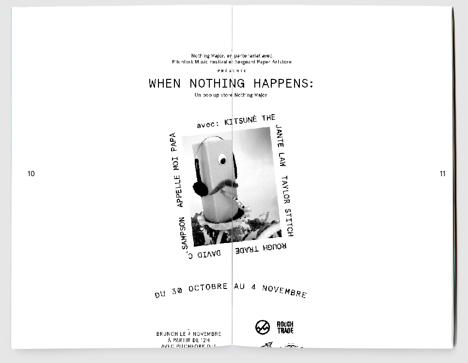
The image above are from Anonymous Press No. 1797, also known as the Nothing Major issue.
[via It's Nice That]
Jon Gray of Gray 318 is a master of typography-driven book designs. We're huge fans of his bold use of hand-drawn lettering. You might know his distinctive and ebullient work on Jonathan Safran Foer novels, for example, but that's just the tip of the iceberg. Gray gives so much personality to a book that it makes us want to drop everything, step away from the computer and read. No wonder he's in demand for major unit-moving, literary titles.
Designer Ben Pieratt introduced Hessian today, an elegantly playful collection of graphic assets, guidelines, and themes—for a brand that is still yet to be determined. If you're "a restaurant, a start-up, a clothing brand or more," you can buy Hessian and work with Pieratt while he fine-tunes the package to suit your project. While it's really great-looking, the artistry here is in the concept of selling a graphic identity using this model. It challenges traditional thought on how the story of a brand should inform its own aesthetic presence, and does so in an era when a design idea born from pure inspiration can just as easily be the foundation from where a new idea can grow. And the name isn't a misspelled Heavy Metal Parking Lot reference—just a nod to acclaimed illustrator and designer Richard Hess.
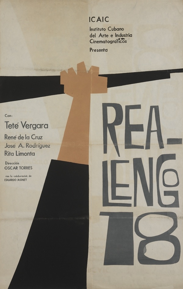
It's hard to imagine that only a few months after the Cuban Revolution the new government would have any interest in film production. As it turns out, the new regime believed the medium was the best way to educate and inspire population. In 1959, Cuba's new founding fathers quickly formed the ICAIC, or the Instituto Cubano del Arte y la Industria Cinematográficos (The Cuban Institute of Cinematographic Art and Industry) with a mission of converting the island nation from a movie consumer to a movie producer.
The Danish Film Institute has collected a range of posters surveying fifty years of Cuba's film industry.
Historical context aside, we like these posters by distinctive artists such as Niko, Dimas, and Bachs for their bold illustrations, simplicity of design, and deep color palettes. Not to mention the gorgeous typography. To see more, head over to the Danish Institute of Film's Flickr page.