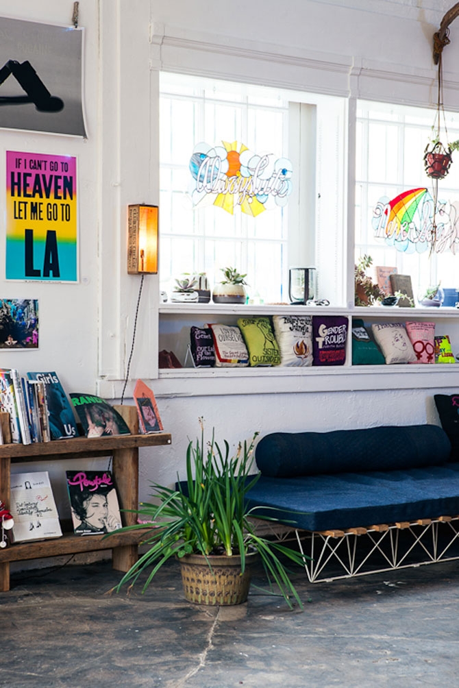
The Los Angeles gem known as Otherwild has a new location. The hybrid retail space and graphic design studio run by Rachel Berks and Marisa Suárez-Orozco opened last year in the thick of tourist mania on Hollywood and Highland. The first incarnation was a brave move for such an earthy outfit. But the new Echo Park location with neon sign suits it much better. On a block that's both tranquil and a bit rough around the edges, the new Otherwild is stocked like a cool kids clubhouse.
Inside, Otherwild has a laid-back witchy vibe balanced with a healthy dose of modern neons and iridescent plastics. The curated selections ride the line between art and craft. There is much to see here. From cast porcelain containers that feel like a nod to Rachel Whiteread, to swirly enamel rings gripping enormous chunks of pyrite, to that white neon Shangri-LA sign, these girls have an eye for simple beauty and West Coast style. The main criteria for what is sold here seems to be a solid belief in the pieces on the shelves and a desire to support the artisans that make the work. Otherwild feels like the kind of place that actually inspires real gift-giving, because everything here is so intimate and genuine.
The space itself serves as a great backdrop for the work in the store, with a hand-stripped wall and textured floor that give the whole place a warm and lived-in feeling. Dazzling smiles and the prettiest dog on the block welcomed us in; we were offered tea and were left to happily touch every single thing in the store with the most casual of chatter. It shouldn't be a surprise, therefore, that social events are a big part of Otherwild as well. Meanwhile, the graphic design studio operates at full steam, offering services that range from wedding invitations to web design. One gets the feeling that with a simple ask these ladies would be available to dive into whatever project presents itself.
Otherwild's new shop is open at 1932 Echo Park Ave, Los Angeles, CA.

Brooklyn designer Kyle LaMar created the brand identity for Rebels in Paradise, which happens to be the name of a book on the LA art scene of the '60s as well as a show at NY gallery NYEHAUS. LaMar's brand concept for the gallery show puts it on the same plane as that of a clothing line, coffee house or whathaveyou—a clever way to get our attention, we tend to think.

Factory Records designers Peter Saville and Brett Wickens created an incredible sleeve for New Order's "Blue Monday" single. Released March 7, 1983, the design remains a stark, modern time capsule of the era. The floppy disk-inspired, die-cut outer sleeve featured only FAC SEVENTY THREE as text for the label catalog number, while the show-through inner sleeve was silver. The records were expensive to produce and "Blue Monday" was an unlikely but massive hit. The record label said it lost a few cents each on the original singles sales, though it is likely that it was losing money in various other ways as well.
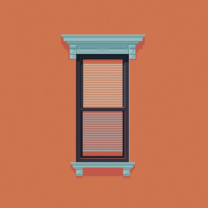
While gazing out of windows is considered much less creepy than gazing into windows, New York City-based graphic designer Jose Guizar has chosen the latter as a source of inspiration for his latest project. Part an ode to architecture and part a self-challenge to never stop looking up, Guizar’s "Windows of New York" project is a weekly illustrated fix for his growing—you guessed it—window obsession. “A product of countless steps of journey through the city streets, this is a collection of windows that somehow have caught my restless eye out from the never-ending buzz of the city,” explains Guizar. And while the designer has done an impressive job of illustrating the many windows of Manhattan, we’re hoping he’ll venture over to New York’s outer boroughs with the same amount of enthusiasm—and creepiness—in the weeks to come.
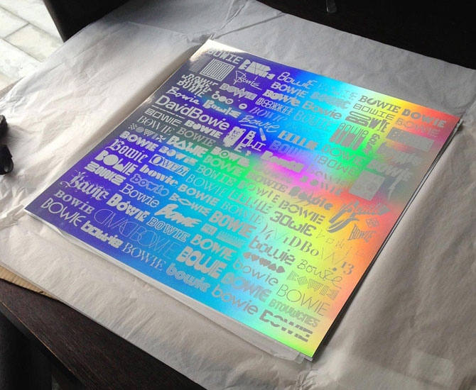
David Bowie is having quite a good 2013. And having recently discovered his scene in the 1981 German junkie film Christiane F. we're as obsessed as ever. We’re not alone. British designer Blam (AKA Mark Blamire) takes that OCD admiration to epic proportions with the "Changing Faces of Bowie Print" (2013). An array of 101 type styles, logos and symbols inspired by the former David Jones screen-printed onto 240gsm Mirri rainbow holographic paper, this 500x500 limited release print showcases the work of some very reputable artists, designers, and publications who are just as clearly enamoured of the legendary rocker. Pentagram, Stockholm Design Lab, Crispin Finn, Monocle, and Wallpaper are among the contributors. The print has been created exclusively for the David Bowie Is exhibition at London’s Victoria & Albert Museum which opens March 23.
"The Changing Faces of Bowie Print" is available for pre-order for £45 at vandashop.com.
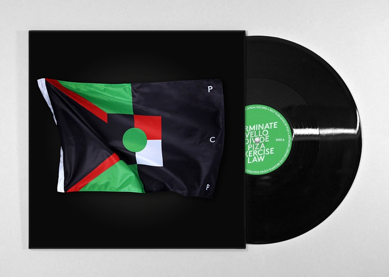
Luke Brown, Jordan Dolheguy, Totem Visual and photographer Dan Crawford collaborated on a flag-draped look for an EP cover and additional images for Melbourne industrial producer P C P. It's inspired work. And no wonder as P C P just happens to be Brown, himself.
Listen to PCP on SoundCloud and see more of Luke Brown's work at lukebrown.com.au.

Once the cameras on our smartphones started getting legitimate, a need for a good photo-editing app to drive the lens became apparent. We've been getting along with options like Snapseed and VSCO, but today Apple finally released the iPhone and Android version of their iPad app—Adobe Photoshop Touch. It does what those other great apps do (applying effects, cropping, sharing), but also provides some of those useful features familiar to users of the Photoshop desktop application (advanced selection tools, layers, filters). If you're a user of Photoshop and Adobe Creative Cloud, you can edit the same project from all of your devices—start a project at work and finish it on the train.
Find Adobe Photoshop Touch at Google Play or the App Store for $4.99.
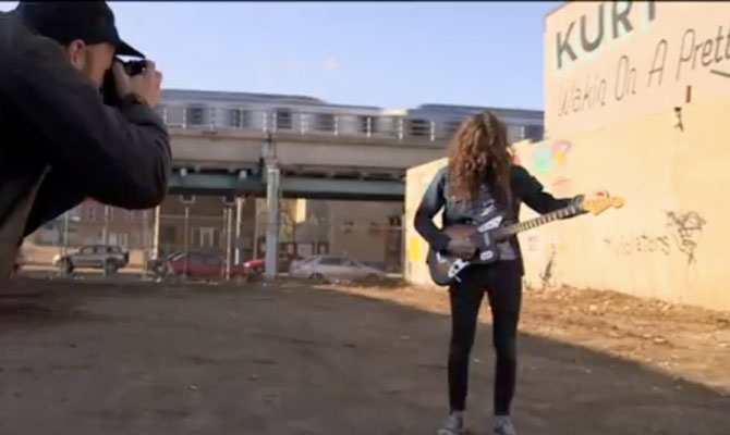
Talk about a perfect collaboration. To create the cover image and simultaneously promote the new album Wakin on a Pretty Daze from Philly's Kurt Vile, artist Steve Powers painted a giant wall-sign in the home of the Liberty Bell. The design by former graffiti writer Powers even draws on the tunes themselves, giving it some extra no-BS legitimacy for Philadelphians. Check out the video for more insight on the collaboration and some great views of work by Powers, then visit firstandfifteenth.net for more signs by Powers.
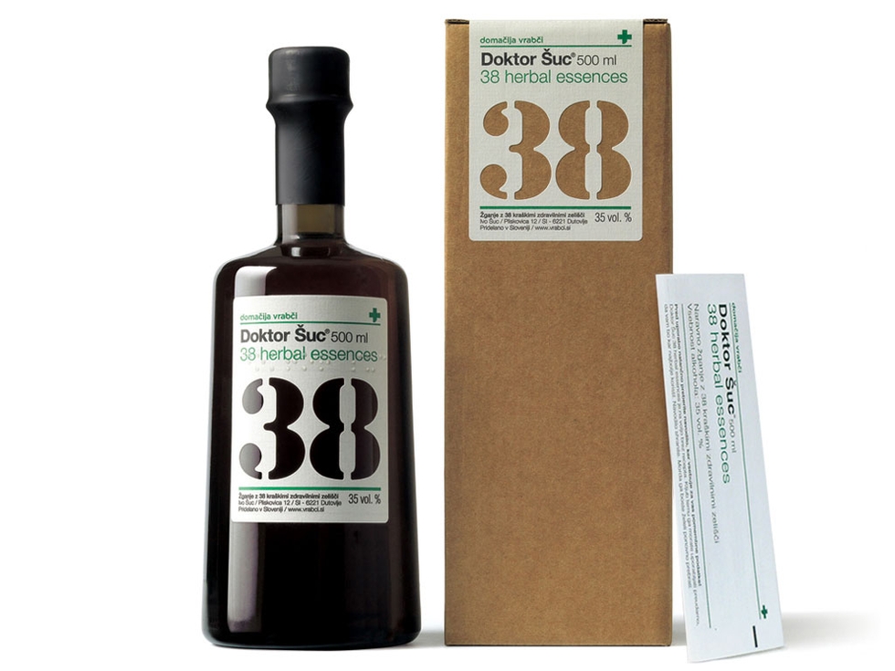
You've seen dozens of branding identities for new hoppy craft beers, or the latest micro-distilled Rye whiskey, but it's not every day a Slovenian brandy makes waves in the design world.
Design firm Loni DBS has just completed a new identity for an organic brandy called Doctor Shutz 38 Herbal Essences. The brandy takes its numerical name from the 38 herbs grown in Slovenian wine country and used in the recipe. The design firm chose a pharmaceutical theme, complete with green cross imagery, a typographic hierarchy reminiscent of medicine bottles, and a small pamphlet included in each package that's familiar to anyone who has ever received a prescription. Also worth noting, most of the bottle's copy is also printed in Braille.

We're all for making the fine points of contemporary food culture as accessible as possible. When it comes to pairing food and wine, it sometimes feels as if some secret knowledge has been held back. That's why this chart from Wine Folly (available for purchase as a poster) is particularly welcome. It might not be the sleekest infographic we've seen this week, but it's the one we might actually tote in the wallet.